


Design shapes our world. It communicates ideas and evokes emotions.
Understanding the key elements of design helps create impactful visuals. In the world of design, certain elements stand out. These elements form the foundation of every great design. Whether you are a beginner or an expert, knowing these core components is essential.
They guide the creative process and ensure the final product is effective. From colors to lines, every detail matters. Understanding these elements will help you create designs that not only look good but also communicate clearly. Dive in to discover what makes a design truly remarkable.
Balance in design is a crucial principle. It ensures that no single element overpowers the others. A well-balanced design feels stable and aesthetically pleasing. There are different types of balance to consider. Two of the most common are symmetrical and asymmetrical balance.
Symmetrical balance creates a mirror image. Both sides of the design are identical. This type of balance often feels formal and organized. It is easy to achieve and understand. Symmetrical balance is common in architecture and nature. Think of butterfly wings or the human face.
Asymmetrical balance is more dynamic. It uses different elements to create visual interest. One side might have a large shape, while the other has a smaller shape. This type of balance feels more casual and energetic. It can be more challenging to achieve but offers unique results. Asymmetrical balance is often used in modern and contemporary designs.
Contrast is one of the most important elements in design. It helps create visual interest and guides the viewer’s attention. Without contrast, designs can look flat and uninteresting. By using contrast effectively, designers can highlight key areas and add depth to their work.
Color contrast is crucial in design. It involves using different colors to make elements stand out. For instance, using a dark color on a light background can make text easier to read. Strong color contrast can highlight important information. It also adds vibrancy and energy to the design.
Choosing the right colors is essential. Complementary colors, which are opposite each other on the color wheel, create strong contrast. Analogous colors, which are next to each other, create less contrast but a harmonious look. Understanding color theory helps in making effective contrast choices.
Texture contrast adds another layer of interest to designs. It involves combining different textures to create a dynamic look. For example, pairing smooth and rough textures can make a design more engaging. Texture contrast can also add a tactile feel to digital designs.
In web design, texture contrast can be achieved using background patterns or images. This can make sections of a website stand out. Textured elements can draw attention to specific areas or content. Effective use of texture contrast can make a design feel more alive and interesting.
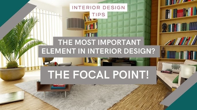
Emphasis is a vital element in design that directs the viewer’s attention to the most important parts of the composition. By creating a clear visual hierarchy, designers ensure that the audience understands the main message at a glance. This section will explore two key aspects of emphasis: the Focal Point and Hierarchy.
The focal point is the area of a design that draws the most attention. It acts as a visual anchor that guides the viewer’s eyes through the layout. A focal point can be achieved through:
For example, in a poster, the title might serve as the focal point, with bold colors and a central position.
Hierarchy organizes information in a way that reflects its importance. It ensures that the most important elements are seen first. This can be achieved through:
In a website layout, the hierarchy might start with the header, followed by subheadings and body text. This structure helps users navigate the content easily.
| Method | Description |
|---|---|
| Contrast | Using different elements to create visual interest. |
| Placement | Strategically positioning elements within the layout. |
| Isolation | Separating elements to highlight them. |
Proportion is a fundamental aspect of design. It refers to the size relationship between elements in a composition. Good proportion creates harmony and balance. Poor proportion leads to a chaotic and unpleasant design.
Scale is about the size of elements in relation to each other. It helps to create a focal point in the design. Large elements draw attention. Small elements are more subtle. Use scale to guide the viewer’s eye.
The relationship between elements is crucial for good design. Proportion connects elements and creates a sense of unity. It ensures that no element feels out of place. Each part of the design should complement the others. This creates a cohesive and pleasing look.
Rhythm in design creates a sense of movement and flow. It guides the viewer’s eye through the composition. Rhythm can be achieved through various techniques. Here, we focus on repetition and movement.
Repetition involves using the same elements throughout the design. This could be shapes, colors, or lines. Repetition helps to create consistency. It makes the design feel cohesive. When elements repeat, they establish a pattern. Patterns can be predictable. Predictability makes the design easier to understand. It also creates a sense of order. Viewers find comfort in organized designs.
Movement in design directs the viewer’s eye. It can show action or guide attention. Movement can be created through lines, shapes, and colors. Curved lines suggest gentle movement. Straight lines can indicate direction. Colors can also lead the eye. Bright colors attract attention quickly. Movement makes the design dynamic. It keeps the viewer engaged. Without movement, designs can feel static. Static designs might not hold attention for long.

The basic elements of design are line, shape, color, texture, and space. They form the foundation.
Balance creates harmony and stability in a design. It ensures no part overpowers another, making it visually appealing.
Color affects mood and emotion. It highlights important areas and creates a sense of unity in the design.
Design elements shape how we experience products and spaces. Color, typography, and layout influence our emotions and behaviors. Balance, contrast, and alignment ensure designs are visually appealing. Consistency fosters recognition and trust. White space enhances readability and focus. Each element plays a crucial role.
Understanding them leads to better designs. Keep experimenting and learning. Your designs will improve over time. Remember, simplicity often works best. Good design communicates clearly and effectively.

