


The FedEx logo is iconic and instantly recognizable. But what is the story behind it?
The FedEx logo has a fascinating history. Its design is clever and unique, making it stand out in the business world. The logo is more than just a name; it has hidden meanings that add depth to its design. Over the years, the FedEx logo has evolved, reflecting changes in the company and in design trends.
Understanding the history and evolution of the FedEx logo offers insights into how branding can impact a company’s image. Join us as we explore the meaning, history, and evolution of this famous logo. Discover the secrets behind its design and how it became a symbol of trust and reliability.
FedEx is a major player in the global shipping industry. Known for its speed and reliability, FedEx has become a household name. But what about its logo? The FedEx logo is more than just a name. It is a symbol of efficiency and trust.
FedEx started in 1971. Frederick W. Smith founded the company. He had a vision for overnight delivery. The first FedEx package was delivered in 1973. Since then, the company has grown rapidly. Today, FedEx operates worldwide.
The logo has also evolved. The first logo was simple. It featured the name “Federal Express.” In 1994, the company rebranded. The new logo became “FedEx.” It introduced a hidden arrow in the logo. This arrow symbolizes speed and precision.
FedEx’s global reach is impressive. The company delivers in over 220 countries. It is a leader in international shipping. The logo is recognized around the world. It stands for reliability and speed.
The hidden arrow in the FedEx logo is famous. It has been praised for its design. People see it as a clever use of space. This small detail adds to the logo’s global impact.
FedEx has influenced other brands. Companies aim for similar recognition. They want logos that convey trust and efficiency. The FedEx logo sets a high standard.
Credit: 1000logos.net
The FedEx logo is a masterclass in effective design. Simple yet powerful, its elements work together to create a memorable brand identity. Let’s explore the key elements of the FedEx logo design.
The FedEx logo uses a distinct color scheme. Purple and orange are the primary colors. Purple represents reliability and authority. Orange symbolizes energy and efficiency. These colors make the logo eye-catching and unique. They also help in creating a strong brand recall.
The typography of the FedEx logo is clean and bold. It uses the Univers 67 font. This typeface is modern and easily readable. The bold letters add to the logo’s strong visual impact. The clever use of negative space creates an arrow between the ‘E’ and ‘x’. This hidden arrow symbolizes speed and precision. Simple yet effective, the typography reinforces the brand’s core values.
The FedEx logo is famous for its clever design. The most fascinating part is the hidden arrow within the logo. This arrow is a brilliant piece of design work. It symbolizes speed and precision, two key attributes of FedEx’s service.
The hidden arrow in the FedEx logo is not easy to spot at first glance. Many people take a while to see it. The arrow is formed in the negative space between the letters ‘E’ and ‘x’. This clever use of negative space makes the logo unique and memorable.
The arrow symbolizes speed, accuracy, and delivery. It highlights FedEx’s commitment to swift and reliable service. The arrow points forward, indicating progress and movement. This aligns with FedEx’s mission to connect people and businesses quickly and efficiently.
Credit: www.designhill.com
The FedEx logo is a symbol of global logistics and delivery. It has a rich history and has undergone several transformations. These changes reflect the company’s growth and adaptation to modern design trends.
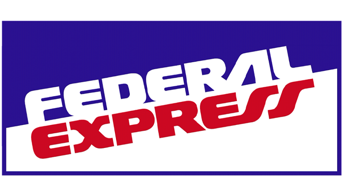
FedEx started as Federal Express in 1971. The first logo was simple. It featured a blue and white color scheme with the full company name. It was straightforward and functional. The focus was on the company’s reliability and speed.
In 1994, FedEx introduced a new logo. This design used negative space to create an arrow between the “E” and “x”. The arrow symbolized speed and precision. The logo was a clever use of design and became iconic.
Over the years, FedEx has updated its logo to stay relevant. The colors and fonts have been refreshed. Each update has been subtle but meaningful. The core elements, like the hidden arrow, remain unchanged.
In recent years, FedEx has focused on digital and mobile platforms. The logo has been optimized for clarity on screens. This ensures the brand remains strong in a digital world.
| Year | Logo Design |
|---|---|
| 1971 | Original blue and white design |
| 1994 | Introduction of the hidden arrow |
| 2000s | Minor updates for digital clarity |
The evolution of the FedEx logo shows a commitment to innovation. Each update has enhanced the brand’s image and message. This evolution is a testament to the brand’s enduring legacy.
The colors in a logo are not just for aesthetics. They carry meaning and communicate messages. The FedEx logo is a prime example of this. Let’s dive into the significance of the colors used in the FedEx logo.
Purple and orange are the primary colors in the FedEx logo. Purple is often associated with reliability and quality. It conveys a sense of trust and professionalism. This is key for a logistics company like FedEx.
Orange, on the other hand, symbolizes energy and efficiency. It stands out and grabs attention. It suggests speed and dynamism, which are essential for delivery services. Together, these colors create a powerful and appealing visual identity.
The choice of purple and orange helps FedEx stand out. It differentiates the brand from competitors. These colors also create a memorable image in the minds of customers. People recognize the logo instantly.
Consistency in color use across all platforms ensures strong brand identity. Whether on trucks, uniforms, or advertisements, the colors stay the same. This consistency builds trust and recognition over time.
Credit: www.appypie.com
The FedEx logo is iconic. Its creation is the work of a skilled designer. The designer’s vision and creativity shaped the brand’s identity. Let’s delve into the designer behind the FedEx logo.
Lindon Leader is the genius behind the FedEx logo. He designed the logo in 1994. Leader’s work has won numerous awards. He is known for his simplicity and cleverness in design.
Leader believes in simplicity and clarity. His designs often have hidden meanings. The FedEx logo is a prime example. It features a hidden arrow between the ‘E’ and ‘x’. This arrow symbolizes speed and precision. Leader’s approach to design is minimalistic. He values clean lines and clear messages.
The Fedex logo has significantly impacted brand recognition over the years. Its simple yet clever design resonates with consumers. This impact extends beyond visual appeal. It influences customer perception and market position.
The Fedex logo conveys reliability and speed. These qualities are essential in the shipping industry. Customers feel confident when they see the logo. They associate it with timely deliveries. This trust strengthens customer loyalty.
Moreover, the hidden arrow in the logo symbolizes precision. It suggests that Fedex moves packages efficiently. This subtle design element enhances customer satisfaction. It makes the brand memorable.
The logo helps Fedex stand out in a crowded market. Its unique design sets it apart from competitors. This distinctiveness is crucial in the logistics sector. It draws attention and creates a lasting impression.
Consistency in branding also plays a role. Fedex has maintained its logo over the years. This consistency reinforces brand identity. It ensures that the logo remains recognizable worldwide.
Overall, the Fedex logo significantly influences brand recognition. It shapes customer perception and solidifies market position. This strong identity helps Fedex maintain its leading status in the industry.
The FedEx logo features a hidden arrow between the “E” and “X”. This symbolizes speed and precision.
The FedEx logo was created in 1994. It has remained largely unchanged since then.
The FedEx logo was designed by Lindon Leader. He worked for the design firm Landor Associates.
The unique feature of the FedEx logo is its hidden arrow. It represents the company’s commitment to speed and accuracy.
The FedEx logo tells a story of innovation and simplicity. Its hidden arrow symbolizes speed and precision. Over the years, the logo evolved, becoming a symbol of trust and reliability. Understanding its history shows the power of thoughtful design. Logos like FedEx’s can shape brand identity and consumer perception.
Next time you see the FedEx logo, appreciate the creativity behind it. It’s more than just a name; it’s a legacy in the world of branding.

