Florida Panthers Logo History: Evolution and Meaning Explained
The Florida Panthers logo history is a fascinating journey. It reflects the team’s evolution and spirit.
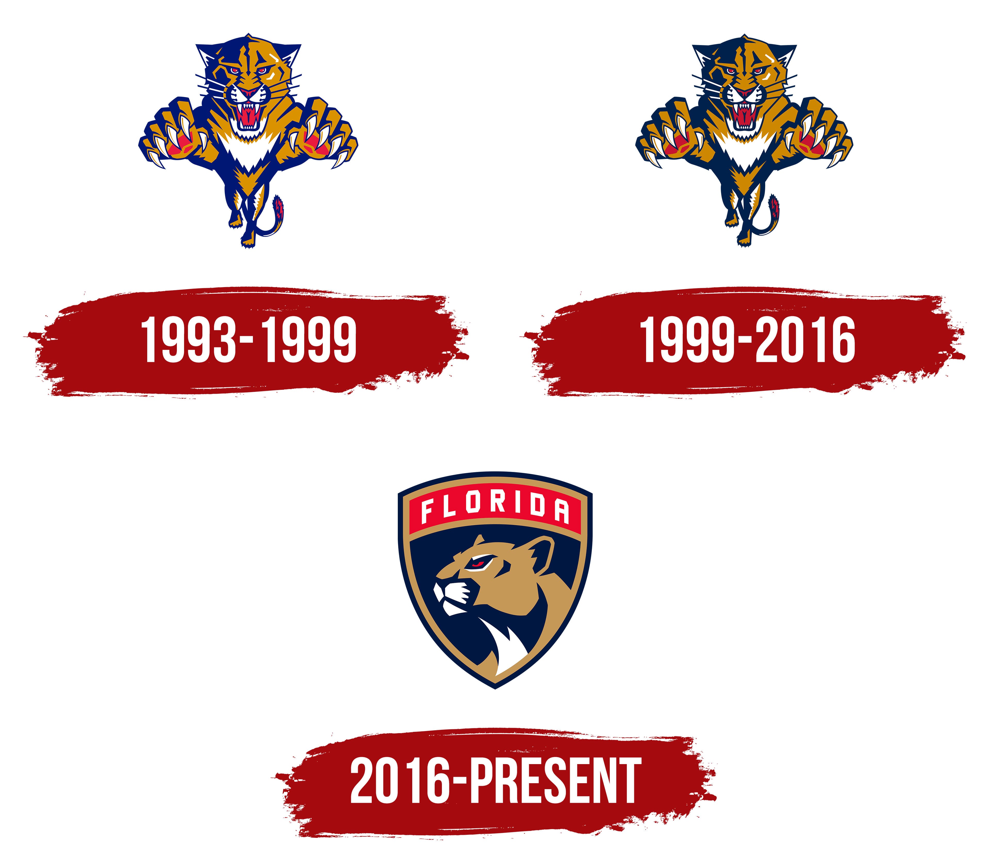
Since their debut in 1993, the Florida Panthers have had a few logo changes. Each design marks a new era for the team and its fans. From the original fierce panther to the sleek, modern designs, the logo tells a story.
Understanding this history not only gives insight into the team’s identity but also connects us to the rich heritage of Florida hockey. This exploration into the Florida Panthers logo history will take you through the transformations, the inspirations behind them, and what each logo symbolizes. Join us as we dive into the visual evolution of this iconic NHL team.

Early Beginnings
The Florida Panthers’ logo history is rich and fascinating. It reflects the team’s journey and identity. The story begins with their early years. During this time, the Panthers established their brand. The logo played a key role in this process.
Original Logo Design
The original logo featured a fierce panther. The panther was in a leaping pose. This dynamic design symbolized strength and agility. The logo used bold colors. These included navy blue and gold. It created a striking visual impact. Fans quickly recognized and embraced the logo.
Inspiration Behind The Design
The design drew inspiration from the Florida panther. This is a rare and majestic animal. The Florida panther is native to the region. The team wanted to honor this local icon. They chose the panther to represent their spirit. The leaping pose added a sense of action and energy. It captured the excitement of the game.
First Major Redesign
The Florida Panthers underwent their first major redesign in 2016. This redesign marked a significant shift in the team’s visual identity. The new logo aimed to modernize the brand and better represent the team’s spirit. Let’s dive into the details of this transformation.
Changes In Style
The original logo featured a fierce, leaping panther. The new design introduced a more streamlined and sophisticated panther head. The colors also changed, with a deeper shade of red and navy blue replacing the old palette. The updated logo included a shield shape, giving it a strong, emblematic look. These changes aimed to create a timeless and versatile design.
Fan Reactions
Fans had mixed reactions to the new logo. Some appreciated the modern and clean look. They felt the redesign captured the team’s evolving identity. Others missed the dynamic energy of the original leaping panther. Despite initial skepticism, many fans grew to embrace the new logo over time. It became a symbol of the team’s new era.
2009 Logo Update
The Florida Panthers made a significant update to their logo in 2009. This change introduced new design elements and refined the existing features. It aimed to modernize the team’s image while staying true to its roots.
Introduction Of New Elements
The 2009 logo update added bold lines and sharper edges. These changes gave the panther a more fierce and dynamic look. The color palette also got an update. The designers introduced a deeper, richer shade of red. This new color added intensity and vibrancy to the logo.
Symbolism Of The Changes
The new elements symbolized strength and aggression. The sharper edges and bold lines reflected the team’s tenacity. The deeper red color symbolized passion and energy. These changes aimed to instill fear in opponents and pride in fans.

2016 Rebranding
The 2016 rebranding of the Florida Panthers marked a significant change. The team sought to modernize its image and better connect with fans. This revamp was more than just a logo change; it symbolized a new era.
Modernizing The Look
The new logo introduced in 2016 had a sleek, modern design. Gone was the snarling panther leaping out. Instead, the logo featured a more regal, composed panther head. This change aimed to reflect strength and confidence.
The new logo also included a shield background. This design choice added a sense of tradition and protection. The colors were sharper, with a cleaner palette of red, blue, and gold. These colors gave the team a bold, fresh appearance.
Impact On Team Identity
The rebranding impacted the Florida Panthers’ identity in many ways. Fans and players embraced the new logo with enthusiasm. It represented a new chapter and a commitment to excellence.
The updated look also helped in marketing efforts. Merchandise sales saw an increase as fans wanted the latest gear. The rebranding made the team more recognizable and appealing to a broader audience.
Current Logo
The Florida Panthers unveiled their current logo in 2016. This new design represents a modern take on their brand identity. The logo boasts a sleek and simplified look, which appeals to both old fans and newcomers.
Design Features
The current logo features a fierce panther head. It is set within a bold, shield-like frame. The panther’s head is detailed with sharp lines and vivid colors. The primary colors used are navy blue, red, and gold. These colors give the logo a strong and dynamic appearance.
A horizontal bar with the word “Florida” sits atop the panther’s head. This bar is colored in gold, ensuring it stands out. The sharp angles and edges of the design convey strength and agility. The use of minimalistic lines adds a touch of modernity.
Meaning Behind The Elements
Each element of the logo carries a specific meaning. The panther’s head represents the team’s fierce and competitive spirit. Panthers are native to Florida, symbolizing local pride and connection.
The shield-like frame around the panther’s head stands for protection and unity. It signifies that the team is a strong, united front. The use of bold colors like navy blue, red, and gold signifies power, passion, and excellence.
The horizontal gold bar with “Florida” signifies the team’s roots. It is a nod to the state they represent. The overall design is a blend of tradition and modernity. This makes it appealing and relevant in the current sports landscape.
Logo In Popular Culture
Florida Panthers’ logo has a rich history and cultural significance. It goes beyond the arena and into popular culture. The logo’s unique design and fierce depiction of a panther have captured the imagination of fans and creators alike.
Appearances In Media
The Florida Panthers’ logo has made its mark in various media. It has appeared in movies, TV shows, and video games. Its bold design grabs attention and adds authenticity to sports-related scenes. The logo often symbolizes power and agility, fitting well in action-packed narratives.
Merchandise And Memorabilia
The logo’s popularity extends to merchandise and memorabilia. Fans proudly wear jerseys, hats, and t-shirts adorned with the Panthers’ logo. Collectors seek out rare items featuring the iconic design. The logo’s presence on merchandise helps spread team spirit and fosters a sense of community among supporters.
From keychains to posters, the logo appears on a variety of products. Each item tells a story of loyalty and passion for the team. The logo’s design makes it a favorite among fans of all ages.
Fan Perspectives
Florida Panthers fans have always been passionate about their team’s logo. Over the years, the logo has evolved, sparking various reactions from the community. Let’s dive into the fan perspectives on these changes.
Community Feedback
The community feedback on the Florida Panthers logo has been diverse. Some fans love the bold, fierce designs, while others miss the classic look. Many cherish the original logo for its nostalgic value. It reminds them of the team’s early days and memorable moments. The newer versions have also gained appreciation. Fans enjoy the modern touch and sleek design. They believe it represents the team’s growth and evolution.
Favorite Versions
Fans have their favorite versions of the Florida Panthers logo. The original logo from 1993 holds a special place in many hearts. Its dynamic, leaping panther symbolized strength and agility. Another beloved version is the 2016 update. This logo features a more detailed panther head and a shield. Many fans appreciate its clean, sophisticated look. It reflects the team’s new direction and renewed spirit.

Frequently Asked Questions
What Is The History Of The Florida Panthers Logo?
The Florida Panthers logo has evolved since the team’s founding in 1993. Initially featuring a leaping panther, it was updated in 2016 to a sleeker, more modern design.
How Many Times Has The Florida Panthers Logo Changed?
The Florida Panthers logo has changed twice. The original logo from 1993 was updated in 2016 to a more modern design.
What Does The Florida Panthers Logo Represent?
The Florida Panthers logo represents strength, agility, and the fierce nature of the panther, Florida’s state animal. The design reflects the team’s spirit.
When Was The Current Florida Panthers Logo Introduced?
The current Florida Panthers logo was introduced in 2016. It features a more streamlined and modern design compared to the original.
Conclusion
The Florida Panthers logo has evolved significantly over the years. Each change reflects a new era for the team. Fans appreciate the history and the pride it represents. The journey of the logo tells a story of growth and identity.
It’s more than just a symbol. It’s a mark of passion, dedication, and community. The Florida Panthers continue to honor their legacy while embracing the future. Their logo is a testament to their enduring spirit.


