The Vikings logo is iconic and rich in history. It represents more than just a sports team.
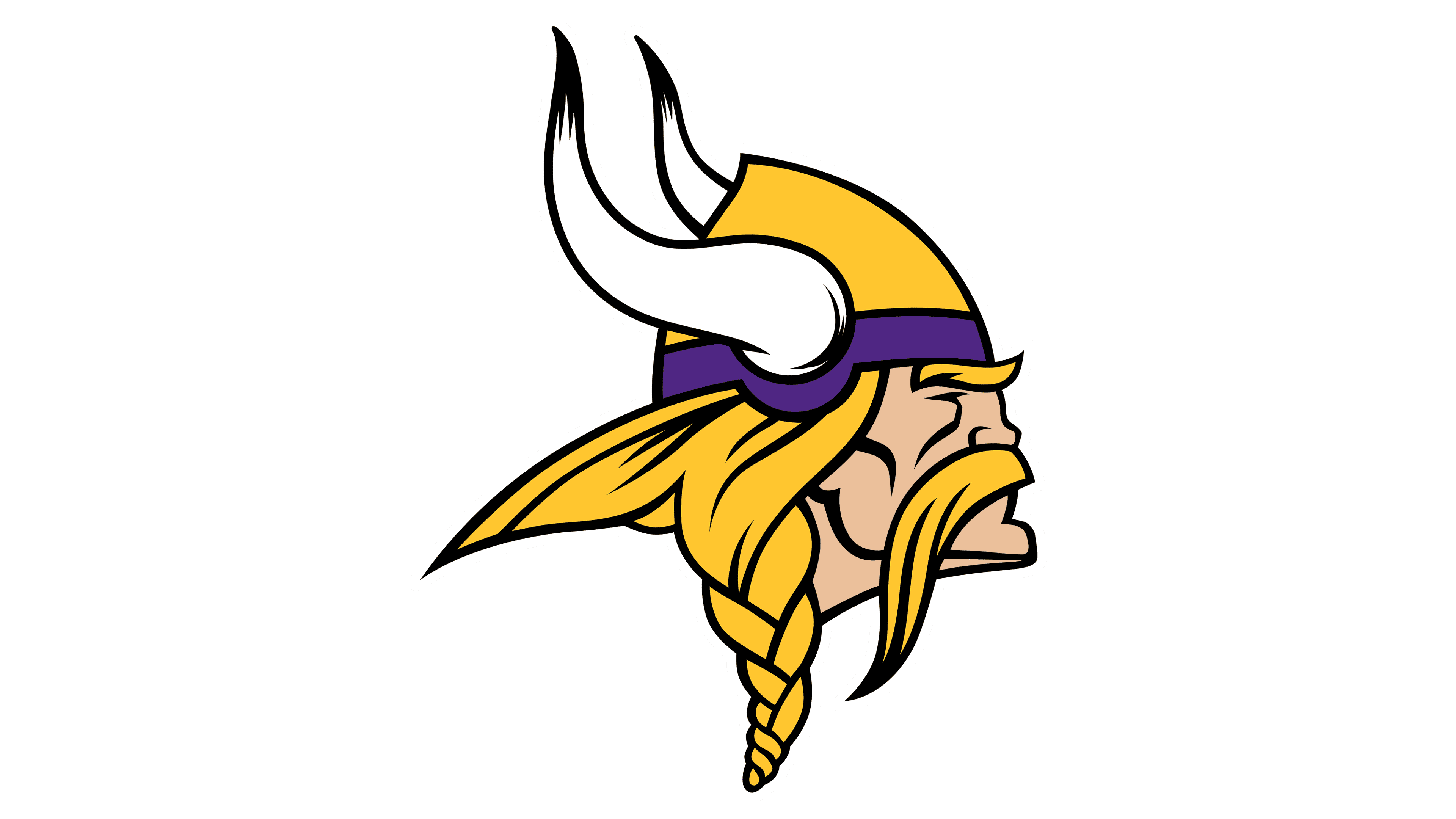
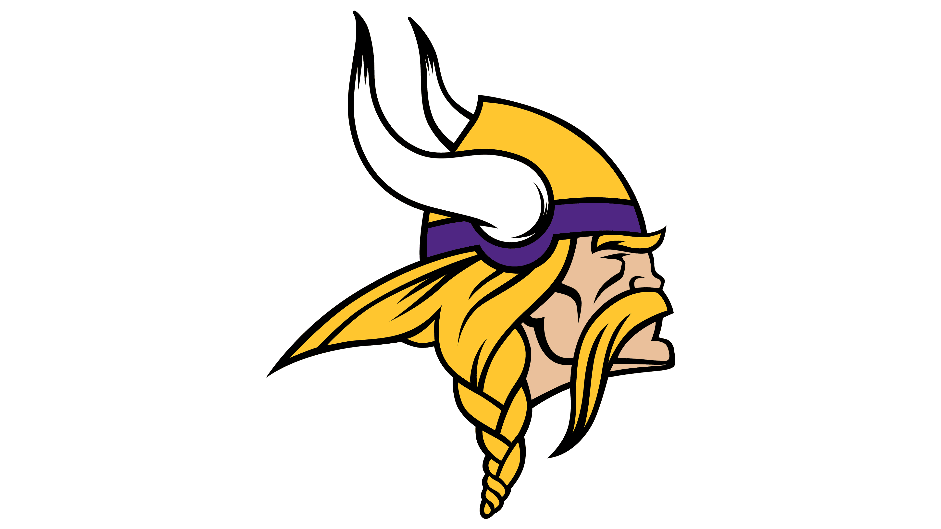
The Minnesota Vikings’ logo has evolved over time, reflecting the team’s heritage and spirit. This logo features a fierce Viking, complete with a horned helmet, capturing the essence of bravery and strength. The symbol isn’t just a random design; it holds deep meaning for fans and players alike.
Understanding the history and evolution of the Vikings logo helps fans appreciate the team’s identity even more. From its origins to its modern-day representation, the Vikings logo is a testament to tradition and pride. Dive into this exploration to uncover the story behind the symbol and its significance.
Origins Of The Vikings Logo
The Minnesota Vikings logo is iconic. It symbolizes strength and heritage. The journey of the logo began many years ago. Let’s dive into its origins.
Early Concepts
In the early stages, the team’s founders wanted a unique logo. They aimed to reflect their Scandinavian heritage. Initial ideas included Viking ships and Norse symbols. These concepts aimed to capture the essence of the Norse warriors.
The early sketches were rough. They featured different elements of Viking culture. The designers experimented with helmets, horns, and fierce expressions. These elements were crucial to the final design.
Initial Designs
The first official logo was designed in 1961. It featured a Viking head in profile. The Viking wore a horned helmet. His expression was fierce and determined. This design aimed to intimidate opponents.
Over the years, the logo underwent minor changes. The colors became more vibrant. The lines were refined for clarity. Despite these changes, the core elements remained the same. The horned helmet and fierce expression stayed intact.
| Year | Change |
|---|---|
| 1961 | Original logo introduced |
| 1980 | Color adjustments |
| 2006 | Minor refinements |
The Vikings logo is more than just an image. It represents strength, heritage, and determination. It has stood the test of time. The logo continues to be a symbol of pride for the team and its fans.

Credit: 1000logos.net
Evolution Over The Decades
The Vikings logo has seen many changes over the decades. Each change reflects a new era for the team. The evolution of the logo tells a story of growth and progress.
1970s Modifications
In the 1970s, the Vikings logo underwent its first major change. The original design featured a Viking head with a simple, bold outline. This logo captured the fierce spirit of the team.
During this decade, the logo was refined. The lines became cleaner and more defined. The Viking’s helmet and horns were made sharper and more detailed. These changes made the logo look more modern and professional.
Modern Updates
In recent years, the Vikings logo has seen further updates. The current logo retains the strong Viking head but with more nuanced details. The team added shading and highlights to give the logo a three-dimensional look.
Modern updates also include a more dynamic design. The Viking’s hair and mustache now have more movement, adding a sense of action. These changes make the logo feel alive and energetic. It captures the spirit of today’s team.
The Vikings logo continues to evolve, reflecting the team’s strength and history. Each update brings a fresh look while honoring the past.
Symbolism In The Design
The Vikings logo is more than just an image. It represents the spirit and strength of the team. Every color and element in the design has a purpose. These elements tell a story of bravery, power, and tradition. Let’s explore what each part of the logo means.
Colors And Their Meanings
The Vikings logo uses purple, gold, and white. Purple stands for royalty and power. It shows the team’s strength and high status. Gold represents wealth and success. It highlights the team’s achievements. White symbolizes purity and focus. It reflects the team’s clear goals and dedication.
Elements And Their Significance
The logo features a fierce Viking warrior. His helmet has horns, a symbol of aggression and readiness for battle. The braided hair and mustache show tradition and heritage. The warrior’s face is determined. It represents the team’s spirit and resilience.
Behind the warrior is a circular shape. It signifies unity and completeness. The circle shows the endless support of the fans. It binds the team and the community together.

Credit: epiclootshop.com
Cultural Impact
The Vikings logo holds a special place in sports culture. This iconic emblem represents more than just a football team. It symbolizes a rich history and a fierce spirit.
The logo features a Viking warrior, with a horned helmet and a determined expression. This image evokes strength, bravery, and a sense of adventure. For fans, it is a powerful symbol of identity and pride.
Influence On Fans
The Vikings logo has a strong influence on fans. It unites them and creates a sense of belonging. Fans wear the logo on jerseys, hats, and even face paint. This shared symbol fosters community and loyalty.
During games, stadiums filled with fans proudly display the Viking emblem. This visual unity boosts team spirit and creates an electrifying atmosphere. The logo becomes a rallying point, inspiring both players and supporters.
Merchandising Success
The Vikings logo drives merchandising success. Fans eagerly buy products featuring the emblem. From clothing to accessories, the logo adorns a wide range of items. This demand generates significant revenue for the team.
The strong visual identity of the logo enhances its appeal. It stands out, making it a popular choice for merchandise. The logo’s timeless design ensures its lasting popularity.
Official merchandise is not just about supporting the team. It is a way for fans to express their passion and dedication. The Vikings logo on merchandise symbolizes a shared love for the team.
Comparisons With Other Team Logos
The Vikings logo stands out among sports team logos. Its unique design often sparks comparisons with other team logos. The fierce Viking head, with its intense expression and traditional helmet, captures attention. This section explores how the Vikings logo compares with other logos, both within the NFL and globally.
Nfl Logos
In the NFL, team logos vary widely. Some, like the Dallas Cowboys’ star, are simple. Others, like the Baltimore Ravens’ raven head, are more detailed. The Vikings logo falls in the middle. It’s detailed but not overly complex. The Viking head is instantly recognizable. This level of detail makes it unique among NFL logos.
Many NFL logos use animals or symbols. The Chicago Bears have a bear’s head. The Philadelphia Eagles use an eagle. The Vikings logo, with its human figure, stands out. It represents strength and courage. These traits align with the team’s identity.
Global Sports Teams
Globally, sports team logos also show great diversity. European football clubs, like FC Barcelona, use intricate crests. These often include multiple symbols. The Vikings logo is simpler. Its single figure focuses attention. This design choice makes it memorable.
In contrast, some global teams use mascots. The Japanese baseball team Hanshin Tigers use a tiger head. The Vikings’ human figure is different. It tells a story. A story of a fierce warrior, ready for battle. This narrative element adds depth to the logo.
Overall, the Vikings logo holds a unique place. It combines simplicity and detail. It stands out in both the NFL and global sports. Its design captures the essence of the Viking spirit.
Controversies And Criticisms
The Vikings logo has sparked numerous controversies and criticisms over the years. Fans and critics alike have voiced concerns about its design, cultural implications, and overall representation. Let’s delve into some of the most significant debates surrounding the Vikings logo.
Cultural Appropriation Debate
One of the main controversies revolves around the cultural appropriation of Norse symbols. Critics argue that using Viking imagery can be seen as disrespectful to the Norse culture. They claim it reduces a rich history to a mere sports emblem. This debate raises questions about the ethical use of cultural symbols in popular culture.
Supporters, on the other hand, view the logo as a tribute. They believe it honors the strength and resilience of the Vikings. This ongoing debate highlights the thin line between honoring and misusing cultural heritage.
Design Critiques
The design of the Vikings logo has also faced its share of critiques. Some graphic designers and fans feel the logo is outdated. They argue it doesn’t reflect the modernity and dynamism of the team. Others believe the logo’s elements, like the horned helmet, are historically inaccurate. Vikings did not actually wear horned helmets. This misconception perpetuates a stereotypical image.
There are also debates about the logo’s color scheme. Some say the colors lack vibrancy and need an update. Others appreciate the traditional purple and gold, seeing it as a symbol of the team’s history.
| Critique | Details |
|---|---|
| Outdated Design | Logo doesn’t reflect modern dynamism |
| Historical Inaccuracy | Horned helmet is a stereotype |
| Color Scheme | Lacks vibrancy, needs an update |
These discussions about the logo’s design show that there is always room for improvement. They reflect the evolving nature of branding in sports.
Notable Logo Moments
The Vikings logo has seen many memorable moments over the years. These moments have contributed to its iconic status in sports history. From historic games to media appearances, the logo has been a symbol of strength and bravery. Let’s dive into some of these notable logo moments.
Historic Games
One of the most famous games featuring the Vikings logo was the 1977 NFC Championship. The team faced the Dallas Cowboys. The game was intense and full of drama. Fans remember the logo proudly displayed on helmets.
Another significant game was in 1998. The Vikings had a remarkable season. They played against the Atlanta Falcons in the NFC Championship. The logo was a beacon of hope for fans. Though the Vikings lost, the logo represented their journey.
Media Appearances
The Vikings logo has appeared in many TV shows and movies. In the hit TV show “How I Met Your Mother,” the logo is often seen. One of the characters, Marshall Eriksen, is a huge Vikings fan. This brought the logo to a wider audience.
In the movie “Little Big League,” the logo makes a cameo. The film features the Minnesota Twins, but the Vikings logo appears in several scenes. This shows its significance in Minnesota culture.
Future Of The Vikings Logo
The Vikings logo has a rich history, symbolizing strength and heritage. As times change, so do logos. The future of the Vikings logo is a hot topic among fans and designers. This section explores potential redesigns and fan expectations for the Vikings logo.
Potential Redesigns
Teams often update their logos to stay current. The Vikings could follow this trend. Possible redesigns might include:
- Modernizing the Viking helmet
- Simplifying the logo for a cleaner look
- Incorporating new colors or shades
Designers may introduce a more streamlined look. This could involve fewer details but a bolder impact. Another idea is to highlight specific elements, like the Viking horns, to make the logo more recognizable.
| Aspect | Current Design | Potential Changes |
|---|---|---|
| Helmet | Detailed and traditional | Modern and sleek |
| Colors | Purple and gold | New shades or additions |
| Overall Style | Classic | Simplified or bold |
Fan Expectations
Fans hold strong opinions about their team’s logo. The Vikings community is no different. They expect any changes to respect the history and tradition of the team. Common expectations include:
- Maintaining the iconic Viking image
- Keeping the traditional colors
- Ensuring the logo remains easily recognizable
Fans also appreciate subtle updates that enhance the logo without losing its essence. They enjoy seeing modern elements but want the core identity to stay the same. Balancing tradition with modernity is key.
The future of the Vikings logo involves careful consideration. Both potential redesigns and fan expectations play crucial roles. Any changes must respect the past while embracing the future.

Credit: logos-world.net
Frequently Asked Questions
What Is The Origin Of The Vikings Logo?
The Vikings logo was first introduced in 1961. It was designed by Karl Hubenthal, a Los Angeles-based sports cartoonist.
What Does The Vikings Logo Symbolize?
The logo symbolizes strength and courage. It features a Viking head with a helmet and horns, representing the fierce Norse warriors.
How Has The Vikings Logo Evolved?
The logo has undergone minor changes since its inception. The most notable update was in 2013, making it sleeker and more modern.
What Colors Are Used In The Vikings Logo?
The Vikings logo primarily uses purple, gold, and white. These colors represent royalty, valor, and purity, respectively.
Conclusion
The Vikings logo has a rich and fascinating history. Its bold design reflects strength and tradition. Fans connect deeply with the symbol. It represents more than just a team. It’s a piece of cultural heritage. Understanding its meaning adds to its appreciation.
The logo’s evolution shows growth and enduring spirit. Each change tells a story. This iconic emblem continues to inspire. It stands proud, much like the Vikings themselves. As you follow the team, remember the legacy behind the logo. It’s more than an image; it’s a lasting legacy.
A true symbol of Viking pride.

