


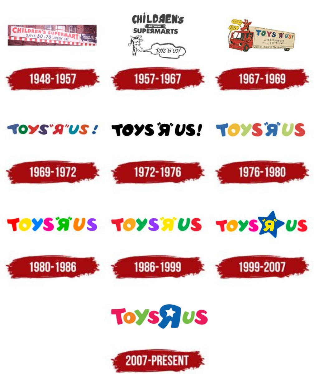
The Toys R Us logo has a rich history. It has changed many times over the years.
Toys R Us is a beloved toy store known worldwide. Its logo is iconic and instantly recognizable. But this famous logo did not always look the same. Since the store’s founding in 1948, the logo has evolved to match the times and trends.
Each change in the logo tells a story of the company’s growth and adaptation. By exploring the history of the Toys R Us logo, we can see how the brand has remained a favorite through generations. Let’s dive into the journey of this playful and enduring logo.
Toys R Us is a beloved toy store. It started as a small business. Over the years, it grew into a household name. The company’s journey began with a simple idea. Charles Lazarus founded it in 1948. He aimed to create a one-stop shop for toys. This vision shaped the brand we know today.
Charles Lazarus returned from World War II. He noticed a need for a dedicated toy store. In 1948, he opened his first store. It was called “Children’s Bargain Town.” The store was in Washington, D.C. It focused on baby furniture and toys. The idea was an instant hit. Parents loved the convenience.
The first logo was simple. It featured the store’s name in bold letters. The design was straightforward. The focus was on clarity. The logo aimed to be easily recognizable. It helped establish the brand’s identity. Over time, the logo evolved. But the core idea remained the same. Simplicity and recognition were key.
The 1960s marked a significant period for Toys R Us. The company underwent a major redesign of its logo. This redesign aimed to modernize the brand’s image and make it more appealing to children and parents alike. Let’s explore the key changes during this era.
The new logo introduced in the 1960s had a distinct look. The design featured bold, playful letters. The letters were bright red, reflecting a vibrant and energetic brand.
Key features of the 1960s redesign include:
This new look marked the beginning of a new era for Toys R Us. It successfully captured the attention of both kids and parents, establishing a strong visual identity.
The modern touch of the 1960s logo was evident in its simplicity. The design focused on being eye-catching and memorable. The bright red color made the logo stand out in stores and advertisements.
Key elements that added a modern touch:
This modern approach helped Toys R Us build a recognizable brand. The logo’s simplicity ensured it was easy to remember, while the vibrant color made it attractive to children.
| Aspect | Details |
|---|---|
| Font | Playful and bold |
| Color | Bright red |
| Design | Simple and impactful |
This redesign was a pivotal moment for Toys R Us. It set the stage for the brand’s future success and established a lasting visual identity.
Geoffrey the Giraffe has been the beloved mascot of Toys R Us for decades. The logo has changed many times, yet Geoffrey remains a constant symbol of fun and adventure for children.
Geoffrey the Giraffe has been the face of Toys R Us for years. His charm and friendly appearance made him a favorite among children. But how did Geoffrey come into existence? Let’s dive into his story.During the 1970s, Toys R Us decided to revamp its logo. This transformation marked a new era for the brand. The changes were eye-catching and made a big impact. Let’s dive into the specific elements of this transformation.
One of the most notable changes in the 1970s was the use of bold colors. The logo featured bright, vibrant hues that grabbed attention. These colors made the brand stand out. The combination of red, yellow, blue, and green became iconic.
The use of such bold colors was strategic. It appealed to children and parents alike. The vibrant palette conveyed a sense of fun and excitement. This helped Toys R Us create a memorable visual identity.
Another major change was the font. The new font was playful and childlike. It featured rounded edges and a whimsical style. This font choice reflected the brand’s focus on fun and play.
In addition, the letters in the logo were uneven. They appeared to jump and dance. This gave the logo a dynamic feel. The font change was a key part of the 1970s transformation. It reinforced the brand’s playful image.
| Element | Change |
|---|---|
| Colors | Bright, bold hues |
| Font | Playful, childlike style |
Overall, the 1970s transformation of the Toys R Us logo was significant. The bold colors and font change helped the brand stand out. These changes created a lasting impression. They set the tone for the brand’s identity for years to come.
The 1980s marked a significant period for Toys R Us. The brand underwent major changes to adapt to the evolving market. During this time, the logo received a notable update that reflected the company’s growth and new direction.
Toys R Us expanded rapidly in the 1980s. New stores opened across various regions. This growth necessitated a fresh look for the brand. The logo needed to reflect this expansion. It was essential to connect with a broader audience.
The updated logo in the 1980s featured a refined design. The iconic backward “R” remained a key element. This playful touch kept the brand’s identity intact. The colors became bolder and more vibrant. This change aimed to attract more attention from children and parents alike.
The typography also saw improvements. It became cleaner and more modern. This made the logo easier to read from a distance. The changes helped the brand stand out in a crowded market.
The 1990s brought a fresh look to the Toys R Us logo. This decade saw a shift towards a more modern and vibrant design. The brand aimed to connect with a new generation of kids and their families.
The refreshed logo featured playful elements to attract children. Bright colors like red, yellow, blue, and green were used. These colors made the logo lively and appealing. A cartoonish star replaced the backward “R.” This star added a whimsical touch. The font became more rounded and child-friendly. These changes made the logo fun and inviting for kids.
The 1990s also marked the rise of the digital age. Toys R Us adapted its logo for online platforms. The design had to be clear and recognizable on screens. The company ensured the logo remained bold and eye-catching. This adaptation helped the brand stay relevant. It also made it easier for customers to find Toys R Us online.
The 2000s brought a fresh wave of change for Toys R Us. The company decided to modernize its logo to align with contemporary trends and its growing global presence. This transformation was crucial to appeal to a new generation of customers while retaining the nostalgic charm that the brand was known for. Let’s dive into the key elements of this modernization.
The Toys R Us logo in the 2000s took on a more sleek and modern appearance. The iconic backward “R” remained, keeping the playful essence. However, the logo’s font became smoother and more polished. The colors became brighter and more vibrant. This change was designed to attract the attention of children and parents alike.
Here’s a brief comparison of the old and new elements:
| Old Logo | New Logo |
|---|---|
| Chunky font | Sleek, smooth font |
| Muted colors | Bright, vibrant colors |
These modifications helped the logo look more contemporary and appealing. The changes were subtle but effective, keeping the brand’s identity intact while making it look fresh.
The modernization of the Toys R Us logo in the 2000s coincided with the company’s global expansion. As the brand grew its footprint in international markets, it needed a logo that would resonate universally. The sleek design and vibrant colors helped establish a consistent brand image worldwide.
Key achievements during this period included:
The modernized logo played a significant role in these achievements. It made the brand recognizable and relatable across different cultures.
Overall, the 2000s modernization was a strategic move. It ensured the Toys R Us logo remained relevant and engaging in a rapidly changing market.
Toys R Us has always been a beloved brand for children and parents. Over the years, the logo has seen many changes. These changes reflect the evolving nature of the brand. Recently, the company has made significant innovations. These changes aim to capture the essence of modern times while staying true to its roots.
In recent years, Toys R Us has focused on rebranding efforts. The goal was to reconnect with its audience. The company wanted to create a modern and appealing look. This involved tweaking the logo to make it more vibrant and engaging.
The rebranding efforts included a fresh color palette. Bright colors were used to attract the attention of children. The new design is playful yet professional. It reflects the fun and excitement that Toys R Us offers.
The current Toys R Us logo is a blend of tradition and innovation. It retains the iconic star in the “R” but with a modern twist. The font is bold and rounded, making it easy to read. The colors are brighter, giving the logo a more cheerful look.
The logo also includes subtle design elements. These elements add depth and dimension. They make the logo more dynamic and visually appealing. The current logo captures the spirit of Toys R Us perfectly. It is a testament to the brand’s commitment to staying relevant in a fast-changing world.
The Toys R Us logo was first introduced in 1957. It has undergone several changes to reflect the brand’s evolution.
The Toys R Us logo has seen various updates. It evolved from a simple text logo to its current playful design.
Toys R Us changed their logo to keep the brand fresh and appealing to new generations of children.
The current Toys R Us logo represents fun, playfulness, and the brand’s focus on children’s products.
The Toys R Us logo has seen many changes over the years. Each version reflects the brand’s evolving identity. From playful fonts to vibrant colors, the logo captures the spirit of childhood. It remains a symbol of fun and joy for many.
The logo’s history shows the brand’s journey and growth. It connects past memories with today’s experiences. Learning about its evolution deepens our appreciation. The Toys R Us logo will always hold a special place in our hearts.

