The Toyota logo is one of the most recognized symbols in the world. It stands for quality, innovation, and trust.
But what is the story behind this iconic emblem? The journey of the Toyota logo is as intriguing as the brand itself. It reflects the company’s growth and its commitment to excellence. From its humble beginnings to its current form, the logo has undergone several changes.
Each transformation tells a story about Toyota’s values and vision. In this blog post, we will explore the history, meaning, and evolution of the Toyota logo. We’ll delve into its origins, decode its symbolism, and see how it has evolved over the decades. Join us as we uncover the fascinating tale behind the Toyota logo.
Introduction To Toyota Logo
The Toyota logo is one of the most recognizable symbols in the automotive world. It represents quality, reliability, and innovation. But how did this iconic emblem come to be? Understanding the history and evolution of the Toyota logo provides insight into the brand’s identity and values. This section delves into the origins and transformations of the Toyota logo.
Brief History
The Toyota Motor Corporation was founded in 1937 by Kiichiro Toyoda. Initially, the company produced automatic looms, before shifting focus to automobiles. The brand name “Toyota” was chosen for its simplicity and ease of pronunciation. Over the decades, the Toyota logo has undergone significant changes, each reflecting the company’s growth and vision.
Initial Design
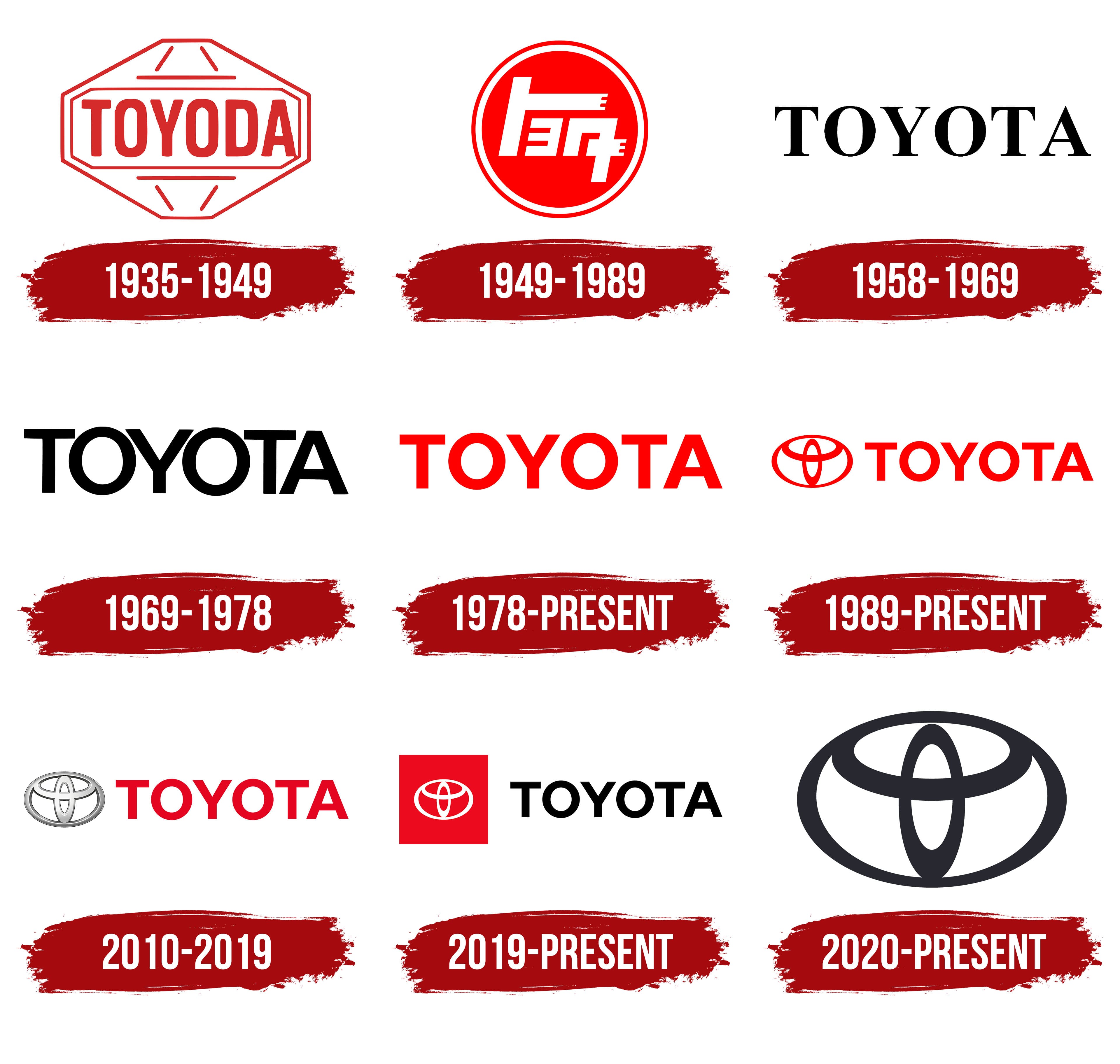
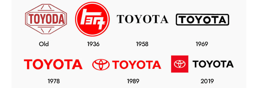
The first Toyota logo was introduced in 1936. It featured the name “Toyoda” inside a red circle, as a nod to the founder’s family name. The logo was simple and straightforward, symbolizing the company’s strong foundation. In 1989, Toyota unveiled a new logo to celebrate its 50th anniversary. This design included three overlapping ovals, representing trust, unity, and the company’s commitment to customers.
Symbolism Behind The Logo
The Toyota logo is more than just a symbol. It tells a story of a brand that values its heritage and future. This iconic logo is filled with meanings that reflect the company’s vision and legacy.
Three Ellipses
The Toyota logo features three ellipses. Each ellipse has a distinct significance. The three ellipses represent the heart of the customer, the heart of the product, and the heart of technological progress.
These intertwined shapes form a unique design. They symbolize unity and trust. The overlapping ellipses create a sense of continuous improvement.
Hidden Meanings
There are hidden meanings in the Toyota logo. The two inner ellipses form a “T,” representing Toyota. This clever design technique adds a layer of intrigue. It makes the logo memorable and distinctive.
Additionally, the ellipses form a steering wheel. This signifies the company’s commitment to vehicles and driving experience. It also stands for global expansion and customer satisfaction.
The negative space within the logo spells out “Toyota” in a subtle manner. This creative use of space showcases the brand’s attention to detail.
| Element | Symbolism |
|---|---|
| Three Ellipses | Unity, trust, continuous improvement |
| Inner “T” Shape | Represents Toyota |
| Steering Wheel | Commitment to vehicles and driving experience |
| Negative Space | Subtle spelling of “Toyota” |
These elements make the Toyota logo a powerful symbol. It blends tradition with innovation. The logo tells the story of Toyota’s past, present, and future.
Evolution Of The Logo
The Toyota logo has undergone significant changes over the years. Each transformation symbolizes the company’s growth and dedication to quality. Let’s explore the evolution of this iconic logo.
Early Modifications
The first Toyota logo appeared in 1935. It featured the word “Toyoda” in Japanese characters. In 1936, the company held a public competition to create a new logo. The winning design used a more stylized form of the original characters.
By 1949, Toyota simplified the logo. They adopted a more Western-friendly design, using the Roman alphabet. This new logo read “TOYOTA” in a bold, simple font. The change made the brand more recognizable globally.
In the 1960s, Toyota introduced a new emblem. This logo featured a red and blue circle with the word “TOYOTA” below it. The circle symbolized the company’s global reach and unity.
Modern Changes
In 1989, Toyota unveiled its most recognizable logo. This emblem consists of three interlocking ovals. Each oval represents a key element of the company:
- The two inner ovals symbolize the hearts of the customers and the company.
- The outer oval represents the world embracing Toyota.
This design reflects Toyota’s commitment to customer satisfaction and global presence.
In 2005, Toyota made a slight adjustment to the logo. They introduced a more three-dimensional look. This modern touch added depth and a contemporary feel to the emblem.
In recent years, Toyota has focused on digital-friendly designs. They simplified the logo for better visibility on screens. The current logo retains the three ovals but with a sleeker, cleaner appearance.
The Toyota logo’s evolution shows the company’s dedication to progress and innovation. Each change tells a story of adaptation and growth in the automotive industry.

Credit: www.ceafam.com
Global Recognition
Global Recognition is a key aspect of the Toyota logo. Across the world, the logo is synonymous with quality, innovation, and reliability. With its sleek design, the logo stands out in the automotive industry.
Brand Identity
The Toyota logo plays a vital role in the brand’s identity. It features three overlapping ovals. These ovals symbolize the fusion of the hearts of Toyota customers and the heart of Toyota products.
The distinctive emblem reflects the company’s global expansion and commitment to delivering excellence. The logo’s simplicity makes it easily recognizable, even from a distance.
Consumer Perception
Consumer perception of the Toyota logo is overwhelmingly positive. Many associate the logo with trust, durability, and advanced technology. The logo inspires confidence in the brand.
Customers often connect the logo with their own experiences of reliability and satisfaction. This strong emotional connection helps Toyota maintain its loyal customer base.
| Aspect | Description |
|---|---|
| Trust | Consumers trust the quality and reliability of Toyota vehicles. |
| Innovation | The logo is a symbol of Toyota’s commitment to technological advancements. |
| Global Presence | The logo is recognized worldwide, symbolizing Toyota’s global reach. |
Comparisons With Competitors
Toyota’s logo stands out with its unique design, making it easily recognizable among competitors. The emblem reflects the brand’s history and values.
When comparing the Toyota logo with those of its competitors, several interesting points emerge. Understanding these similarities and differences helps appreciate the unique identity of the Toyota brand.Similarities
Many car logos aim for simplicity and recognition. Toyota’s logo shares this trait. For instance, like the Ford logo, it is easily identifiable. Both use a minimalistic design. This makes them memorable. Additionally, like Honda, Toyota uses an emblematic shape. This shape forms the core of its identity.Differences
Toyota’s logo differs in its symbolic meaning. Unlike BMW’s logo, which represents a propeller, Toyota’s three ovals signify trust, customer focus, and innovation. This focus on symbolism sets it apart. Another difference is the color choice. Toyota opts for a sleek silver, representing modernity. On the other hand, Ferrari’s logo uses vibrant red and yellow. These colors symbolize speed and passion. Each brand’s logo has its unique touch. Toyota’s blend of symbolism and simplicity creates a distinct mark in the automotive world.
Credit: www.designhill.com
Impact On Marketing
The Toyota logo is more than just a design. It has a significant impact on marketing. This simple yet iconic symbol has played a major role in Toyota’s advertising campaigns and brand loyalty. Let’s explore how the Toyota logo has influenced these areas.
Advertising Campaigns
The Toyota logo is a key element in advertising campaigns. It instantly grabs attention. The logo’s design is easy to recognize. This helps create a strong visual impact. Advertisements featuring the logo convey trust and reliability. These qualities attract customers. The logo’s presence reinforces the brand’s message. This consistency boosts the effectiveness of marketing efforts.
Brand Loyalty
The Toyota logo fosters brand loyalty. Customers associate the logo with quality. They also link it with innovation and durability. This connection builds trust over time. Loyal customers are more likely to return. They also recommend Toyota to others. The logo serves as a reminder of positive experiences. This encourages repeat business. The strong emotional bond with the logo helps sustain long-term loyalty.
Cultural Influence
The Toyota logo has transcended beyond a mere corporate symbol. It holds significant cultural influence worldwide. This influence is evident in various aspects of everyday life and media.
Pop Culture Presence
The Toyota logo frequently appears in movies, TV shows, and music videos. Its presence is a testament to the brand’s widespread recognition. Characters drive Toyota vehicles, showcasing their reliability and style. This constant exposure cements the logo in the minds of viewers.
Many celebrities endorse Toyota, associating the brand with trust and quality. Fans often notice the logo, linking their favorite stars to Toyota. Such appearances enhance the logo’s cultural significance.
Artistic Interpretations
Artists often incorporate the Toyota logo into their works. This includes street art, digital designs, and sculptures. The logo’s simplicity and elegance make it a popular choice for creative expressions.
Art exhibits sometimes feature pieces inspired by Toyota’s logo. These works highlight the logo’s aesthetic appeal and its impact on modern art. Such interpretations reflect the logo’s influence beyond the automotive industry.

Credit: www.whitehorsetoyota.com
Future Of The Toyota Logo
The Toyota logo has a rich history and deep meaning. It symbolizes trust and quality. As we look towards the future, the iconic logo may evolve. Change is inevitable in the automotive industry. New trends and technologies emerge. This may influence the design of the Toyota logo.
Potential Changes
The Toyota logo could see some updates. These changes might be subtle. It might include slight modifications to its shape. Adjustments in color could also be a possibility. Modernizing the typeface is another option. Each change would aim to keep the brand fresh.
Design Trends
Design trends impact logos worldwide. Minimalism is a big trend now. Toyota might adopt a simpler design. This would align with modern aesthetics. Another trend is 3D effects. Adding depth to the logo could make it more dynamic. Sustainability is key today. Toyota may use eco-friendly colors and materials.
Adapting to these trends ensures the logo remains relevant. It helps connect with a broader audience. The future of the Toyota logo looks promising. It will continue to reflect the brand’s values.
Frequently Asked Questions
What Does The Toyota Logo Mean?
The Toyota logo symbolizes unity, trust, and innovation. The overlapping ovals represent the connection between Toyota and its customers. The sleek design signifies excellence and reliability.
When Was The Toyota Logo First Introduced?
The iconic Toyota logo was first introduced in 1989. It marked the company’s 50th anniversary and represented a new era of global expansion and innovation.
How Has The Toyota Logo Evolved Over Time?
The Toyota logo has evolved from a simple wordmark to a sophisticated emblem. The current logo, introduced in 1989, features three overlapping ovals, symbolizing unity and trust.
Why Did Toyota Change Its Logo?
Toyota changed its logo to better reflect its global presence and innovation. The new design emphasizes unity, trust, and the company’s commitment to excellence and customer satisfaction.
Conclusion
The Toyota logo tells a rich story of innovation and progress. Its design reflects the brand’s commitment to quality and customer satisfaction. Over the years, it has evolved, yet retained its core identity. Each change symbolizes Toyota’s growth and adaptability.
This logo remains a strong emblem of trust and reliability. Understanding its history and meaning deepens our appreciation for the brand. As Toyota continues to innovate, its logo will surely keep representing its values. Embrace the journey of this iconic symbol.

