The Starbucks logo is iconic and instantly recognizable. Its design has evolved over the years, reflecting the brand’s growth and changes.
Starbucks started in 1971 in Seattle, Washington. The first logo featured a twin-tailed mermaid, or siren, inspired by Greek mythology. This design aimed to capture the allure and mystery of the sea, tying into the company’s nautical theme. Over time, the logo has undergone several redesigns, each simplifying and modernizing the image while maintaining its core elements.
The green and white logo we see today symbolizes the brand’s commitment to quality and its global reach. This blog post will explore the fascinating journey of the Starbucks logo, from its origins to its current form, highlighting key changes and the reasons behind them.
Introduction To Starbucks Logo
The Starbucks logo is one of the most recognized symbols globally. It represents the iconic coffee brand that has become a household name. The logo has undergone several changes over the years. Each change reflects the company’s growth and evolution.
Brief Overview
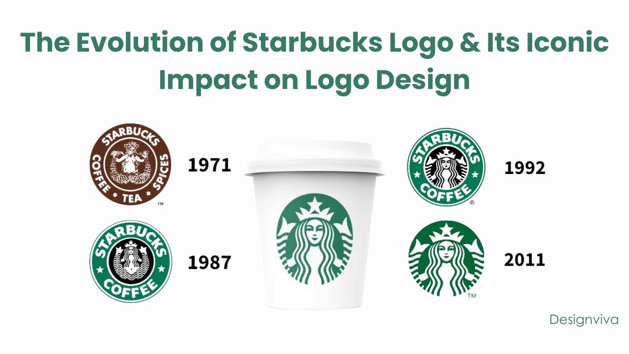
Starbucks was founded in 1971 in Seattle, Washington. The original logo featured a twin-tailed mermaid or siren. This design was inspired by a 16th-century Norse woodcut. The siren symbolized the seafaring history of coffee traders. The logo was brown and circular, with the words “Starbucks Coffee, Tea, and Spices”.
In 1987, the logo underwent a significant redesign. The company adopted a more modern, green-and-white color scheme. The logo now featured a close-up of the siren, focusing on her face and upper body. The words “Starbucks Coffee” surrounded the image.
The logo saw another change in 1992. The siren’s navel was removed to make the design less controversial. The updated logo kept the green and white color scheme. It also maintained the circular shape and the words “Starbucks Coffee”.
In 2011, Starbucks celebrated its 40th anniversary. The logo was simplified to remove the text. The siren became the sole focus, representing the brand’s global presence. This change marked a new era for Starbucks as a company.
Significance Of The Logo
The Starbucks logo holds deep significance for the brand. The siren symbolizes allure and mystery. She draws customers in with her charm, much like the coffee itself.
The green color in the logo represents growth and freshness. It aligns with the company’s commitment to sustainability. The circular shape of the logo signifies unity and community. It reflects Starbucks’ mission to create a welcoming environment.
The evolution of the logo shows the company’s adaptability. Each redesign mirrors Starbucks’ growth and changing market trends. The logo’s simplicity and elegance make it memorable. It remains a powerful symbol of the Starbucks brand.
Credit: www.expertcleaningsolutions.net
Early Beginnings
The Starbucks logo is one of the most recognizable symbols in the world. Its history and evolution tell an interesting story. The iconic logo has undergone several changes since its inception. Understanding its early beginnings offers insight into its design and the inspiration behind it.
Original Design
Starbucks was founded in 1971 in Seattle, Washington. The original logo featured a twin-tailed mermaid, also known as a siren. This siren was designed in a circular frame with the words “Starbucks Coffee, Tea, and Spices” encircling the image.
The logo’s design was simple but unique. It drew attention and curiosity. The siren’s image was detailed, showing her bare chest and twin tails. This design aimed to capture the seafaring history of coffee and Seattle’s port city roots.
Inspiration Behind The Logo
The inspiration for the Starbucks logo came from the sea. The founders, Jerry Baldwin, Zev Siegl, and Gordon Bowker, wanted a logo that reflected the maritime history of coffee trading. They chose the siren because of its connection to the sea and the lure it represented.
According to Bowker, the team discovered the siren in an old marine book. They were captivated by the mythological creature. The siren symbolized the irresistibility of their coffee. This ancient and enchanting image helped Starbucks stand out from other coffee brands.
The original logo’s design and inspiration laid the foundation for the brand’s identity. It connected the rich history of coffee with a modern and appealing image. The Starbucks siren continues to evolve, but its roots remain deeply embedded in its early beginnings.
First Major Redesign
The Starbucks logo has undergone several transformations over the years. The first major redesign in 1987 marked a significant shift in the brand’s visual identity. This redesign was crucial for the company’s growth and expansion.
Changes In 1987
The 1987 redesign introduced several notable changes to the Starbucks logo. The most significant change was the transition from a brown color scheme to a more vibrant green palette. This change made the logo more eye-catching and modern.
Additionally, the siren, which had been a central element of the logo, was now given a more streamlined and elegant look. The text “Starbucks Coffee” was prominently displayed in a bold, uppercase font, encircling the siren. This made the brand name more visible and memorable.
Impact On Brand Identity
The 1987 redesign had a profound impact on Starbucks’ brand identity. The new green color scheme became synonymous with the brand, representing freshness and growth. The modernized siren and bold text helped establish Starbucks as a contemporary and forward-thinking company.
The redesign also helped Starbucks stand out in a crowded market. The distinct green logo became easily recognizable, contributing to the company’s growing popularity. This redesign laid the foundation for Starbucks to become a global coffee giant.
1992 Redesign
The 1992 redesign of the Starbucks logo marked a significant shift. The changes brought a fresh look. It aimed to modernize the brand while retaining its core identity.
Modernizing The Logo
The 1992 redesign simplified the logo. It removed unnecessary details. The siren was now close-up, focusing on her face. The double-tailed mermaid became more stylized. The color scheme shifted to green and white. This made the logo cleaner and more recognizable.
The bold, sans-serif font replaced the original font. It gave the logo a contemporary feel. The simplified design helped the brand stand out. It was easier to reproduce on various products. This was essential for global expansion.
Cultural Impact
The 1992 logo redesign had a huge cultural impact. It reflected a shift towards minimalism. This resonated with the public. The green color symbolized growth and freshness. It appealed to eco-conscious consumers.
The logo became an icon in popular culture. It was easily recognizable worldwide. This helped build a strong brand identity. Starbucks became synonymous with quality coffee. The logo played a key role in this perception.
2011 Redesign
The 2011 redesign of the Starbucks logo marked a significant shift. This version dropped the wordmark and focused on the siren. Let’s dive deeper into the details.
Simplifying The Design
The 2011 redesign aimed to simplify the logo. This helped the brand stand out more easily. The siren, now in a single green color, became the sole focus. The intricate details were retained but made cleaner.
Here’s a breakdown of the changes:
| Element | Pre-2011 | Post-2011 |
|---|---|---|
| Color | Green, black, white | Green |
| Wordmark | Present | Removed |
| Details | Complex | Simplified |
Consumer Reactions
Consumer reactions were mixed at first. Some people missed the wordmark. Others loved the fresh look. Over time, most accepted the new design. The siren alone became a strong brand symbol.
Key points on consumer reactions:
- Initial skepticism due to the missing wordmark
- Gradual acceptance
- Recognition of the logo’s simplicity and elegance
The redesign showed the power of brand identity. A single image can convey so much. Starbucks proved that a simplified logo could still be iconic.
Symbolism In The Logo
The Starbucks logo features a siren, symbolizing the irresistible allure of coffee. This iconic design has evolved over the years. It reflects the brand’s rich history and global reach.
The Starbucks logo is iconic and recognizable worldwide. It has evolved significantly since its inception. The logo’s symbolism plays a crucial role in its design and appeal. Understanding the elements and their meanings provides insight into the brand’s identity.Elements And Meanings
The main element of the Starbucks logo is the siren. The siren is a two-tailed mermaid, a nod to mythology. Mermaids often symbolize allure and mystery. The siren represents the irresistible nature of Starbucks coffee. The green color in the logo is also symbolic. Green is often associated with growth and freshness. This aligns with Starbucks’ commitment to high-quality, fresh coffee. The circular shape of the logo suggests unity and community. It reflects Starbucks’ inclusive culture and customer-centric approach.Connection To Starbucks’ Values
The siren connects with Starbucks’ values of inspiration and discovery. Just as the siren lures sailors, Starbucks aims to attract and inspire customers. The siren’s twin tails symbolize the dual commitment to coffee and community. The green color represents Starbucks’ dedication to sustainability. It highlights their efforts in ethical sourcing and environmental stewardship. The circular design signifies the brand’s global reach and local impact. It shows how Starbucks values inclusivity and customer connection. The overall logo design encapsulates Starbucks’ mission and values. Each element is carefully chosen to tell a story. Together, they create a strong brand identity that resonates with customers worldwide. “`Global Influence
The Starbucks logo holds a unique place in the world of branding. Its global influence is unmatched, making it one of the most recognizable logos today. This section delves into how the Starbucks logo has achieved its global influence, with a focus on its recognition and role in brand expansion.
Recognition Around The World
The green and white mermaid logo is instantly recognizable. It is seen in cities across the globe. From bustling streets in New York to serene beaches in Bali, the logo stands out. This ubiquity is a testament to the brand’s global reach.
Starbucks uses a consistent logo design. This consistency ensures that wherever you are, you can easily identify a Starbucks store. The logo’s simple yet distinctive design plays a significant role in this recognition. People associate the logo with quality coffee and a welcoming environment.
Role In Brand Expansion
The Starbucks logo is crucial to the brand’s expansion strategy. It symbolizes more than just coffee. It represents a lifestyle. The logo’s design adaptation over the years has kept it modern and appealing to diverse cultures.
The logo is often the first thing customers notice. Its strong visual identity helps Starbucks enter new markets with ease. The brand leverages this powerful logo to establish trust and familiarity in new regions. This strategy has been successful in expanding Starbucks’ presence worldwide.

Credit: www.pinterest.com
Future Of The Logo
The Starbucks logo has evolved over the years, becoming a symbol of the brand’s identity. From a simple mermaid design to the modern green siren, it reflects the company’s growth and adaptation. This iconic emblem continues to capture attention globally.
The Starbucks logo is one of the most iconic symbols worldwide. With its rich history and distinct design, it has become a cultural emblem. As trends evolve, so does the need for brands to adapt. Let’s explore the future of the Starbucks logo.Potential Changes
The future may bring subtle tweaks to the Starbucks logo. Companies often update their logos to stay relevant. Starbucks may opt for modern design elements. These changes could be minimal. Small adjustments in color or shape. The goal would be to keep the logo fresh. Yet, still recognizable to loyal customers.Maintaining Brand Legacy
Starbucks values its brand legacy. The logo has a deep connection with its history. Any changes would respect this legacy. The iconic siren is central to the brand. It symbolizes adventure and coffee culture. Future updates will likely keep the siren intact. This ensures the logo remains familiar. Customers should feel the same connection. In summary, the Starbucks logo may see updates. These will be mindful changes. The brand’s legacy will guide any redesigns. The iconic siren will continue to be a key feature. The logo will evolve, but its essence will stay the same.
Credit: www.designhill.com
Frequently Asked Questions
What Is The Meaning Behind The Starbucks Logo?
The Starbucks logo features a twin-tailed siren, symbolizing allure and the sea. It’s a nod to the brand’s maritime coffee trade origins.
How Has The Starbucks Logo Evolved?
The Starbucks logo has evolved from a detailed brown mermaid to a simplified green siren. It reflects the brand’s modern, global identity.
Why Did Starbucks Change Its Logo?
Starbucks changed its logo to modernize its image. The new design emphasizes simplicity and global recognition, aligning with its evolving brand.
When Was The First Starbucks Logo Created?
The first Starbucks logo was created in 1971. It featured a detailed, brown mermaid with a maritime theme.
Conclusion
The Starbucks logo has a rich history and unique evolution. Each redesign reflects cultural shifts and brand growth. From the original mermaid to the modern siren, changes are clear. The logo represents quality coffee and a global brand. This iconic symbol remains recognized worldwide.
Starbucks continues to innovate while honoring its roots. The logo’s journey tells a compelling story. It’s more than an image; it’s a brand legacy.
