


The Seattle Mariners logo is a symbol of baseball heritage. It has evolved over the years.
In this blog post, we will explore the rich history of the Seattle Mariners logo. From its early days to the present, each change tells a story. Logos are not just images; they hold deep meaning and reflect the team’s journey.
The Mariners’ logo has seen several transformations, each with unique elements. Understanding these changes helps fans connect with the team’s past and present. Join us as we delve into the fascinating world of the Seattle Mariners logo, its symbols, and its meaning. Discover the stories behind each design and what they represent to the team and its supporters.
The Seattle Mariners have a rich history, and their logo has evolved over the years. Let’s take a closer look at the early years of the Mariners’ logo. Understanding the origins of their logo gives us insight into the team’s identity and history.
The original logo of the Seattle Mariners debuted in 1977. It featured a trident, a powerful symbol of the sea. The trident was set inside a baseball diamond shape. The colors were blue and gold, which represented the maritime heritage of Seattle.
The trident pointed upwards, symbolizing hope and victory. The logo also included the team name in bold, easy-to-read letters. This design aimed to create a strong identity for the new team.
The trident in the original logo drew inspiration from Greek mythology. The trident is associated with Poseidon, the god of the sea. This was a fitting choice for a team named after seafarers.
The blue color in the logo represents the ocean. The gold color symbolizes treasure, highlighting the team’s value and potential. The baseball diamond shape ties the logo to the sport.
The designers wanted to create a logo that was unique and memorable. They succeeded in making a lasting impression with the trident and the bold color scheme.

Credit: m.facebook.com
The 1980s marked a significant period for the Seattle Mariners as the team underwent a major rebranding. This transformation aimed to establish a stronger identity and connect with the fans on a deeper level. Let’s delve into the important changes that defined this era.
During the rebranding, the Seattle Mariners introduced a new logo that reflected the team’s maritime heritage. The new design featured a baseball with a trident, symbolizing strength and the sea. This trident represented the power and resilience of the Mariners.
In the redesigned logo, the baseball was placed centrally, making it the focal point. The trident intersected the ball, creating a dynamic and memorable image. This change aimed to make the logo easily recognizable and unique.
The rebranding also brought a new color scheme. The Mariners opted for a bold color palette to stand out. The primary colors were royal blue and gold, replacing the original blue and yellow. This combination gave the team a modern and energetic look.
Royal blue symbolized the depth of the ocean, while gold represented success and achievement. These colors were chosen to inspire both the team and its fans, creating a sense of pride and unity.
| Element | Old Design | New Design |
|---|---|---|
| Logo | Basic baseball design | Baseball with trident |
| Primary Colors | Blue and Yellow | Royal Blue and Gold |
This table summarizes the key changes. The new logo and colors were designed to leave a lasting impression. The 1980s rebranding was a pivotal moment, setting the stage for the Mariners’ future successes.
The 1990s were a transformative era for the Seattle Mariners logo. This period saw a significant shift in the team’s visual identity, incorporating modern elements and updating their traditional look. The redesign aimed to reflect the city’s maritime heritage and the team’s progressive approach.
The new logo introduced several nautical elements. These elements were a nod to Seattle’s rich maritime culture. The most noticeable change was the addition of a compass rose. This symbol represented direction and navigation, aligning with the Mariners’ journey in the MLB.
The compass rose featured a bold navy blue and teal color scheme. These colors evoked the sea and sky, reinforcing the maritime theme. The design also incorporated silver accents, adding a modern touch to the traditional elements.
The font used in the logo also saw a significant update. The new typography was sleek and modern, moving away from the old-fashioned block letters. The updated font featured sharp, clean lines, making the team name more readable and visually appealing.
In addition to the new font, the word “Mariners” was prominently placed within the compass rose. This placement ensured that the team’s identity was central and unmistakable. The font color also matched the overall color scheme, creating a cohesive and unified look.
The modernization of the Seattle Mariners logo in the 1990s was a crucial step in establishing a strong, recognizable brand. The introduction of nautical elements and updated font helped the team connect with its roots while embracing a contemporary style.
Credit: 1000logos.net
The Seattle Mariners logo went through significant changes in the 2000s. These refinements aimed to modernize the look while preserving its core elements. The updates brought a fresh appeal to the team’s identity, ensuring it remained relevant in a new era. Let’s delve into the specific enhancements made during this period.
The Mariners’ logo in the 2000s featured cleaner lines and more defined shapes. The compass rose, an essential part of the logo, was sharpened. The sharper lines gave it a more modern look. The colors were also updated to be more vibrant. The blue became deeper, and the silver gleamed brighter. These changes made the logo stand out more on merchandise and screens.
Another notable change was the typography. The font used for “Mariners” was refined. It became sleeker and more streamlined. This made it easier to read and more visually appealing. The overall effect was a logo that looked polished and professional.
In the 2000s, the Mariners also focused on enhancing the symbolism of their logo. The compass rose represents navigation, a nod to Seattle’s maritime history. This element was emphasized more in the new design. The refined compass rose symbolized precision and direction. This resonated with the team’s goal of achieving success on the field.
The use of color also had symbolic meaning. The deeper blue represented the ocean and Seattle’s connection to the sea. The silver symbolized the modern, forward-thinking spirit of the city. Together, these elements created a logo that was not only visually appealing but also rich in meaning.
Overall, the 2000s refinements to the Mariners’ logo were a blend of sleek design and deep symbolism. These changes helped the team maintain a strong and recognizable brand identity.
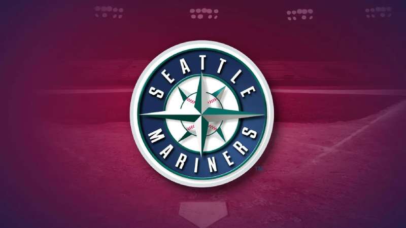
The Seattle Mariners’ current logo reflects a modern and stylish design. Introduced in 1993, it has become an iconic symbol of the team. This logo represents more than just a baseball team; it symbolizes the spirit of Seattle.
The current logo features a nautical compass rose. At the center, there is a baseball, emphasizing the sport. The compass rose has a silver color with navy blue outlines. The surrounding circle contains the team’s name in navy blue letters. The color palette of navy blue, silver, and white gives the logo a sleek and professional look.
The compass rose symbolizes direction and guidance. It reflects Seattle’s maritime heritage. The baseball at the center signifies the core of the Mariners’ identity. The navy blue color represents stability and confidence. Silver adds a touch of modernity and strength. Together, these elements create a logo that stands for tradition, strength, and the spirit of Seattle Mariners.
Credit: www.designyourway.net
The Seattle Mariners logo reflects the city’s rich maritime heritage and deep community ties. Each element of the logo tells a story. Let’s dive into its symbolism and meaning.
The Seattle Mariners logo features a compass rose at its center. This symbol pays homage to Seattle’s strong nautical traditions. The city is known for its bustling ports and maritime history. The compass rose signifies direction and guidance, essential elements for sailors navigating the vast seas. The colors in the logo, predominantly navy blue and northwest green, echo the deep waters and lush landscapes of the Pacific Northwest.
The Mariners’ logo connects deeply with the Seattle community. It represents the unity and pride of the people. The team’s name, “Mariners,” celebrates the city’s seafaring roots. The intertwined letters “S” and “M” in the logo stand for Seattle Mariners. This design symbolizes the bond between the team and its fans. The logo’s circular shape suggests inclusivity and togetherness, key values in the community.
The Seattle Mariners logo has a rich history. Fans have always had strong reactions to any changes. Their opinions reflect the passion they have for the team. The logo holds deep meaning for them.
Fans have mixed feelings about the logo changes. Some love the modern look. Others miss the old designs. Each new version sparks debate. Social media buzzes with opinions. The logo’s colors and symbols are important to fans. They see them as part of their identity.
The Seattle Mariners logo has become iconic over the years. It represents the team’s spirit. Fans wear it with pride. They see it on jerseys, caps, and memorabilia. The compass rose in the logo is a key symbol. It connects the team to Seattle’s maritime history.
Many fans cherish the logo. It reminds them of memorable games. It stands for the community and the shared love of baseball. The logo’s evolution reflects the team’s journey. Each version tells a story. It’s not just a design. It’s a symbol of loyalty and tradition.
The Seattle Mariners’ logo has undergone several changes over the years. Each change has impacted the team’s merchandise sales. Fans love to show their support with gear featuring the latest logo. This section explores how the Mariners’ logo history influences merchandise popularity and brand recognition.
Mariners’ merchandise featuring their logo is popular among fans. Hats, jerseys, and T-shirts are top sellers. Each new logo design sparks a fresh wave of interest. Fans eagerly buy items with the updated look. Retro logos also find their way into collections. Nostalgic designs bring back memories for long-time supporters. Both new and old logos have their own fan base.
The Mariners’ logo plays a key role in brand recognition. A unique and memorable logo makes the team stand out. Fans and non-fans alike recognize the Mariners by their logo. This recognition extends beyond the baseball field. Mariners’ merchandise is worn proudly by fans in everyday life. The logo becomes a symbol of loyalty and passion. It represents the team’s identity and history.
The Seattle Mariners logo originated in 1977. It has evolved over the years to better represent the team’s identity.
The Mariners logo has undergone several changes. It started with a trident symbol and later adopted a nautical compass.
The compass in the Mariners logo symbolizes navigation. It reflects Seattle’s maritime heritage and the team’s direction.
The Mariners chose a nautical theme to connect with Seattle’s rich maritime history. It also represents the city’s port significance.
The Seattle Mariners logo history is rich and meaningful. Each change reflects growth and pride. Fans connect deeply with the symbols. The nautical theme is consistent and strong. Mariners’ logos honor Seattle’s maritime heritage. This connection makes the team unique.
Understanding the logo’s evolution adds to the fan experience. It’s clear the Mariners’ symbols carry great significance. They tell a story of tradition and identity. Every logo detail has purpose. The Mariners continue to inspire and unite. Their logo is a testament to their journey.

