The Pirates logo has a rich and colorful history. Over the years, it has evolved, reflecting changes in the team and culture.
The Pittsburgh Pirates, a Major League Baseball team, have used various logos since their founding in 1887. Each logo tells a part of the team’s story and evolution. From the early days of simple designs to the more detailed and modern images, the Pirates logo has always aimed to capture the spirit of the team and its fans.
Understanding the history of these logos offers a fascinating glimpse into the team’s legacy and how it has sought to represent itself visually. Let’s dive into the journey of the Pirates logo and explore its transformation over the decades.
Origins Of The Pirates Logo
The origins of the Pirates logo are steeped in rich history and unique designs. From its early days to its current form, the Pirates logo has evolved significantly. Understanding the origins offers insight into the team’s identity and the elements that make up its iconic symbol.
Early Designs
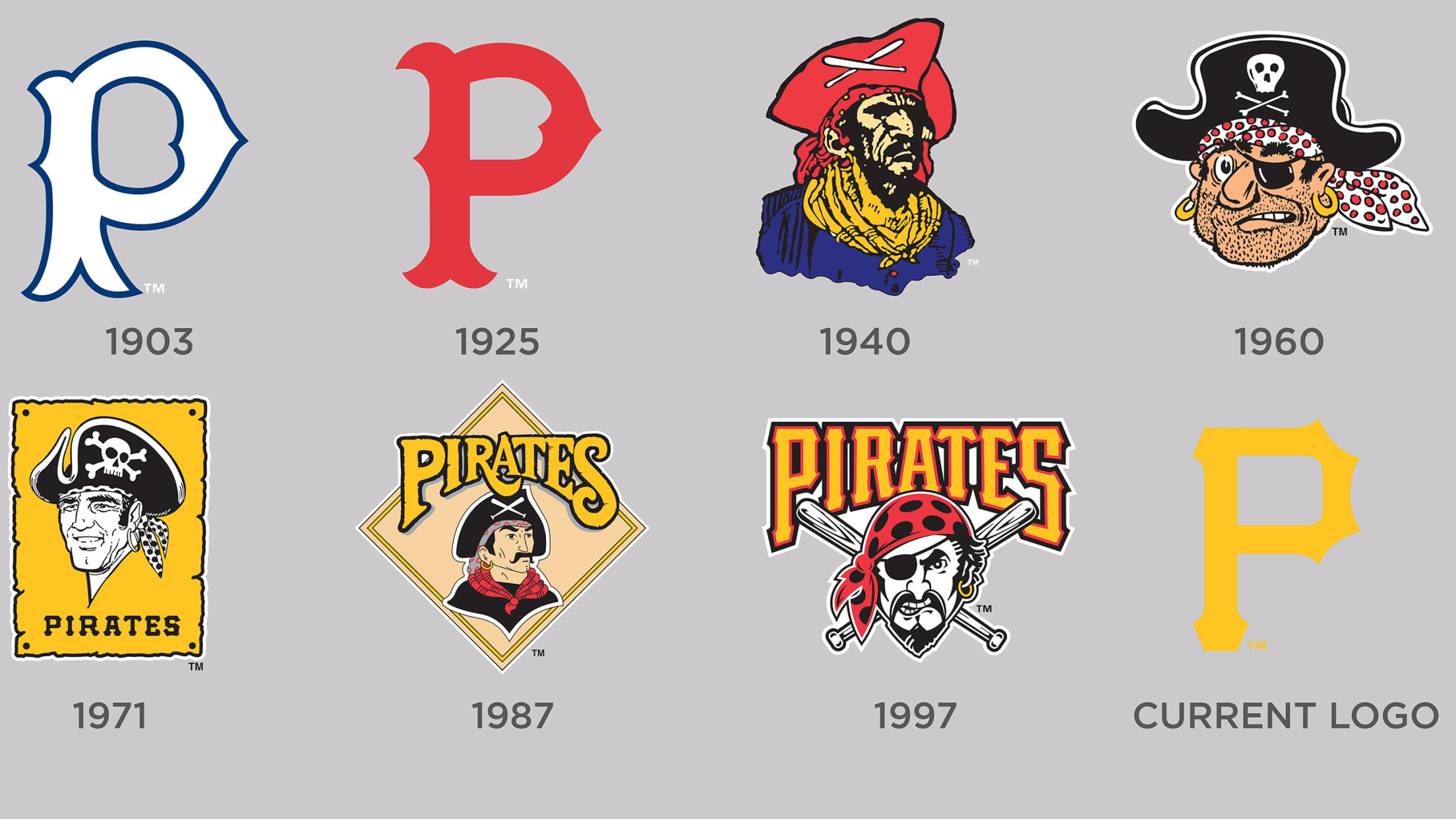
The first Pirates logo appeared in the early 20th century. It featured a simple and straightforward design. The initial logo displayed a pirate’s head, complete with a bandana and an eye patch. This design aimed to evoke a sense of adventure and mystery. Over the years, the logo underwent several changes to keep it fresh and relevant.
Inspiration And Symbolism
The inspiration behind the Pirates logo comes from pirate folklore. Pirates symbolize freedom, bravery, and the quest for treasure. These elements resonate with the team’s spirit and their fans. The use of a pirate in the logo reflects these qualities. It also connects to the team’s name, reinforcing their identity. The design elements, like the bandana and eye patch, add to the mystique.

The Classic Skull And Crossbones
The skull and crossbones is a symbol often linked with pirates. This emblem has a rich history. It evokes images of adventure and danger. Many pirate flags, known as the Jolly Roger, featured this design. But how did this iconic logo come to be? Let’s dive into its history.
Adoption Of The Skull
Pirates adopted the skull and crossbones as a way to instill fear. Pirate captains wanted to intimidate their enemies. The symbol was simple yet effective. It signaled death and danger. Pirates needed a logo that was easy to recognize. The skull and crossbones fit this need perfectly.
Some pirates used variations of the symbol. For example, Blackbeard had a flag with a skeleton holding a spear. But the skull and crossbones became the most famous. It was a universal symbol that spread quickly among pirate crews.
Initial Public Reception
The public’s reaction to the skull and crossbones was mixed. Some saw it as a sign of terror. Ships flying this flag were often avoided. Merchants and sailors knew it meant trouble. But for some, the symbol became a source of fascination. Stories of pirate adventures spread. The skull and crossbones became a symbol of rebellion and freedom.
The skull and crossbones also appeared in popular culture. Books and plays featured pirates with this emblem. Over time, the symbol lost some of its terrifying impact. It became more of a romanticized icon. Today, it is often used in movies, cartoons, and merchandise. The once-feared symbol is now a part of pirate lore.
Mid-20th Century Redesigns
The mid-20th century saw significant changes in the Pirates logo. This era was marked by bold redesigns that reflected the evolving identity of the team. The logos from this period are a testament to the creativity and vision that sought to modernize and invigorate the Pirates’ brand.
Changes In Style
In the mid-20th century, the Pirates logo underwent several stylistic changes. The designs became more intricate and detailed. The emphasis shifted towards creating a more dynamic and engaging look. One notable change was the introduction of more defined facial features in the pirate character. This gave the logo a more menacing and realistic appearance. Additionally, there was a move towards more complex compositions, incorporating elements like crossed swords and nautical themes.
These changes in style were aimed at creating a stronger visual impact. The goal was to make the logo instantly recognizable and memorable. The new designs also reflected the broader trends in graphic design during this period. This included a greater use of shading and three-dimensional effects. The result was a series of logos that were both bold and sophisticated.
Introduction Of Color
The mid-20th century redesigns also saw the introduction of color to the Pirates logo. Prior to this period, the logos were primarily black and white. The new designs incorporated a vibrant color palette. This added a new level of depth and excitement to the logo. The primary colors used were red, black, and yellow. These colors were chosen for their strong visual impact and their association with traditional pirate imagery.
Color played a crucial role in enhancing the overall aesthetics of the logo. It made the design more eye-catching and appealing. The use of color also allowed for greater differentiation between the various elements of the logo. This made it easier to distinguish the details and appreciate the intricacy of the design.
In summary, the mid-20th century redesigns of the Pirates logo were characterized by significant changes in style and the introduction of color. These changes helped to modernize the logo and create a stronger visual identity for the team.
Modern Era Innovations
The Modern Era Innovations in the Pirates logo history reveal a dynamic and evolving design approach. With the advent of digital technology, the logo has seen significant updates. These changes reflect both the team’s legacy and the need to stay relevant in today’s fast-paced world. Let’s explore how the Pirates logo has transformed in the digital age and how fans have reacted to these innovations.
Digital Age Adaptations
In the digital age, the Pirates logo has embraced new design elements. The focus has been on creating a cleaner and more versatile logo. This allows for better scalability across various digital platforms.
- Introduction of high-resolution graphics
- Simplified color schemes for better visibility
- Enhanced typography for readability
The Pirates have also incorporated 3D elements and animations in their logo. This adds a modern touch and engages the audience in a more interactive way. These adaptations ensure the logo remains impactful and recognizable.
Fan Reactions
Fan reactions to the new logo designs have been mixed. Some fans appreciate the fresh look, while others miss the classic design elements.
Here are some common reactions:
- Positive Feedback: Many fans love the modern and sleek design. They feel it represents the team’s forward-thinking attitude.
- Negative Feedback: Traditionalists prefer the old logo. They believe it holds more sentimental value and historical significance.
- Neutral Opinions: Some fans are indifferent. They focus more on the team’s performance rather than the logo.
Overall, the fan base remains passionate and engaged. The Pirates organization continues to balance between innovation and tradition. This ensures they honor their heritage while embracing the future.
Special Edition Logos
Special edition logos have always intrigued pirate fans. These unique designs commemorate significant moments and events in the team’s history. They often feature elements that pay homage to the past while celebrating the present. Let’s delve into some notable special edition logos.
Anniversary Editions
Anniversary editions mark important milestones in the team’s journey. These logos usually incorporate the number of years celebrated. They blend the classic pirate elements with modern touches. For example, the 100th anniversary logo included a bold “100” with a pirate flag. This design honored the team’s century-long legacy.
Event-specific Designs
Event-specific designs capture the essence of particular occasions. These logos are crafted for special games, such as opening day or championship matches. They often feature unique elements related to the event. One notable example is the logo for the World Series. This logo displayed a pirate ship with the year and series details.
These designs add excitement and a sense of occasion. Fans eagerly anticipate these limited-edition logos each year. They become collector’s items and are cherished by fans. Event-specific logos stand out with their creativity and relevance.
Influence On Pop Culture
The history of the Pirates logo has a significant influence on pop culture. The emblematic skull and crossbones are more than just a team symbol. It represents a broader cultural phenomenon. The logo has made its mark in various forms of media and merchandise. This widespread presence has cemented its place in the hearts of fans and beyond.
Appearances In Media
The Pirates logo has appeared in several movies and TV shows. It often symbolizes rebellion or adventure. Many characters wear it as a sign of defiance. Sports documentaries and films featuring baseball frequently showcase the logo. Even animated series have included it in various episodes. This media presence keeps the Pirates logo relevant across generations.
Merchandising Impact
The Pirates logo is a staple in sports merchandise. Fans proudly wear it on jerseys, caps, and t-shirts. The logo also appears on everyday items like mugs and keychains. Its unique design makes it a popular choice for collectibles. The logo’s appeal extends beyond sports fans. It attracts those who appreciate its bold design. This widespread use in merchandise helps maintain the logo’s iconic status.
Controversies And Criticisms
The Pirates logo history has sparked various controversies and criticisms over the years. Many argue that the logo’s design changes fail to honor the team’s rich heritage. Others believe some versions of the logo have culturally insensitive elements.
The history of the Pirates logo is filled with debates and strong opinions. Over the years, the logo has faced its share of controversies and criticisms. Fans and critics alike have voiced their thoughts on various redesigns and cultural implications.Debates Over Redesigns
Each redesign of the Pirates logo sparked heated debates. Some fans loved the changes, while others felt a deep connection to the old design. The team wanted to modernize the logo, but this did not sit well with everyone. Changes to the logo’s colors, shapes, and overall look caused division among the fan base.Cultural Sensitivities
Cultural sensitivities around the Pirates logo have also been a topic of discussion. Some argue that the logo reinforces negative stereotypes. Others believe it respects and honors pirate history. The line between respectful homage and offensive caricature is often blurred. This has led to calls for more thoughtful and culturally aware designs. The team has tried to address these concerns in recent years. They have consulted with cultural experts and engaged with fans. Yet, the debate continues, highlighting the complexities of logo design in a diverse world. “`Legacy Of The Pirates Logo
The Pirates logo has a rich history. It represents adventure and boldness. Over the years, the logo has seen many changes. Each version tells a story. Fans have a deep connection with it. This logo is more than just a symbol. It embodies the spirit of the pirates.
Enduring Popularity
People love the Pirates logo. It stands out in sports history. The design is unique and memorable. Fans wear it proudly on their gear. The logo has a timeless appeal. It evokes a sense of nostalgia. Even new fans feel its charm.
Merchandise sales prove its popularity. From hats to jerseys, the logo is everywhere. Collectors seek out vintage versions. The logo’s appeal spans generations. It’s a symbol of pride and loyalty.
Future Predictions
The Pirates logo will continue to evolve. Designers will keep it fresh. Yet, they will honor its roots. Fans can expect modern touches. Technology might play a role. Digital versions could be interactive.
New merchandise will feature the logo. It will adapt to changing trends. But its core will remain the same. The logo’s legacy will endure. Future generations will cherish it. The Pirates logo will always symbolize adventure and bravery.
Frequently Asked Questions
What Is The Origin Of The Pirates Logo?
The Pirates logo originated in 1936. It featured a pirate with a bandana and eye-patch. Over the years, it has undergone several transformations.
How Has The Pirates Logo Evolved Over Time?
The Pirates logo has evolved from a simple pirate image to a more modern, fierce pirate representation. Changes include color updates and design refinements.
What Elements Are In The Current Pirates Logo?
The current Pirates logo features a stern pirate with a red bandana, eye patch, and a bat. It represents the team’s fierce and competitive spirit.
Why Did The Pirates Choose A Pirate For Their Logo?
The Pittsburgh Pirates chose a pirate to symbolize toughness, adventure, and a fighting spirit. It reflects the team’s competitive nature and historical significance.
Conclusion
The Pirates logo has evolved over the years. Each design tells a story. Fans cherish these changes. They reflect the team’s spirit. The journey is fascinating to explore. From simple to complex designs. Each logo holds memories. It connects fans to their team.
The Pirates logo remains iconic. It stands the test of time.