Ny Giants Logo History: A Fascinating Evolution Over the Years
The NY Giants logo has a rich and evolving history. Each design reflects different eras and team milestones.
The New York Giants, a storied NFL franchise, has a logo that tells a captivating story. From its early days, the logo has changed, embodying the team’s journey and spirit. Fans have seen various designs, each with its unique charm and significance.
The evolution of the Giants’ logo mirrors the team’s growth and the changing times. Understanding this history not only deepens appreciation for the team but also highlights how branding can evolve. Dive into the fascinating history of the NY Giants logo and explore the transformations that have shaped one of the NFL’s most iconic symbols. Let’s journey through time and see how the Giants’ logo has become what it is today.
Early Beginnings
The New York Giants have a rich history. This history includes the evolution of their logo. The early years of the Giants saw many changes. These changes were in both design and team colors.
First Logo Design
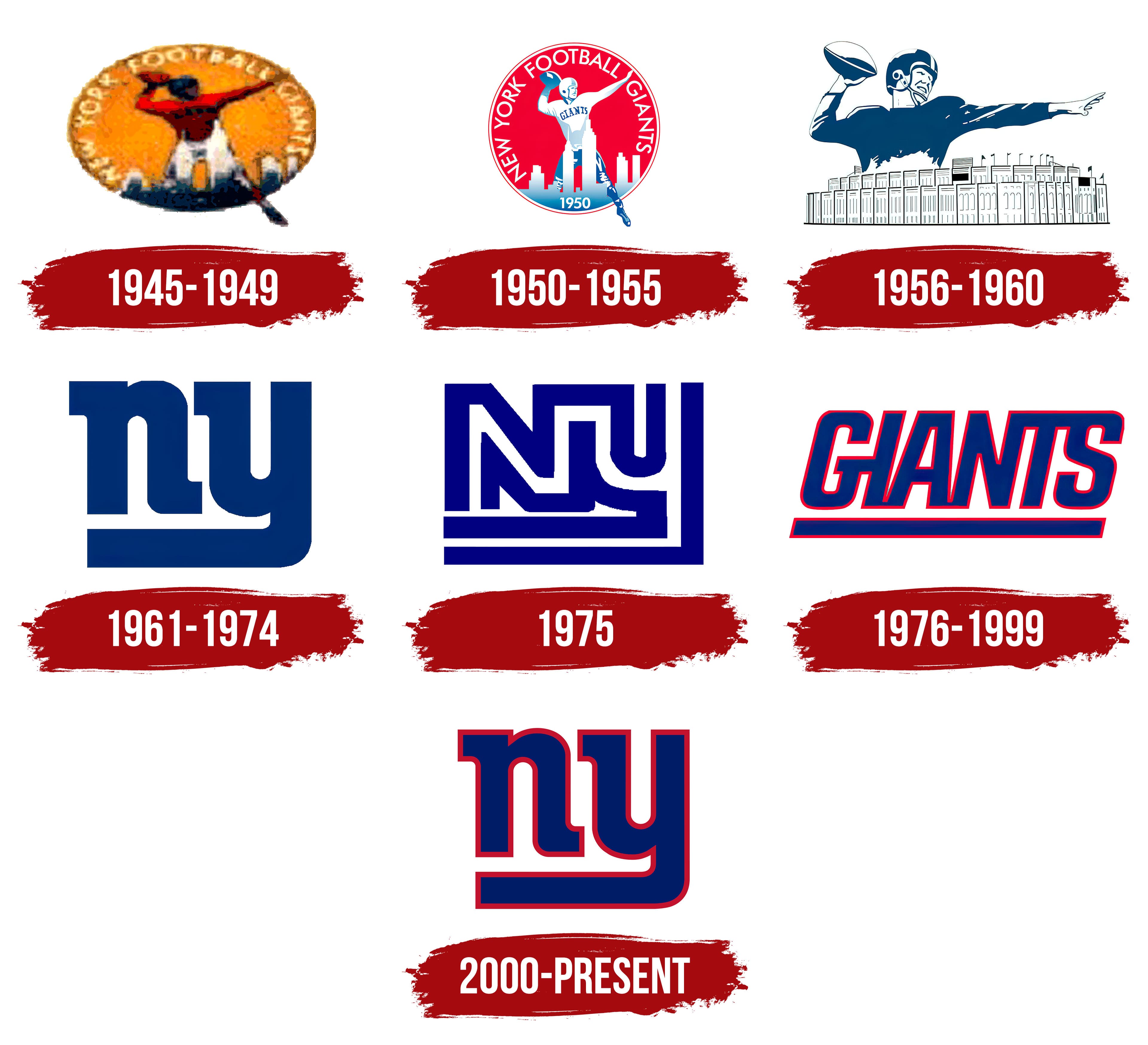
The Giants’ first logo appeared in 1925. It featured a simple design. The logo displayed a giant football player. He towered over a New York city skyline. This logo aimed to show the team’s strength and dominance. The player wore a basic uniform. The design was bold and straightforward. It symbolized the spirit of the team.
Initial Team Colors
The original colors of the Giants were blue and red. These colors became iconic. Blue represented loyalty and trust. Red stood for passion and energy. The team uniforms reflected these colors. They created a sense of unity and pride. Over time, these colors became a strong part of the Giants’ identity. The colors and the logo together told a story. A story of a team with great ambition and heart.

Mid-20th Century Changes
The mid-20th century brought significant changes to the New York Giants logo. These changes reflected the evolving spirit of the team. Fans saw new design elements and color updates that marked a new era for the Giants.
Introduction Of New Elements
In the 1950s, the Giants introduced new elements to their logo. The team added a stylized “NY” to their design. This symbol became iconic. It represented the pride of New York City. The simple yet bold letters stood out. Fans loved the fresh look. The logo was modern and sleek. It resonated with the times.
Color Scheme Updates
The color scheme also saw updates during this period. The team chose a bold blue and red palette. These colors were vibrant. They captured the energy of the Giants. The new scheme gave the logo a fresh feel. It was eye-catching and memorable. The bright colors stood out on merchandise. This helped to boost team identity.
Modernization Era
The New York Giants have a rich history. Their logo has evolved over the years. The modernization era brought significant changes. The logo became sleek and contemporary. This new design reflected the team’s dynamic spirit.
Sleek Design Introduction
The modernization era saw the introduction of a sleek design. The new logo featured clean lines and a bold look. This change was aimed at appealing to a younger audience. It also represented a fresh start for the team.
The new design was simple yet powerful. It used strong colors and a minimalist approach. This made the logo easily recognizable. Fans quickly embraced the new look.
Impact On Team’s Image
The updated logo had a positive impact. It rejuvenated the team’s image. The sleek design conveyed strength and confidence. It aligned with the team’s competitive spirit.
The new logo also helped in branding. Merchandise featuring the logo saw a rise in sales. It became a symbol of pride for fans. The modernization era marked a new chapter for the Giants.

21st Century Innovations
The New York Giants have had a long and storied history. Their logo has changed several times. The 21st century brought new innovations. These changes reflect the digital age and fan preferences.
Digital Era Designs
In the 21st century, the Giants embraced digital design. The team updated their logo to be more modern. The updated design is sleek and straightforward. The current logo features a bold “NY” in blue and white. This design is versatile and works well on different platforms.
The digital age demands flexibility. The logo looks good on websites, apps, and social media. The Giants ensure their logo is recognizable everywhere. They also use high-quality graphics. This helps the logo stay clear and sharp on all devices.
Fan Reactions
Fans have strong opinions about logo changes. Many fans liked the new, modern look. They felt it represented the team’s future. Some fans missed the old, classic designs. They felt a connection to the team’s history.
To address this, the Giants sometimes use throwback logos. These designs honor the team’s past. It keeps long-time fans happy. The team balances tradition with innovation. This strategy helps maintain a strong fan base.
The Giants also engage with fans online. They ask for feedback on logo changes. This makes fans feel involved. It shows the team values their opinions. This interaction builds a loyal and dedicated fan community.
Current Logo Significance
The New York Giants logo has seen many changes over the years. The current logo holds special significance for fans and the team alike. This logo is more than just a symbol; it represents the team’s history, values, and identity.
Symbolism And Meaning
The current logo features the lowercase letters “ny” in blue with a white outline. The color blue represents loyalty and strength. The white outline adds a touch of purity and simplicity. Together, these elements create a powerful symbol of the team’s resilience and unity.
The lowercase “ny” also brings a sense of humility and approachability. It shows that the team is grounded and connected to its roots. The design is clean and modern, reflecting the team’s forward-thinking nature.
Comparison With Past Logos
The Giants’ logo has evolved many times since the team’s inception. Here is a comparison of the current logo with past logos:
| Era | Logo | Significance |
|---|---|---|
| 1925-1949 |  |
Featured a football player. Emphasized the physical aspect of the game. |
| 1950-1960 |  |
Introduced the giant figure. Represented the team’s larger-than-life presence. |
| 1975-1999 |  |
Shifted to the “NY” initials. Focused on the team’s identity. |
| 2000-Present |  |
Modern “ny” design. Symbolizes unity, strength, and humility. |
The current logo is simpler than past designs. This simplicity allows for easy recognition and a timeless appeal. It reflects the team’s commitment to its core values while embracing modernity.

Frequently Asked Questions
What Is The History Of The Ny Giants Logo?
The NY Giants logo has evolved since 1925. It started as an interlocking “NY” and changed to the current “NY” in 2000.
How Many Times Has The Ny Giants Logo Changed?
The NY Giants logo has changed several times. Key changes occurred in 1925, 1945, 1975, and 2000.
What Does The Current Ny Giants Logo Represent?
The current NY Giants logo represents the team’s strong heritage. It features a simple and bold “NY” to symbolize New York pride.
Conclusion
The NY Giants logo has changed a lot over the years. Each change reflects a new era for the team. Fans connect deeply with these logos. They symbolize pride, history, and the spirit of the Giants. Understanding the logo’s history gives fans a richer appreciation.
It shows how the team has evolved. The Giants’ logo journey is a testament to their legacy. Embrace the past and look forward to future designs. Each logo tells a story worth celebrating. Keep cheering for the Giants!


