The Nintendo logo is iconic and recognized worldwide. Its evolution tells a fascinating story.
Nintendo’s journey began over a century ago, and its logo has changed many times. From a small playing card company in Japan to a global gaming giant, each logo reflects a part of its history. Understanding the changes in the Nintendo logo gives insight into the company’s growth and transformation.
This exploration of the Nintendo logo history will take you through the different designs and what they represent. Discover how Nintendo’s identity has evolved, mirroring its innovation and impact on the gaming industry. Dive into this visual journey and see how the Nintendo brand has become what it is today.
Early Beginnings
Nintendo’s journey began long before it became a gaming giant. The company’s early logos reflect its humble origins and evolving identity. Let’s explore the beginnings of Nintendo’s logo history.
The Hanafuda Card Era
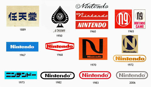
In 1889, Nintendo started as a Hanafuda card company. These cards were used in Japanese card games. The early logo featured intricate designs reflecting traditional Japanese art.
Here’s a table showcasing the key features of the Hanafuda card era logos:
| Year | Logo Description |
|---|---|
| 1889 | Intricate designs, traditional Japanese motifs |
| 1920 | More simplified, yet still culturally rich |
First Brand Marks
In the 1960s, Nintendo transitioned from card games to toys and electronics. This shift called for a new identity. The first brand marks were born.
- 1965: The logo had a bold, modern look.
- 1970: Introduction of a red logo, symbolizing energy and innovation.
These early brand marks laid the foundation for the iconic logo we know today. They were simple yet impactful, reflecting Nintendo’s growing ambitions.
First Logo Designs
The early logos of Nintendo are a testament to the company’s rich history. These designs reflect the brand’s evolution from a playing card company to a global gaming giant. Let’s delve into the first logos and their significance.
Original Logo
Nintendo’s original logo was created in 1889. The company, then known as Nintendo Koppai, focused on producing handmade Hanafuda cards. This logo featured intricate Japanese characters which highlighted its cultural roots.
The design was simple yet elegant. It used traditional calligraphy to convey a sense of heritage. This was a fitting start for a company with a deep connection to Japanese culture.
Post-war Changes
After World War II, Nintendo underwent significant changes. The company shifted its focus from playing cards to toys and games. This change was reflected in its logo.
The post-war logo was more modern. It used bold, clean lines to signify a new era. The design was more accessible to a global audience, aligning with Nintendo’s expanding market.
This era marked the beginning of Nintendo’s journey toward becoming a household name in gaming.
1960s Transformation
The 1960s marked a significant period in Nintendo’s history. This decade saw the company shift its focus from playing cards to electronic entertainment. This transition also brought about a notable change in the company’s logo. Let’s delve into this transformative period and explore the key changes.
Introduction Of Electronics
In the 1960s, Nintendo ventured into the electronic market. This was a bold move for a company known for its traditional playing cards. The introduction of electronic toys and games opened new avenues for growth.
- Innovative products like the Ultra Hand
- Expanding market reach
- Setting the stage for future video game ventures
Nintendo’s shift to electronics was a game-changer. It set the foundation for the company’s future success in the gaming industry.
Modernizing The Logo
With the company’s new direction, a modernized logo was necessary. The old logo, rooted in tradition, no longer fit the new brand image. The new logo had to reflect innovation and progress.
| Old Logo | New Logo |
|---|---|
| Traditional, intricate design | Simple, sleek, and modern |
| Reflective of playing cards | Emphasized electronic innovation |
The new logo featured a minimalist design. It represented Nintendo’s commitment to innovation and modernity.
- Simpler aesthetics
- Emphasis on electronics
- Forward-looking design
This transformation was more than just a visual change. It symbolized Nintendo’s evolution and readiness for the future.
1970s Refinement
The 1970s was a pivotal decade for Nintendo. The company began shifting its focus from traditional playing cards to the burgeoning world of video games. This era saw a significant refinement in both their business strategy and their logo.
Expansion Into Video Games
During the 1970s, Nintendo ventured into the video game industry. This transition marked a new chapter for the company. They released their first arcade game, EVR Race, in 1975. By 1977, the Color TV-Game series had launched.
These early video games helped establish Nintendo’s presence in the gaming market. Their success laid the foundation for future innovations. The company’s commitment to quality and innovation was evident even then.
Logo Simplification
With this new direction, Nintendo decided to simplify its logo. The old, ornate design no longer suited the modern, tech-focused image the company wanted.
The new logo featured a clean, bold font. It was easy to read and visually appealing. The logo was often presented in a red and white color scheme, which became iconic.
This streamlined logo reflected Nintendo’s move towards a more contemporary, innovative brand identity. The simplicity of the design made it versatile and timeless.
Below is a table summarizing the key changes in Nintendo’s logo during the 1970s:
| Year | Logo Design | Notes |
|---|---|---|
| 1970 | Ornate, traditional design | Used for playing cards |
| 1975 | Simplified, bold font | First video game logo |
| 1977 | Red and white color scheme | Iconic modern logo |
Nintendo’s logo evolution during the 1970s was a crucial step. It marked their transition into the video game industry and set the stage for future success.
1980s Iconic Red Oval
The 1980s marked a significant era for Nintendo’s logo. During this time, the company introduced the iconic red oval logo. This design became synonymous with gaming excellence and innovation. The red oval featured the company name in white, bold letters. This simple yet striking design captured the essence of the brand.
Nes And Famicom Era
The red oval logo became widely recognized during the NES and Famicom era. The Nintendo Entertainment System (NES) launched in 1985. It was a groundbreaking moment for home gaming. The Family Computer (Famicom) was the Japanese version of the NES. Both systems carried the red oval logo. This logo appeared on consoles, cartridges, and marketing materials. It was a symbol of quality and fun.
Global Recognition
The red oval logo helped Nintendo gain global recognition. Players across different countries saw the same logo. It created a sense of unity among gamers. This consistency in branding was crucial. It built trust and loyalty among consumers. The red oval became a beacon for gaming enthusiasts. It represented a world of entertainment and adventure.
1990s And Beyond
The 1990s marked a significant era for Nintendo. This was a time of rapid technological advancements. Nintendo’s logo had to evolve to keep up. The changes reflected the company’s growth and innovation. The brand needed to stay relevant in a competitive market. Let’s explore how Nintendo adapted during this period.
Adaptation In The 3d Era
The launch of the Super Nintendo Entertainment System (SNES) brought a new wave of gaming. 3D graphics were becoming more popular. Nintendo’s logo needed to fit this modern look. The logo became sleeker and more dynamic. It complemented the advanced graphics of the games. This adaptation helped Nintendo appeal to new audiences.
With the release of the Nintendo 64, the logo saw further changes. The design became more polished. It reflected the leap from 2D to 3D gaming. This era showed Nintendo’s commitment to innovation. The logo was simple yet powerful. It matched the cutting-edge technology of the time.
Consistency In Branding
Despite changes, Nintendo’s logo maintained its core elements. The red and white color scheme remained. This consistency helped build brand recognition. Fans could easily identify Nintendo products. The logo’s simplicity made it timeless. It stood out in a crowded market.
Nintendo’s branding strategy was clear. Keep the logo recognizable but adaptable. This balance was crucial for long-term success. The logo evolved with the times but kept its essence. This approach ensured Nintendo’s logo stayed iconic.
21st Century Updates
In the 21st century, the Nintendo logo saw several updates. These updates reflected shifts in gaming technology and design trends. From the GameCube to modern consoles, each era brought unique changes to the logo.
Gamecube And Wii
The early 2000s marked the arrival of the GameCube. The logo featured a sleek, 3D cube design. It was a departure from previous, simpler logos. The design aimed to capture the console’s power and innovation.
Next came the Wii in 2006. The Wii logo was straightforward and clean. The letters were round and friendly, matching the console’s family-friendly appeal. This simplicity appealed to a broad audience.
Modern Minimalism
In recent years, Nintendo embraced minimalism. The latest logo is simple and iconic. It features a red background with white text. This design is easy to recognize and versatile.
The minimalistic approach reflects modern design trends. It also keeps the focus on the games and consoles. This clean design ensures the logo remains timeless.
Current Logo Significance
The current Nintendo logo is more than just a design. It symbolizes the company’s evolution and its commitment to quality entertainment. This logo represents a blend of tradition and modernity.
Cultural Impact
The current Nintendo logo has a deep cultural impact. It is recognized worldwide. This symbol connects generations of gamers. The simple, bold design is memorable. It evokes nostalgia and excitement.
For many, the logo brings back childhood memories. It reminds them of beloved games and characters. This emotional connection is powerful. It keeps fans loyal and engaged.
The logo also stands for innovation. Nintendo is known for creating groundbreaking games and consoles. The logo represents this spirit of creativity and adventure.
Brand Legacy
The current logo continues Nintendo’s brand legacy. It reflects the company’s long history. Nintendo has been around for over a century. The logo encapsulates this rich heritage.
Over the years, the logo has evolved. Yet, it has always retained its core identity. This consistency builds trust. Fans know what to expect from Nintendo. High-quality entertainment and innovative gameplay.
The logo’s clean, modern look appeals to new generations. It shows that Nintendo is forward-thinking. This balance of old and new is crucial. It helps Nintendo stay relevant in a fast-changing industry.
In summary, the Nintendo logo is a powerful symbol. It signifies cultural impact and brand legacy. It connects past, present, and future. For many, it is a badge of honor. A mark of quality and fun.

Frequently Asked Questions
What Is The Origin Of The Nintendo Logo?
The Nintendo logo originated in Japan. It has evolved over the years to reflect modern design trends.
How Has The Nintendo Logo Changed?
The Nintendo logo has changed several times. It started with kanji characters and now features a sleek, rounded rectangle.
What Does The Current Nintendo Logo Look Like?
The current Nintendo logo is a red rectangle. It contains the company’s name in white, rounded letters.
When Was The First Nintendo Logo Created?
The first Nintendo logo was created in 1889. It featured kanji characters and had a traditional look.
Conclusion
The Nintendo logo has evolved over the years. Each change tells a story. From kanji characters to the iconic red oval, every logo is special. They reflect Nintendo’s growth and innovation. Fans worldwide recognize these symbols. They evoke memories of favorite games.
The journey of the Nintendo logo is fascinating. It shows how design and branding matter. As Nintendo continues to create, its logo will likely change again. And fans will surely follow its journey with excitement.
