The logo of Inter Miami FC is iconic and unique. It’s a symbol that tells a story of passion and culture.
Inter Miami FC, a Major League Soccer team, has a fascinating logo design history. The club, co-owned by David Beckham, was founded in 2018. Miami is known for its vibrant culture and art scene. The team’s logo reflects this with its bold design and deep symbolism.
Each element of the logo, from the herons to the colors, has a special meaning. Understanding the history and design of Inter Miami FC’s logo gives fans a deeper connection to the club. It shows the thought and creativity behind the symbol they wear proudly. Dive into the story behind this unique emblem and discover what makes it stand out in the world of sports.
Early Beginnings
Inter Miami FC, a Major League Soccer team, has a unique logo. The logo reflects the team’s identity and vision. The journey to create this logo was long and challenging. It started with initial concepts, facing many hurdles along the way.
First Concepts
The first concepts of the Inter Miami FC logo began in 2013. The team’s owners wanted a design that was modern yet rooted in Miami’s culture. The initial ideas included elements like flamingos, palm trees, and the sun. These symbols represent the vibrant and diverse spirit of Miami.
The design team experimented with various color schemes. Pink, black, and white were chosen to stand out and be memorable. They aimed to create a logo that was simple yet striking, appealing to both locals and international fans.
Initial Challenges
The process of designing the logo was not without challenges. One major challenge was creating a design that resonated with all stakeholders. The team conducted several surveys and focus groups to gather feedback.
Another challenge was ensuring the logo was versatile. It had to look good on different platforms, from jerseys to digital media. The designers had to make sure the logo was scalable and easily recognizable at any size.
Legal issues also posed a challenge. The team had to ensure the logo did not infringe on any existing trademarks. This required thorough research and several iterations of the design.
Despite these challenges, the final logo of Inter Miami FC emerged as a symbol of pride and identity. It reflects the team’s ambition and the city’s vibrant culture.

Credit: 1000logos.net
Inception Of Inter Miami Fc
Inter Miami FC, a name echoing in Major League Soccer, has a rich history. The club’s inception dates back to January 2018. It was founded by an ambitious group aiming to bring top-level soccer to Miami. The journey was fueled by passion and vision.
Founding Vision
The founding vision of Inter Miami FC was clear. The goal was to create a team representing Miami’s diverse culture. David Beckham, a key figure, played a pivotal role. His dream was to build a world-class soccer club. This vision sparked excitement among fans and players alike.
Club Identity
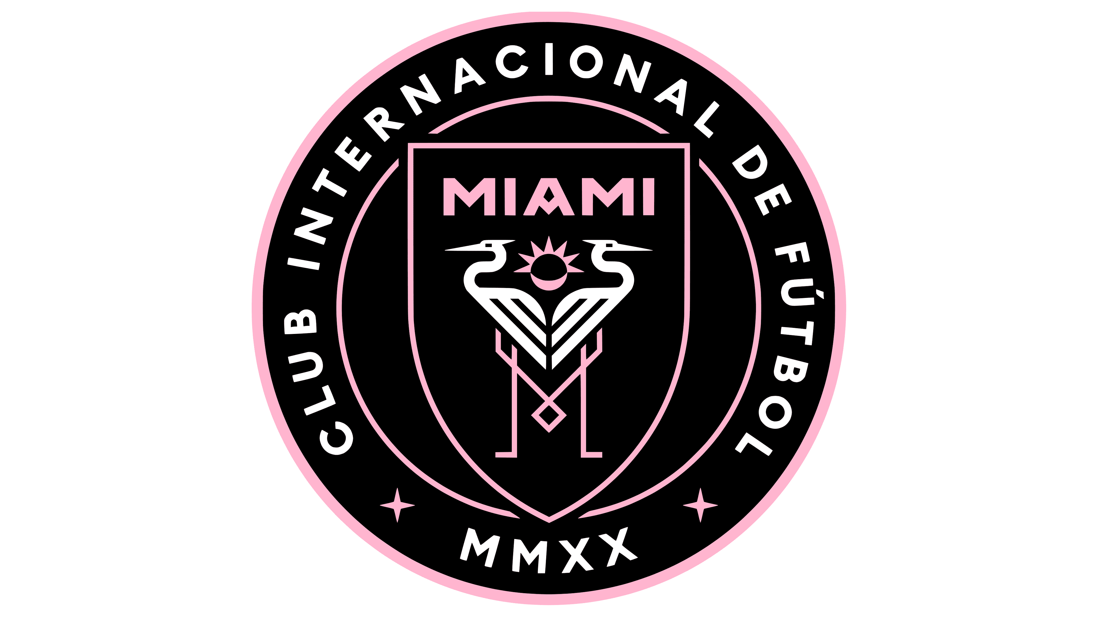
Inter Miami FC’s identity is deeply rooted in its community. The club’s crest features two great white herons. These birds symbolize freedom and strength. The pink and black colors are unique and striking. They reflect Miami’s vibrant and stylish essence.
The club’s motto, “Libertas, Unitas, Fortuna,” resonates with fans. It stands for freedom, unity, and fortune. This motto captures the spirit of Miami. It unites supporters from diverse backgrounds. Inter Miami FC is more than just a team; it’s a community.
Initial Logo Design
The initial logo design of Inter Miami FC is a blend of modern aesthetics and rich symbolism. It reflects the club’s identity and its connection to the vibrant culture of Miami. This section delves into the design philosophy and symbolic elements that make up this iconic logo.
Design Philosophy
The design philosophy behind Inter Miami FC’s logo focuses on creating a bold and distinctive identity. The logo is crafted to stand out and be easily recognizable. The use of black, white, and pink colors signifies sophistication and energy.
The circular shape represents unity and inclusivity. The designers aimed to create a sense of belonging among the fans. This shape also symbolizes the global nature of soccer.
Symbolic Elements
The Inter Miami FC logo incorporates several symbolic elements. Each element has a specific meaning that ties to the club’s values and the city’s culture.
- Herons: Two herons facing each other form the centerpiece. They represent freedom and strength. Herons are native to the Miami area and symbolize the club’s local roots.
- Sun: The sun rays in the background symbolize the sunny and vibrant climate of Miami. It also represents the energy and passion of the club and its fans.
- Stars: Four stars are placed within the logo. They signify the aspirations and excellence of the club.
- Shield: The shield shape encapsulates the logo, representing protection and resilience. It signifies the team’s defensive strength and unity.
Each of these elements contributes to a logo that is not only visually appealing but also rich in meaning and significance.

Credit: logos-world.net
Evolution Over Time
Inter Miami FC’s logo has undergone several changes since its inception. Each change reflects the club’s growth and evolving identity. This section explores the significant redesigns and minor tweaks that have shaped the logo over time.
Major Redesigns
The original Inter Miami FC logo debuted in 2018. It featured two herons standing back-to-back, symbolizing unity and strength. The logo’s colors were black, pink, and white.
In 2020, the club made a major redesign. The herons’ positions were adjusted to face forward, giving a more aggressive look. The roundel format was retained, but the font style was updated to a more modern typeface.
Another significant redesign occurred in 2022. This time, the logo was simplified. The herons were stylized with cleaner lines, and the overall design was made sleeker. The colors remained the same, but the pink shade was slightly altered for better visibility on merchandise.
Subtle Tweaks
Besides major changes, Inter Miami FC’s logo has seen many subtle tweaks.
- 2019: The border thickness was increased for better clarity.
- 2021: The club added a small star above the logo to celebrate their league title.
- 2023: Minor adjustments were made to the font kerning for improved readability.
These small changes may seem minor, but they play a crucial role. They ensure the logo remains fresh and relevant.
In summary, the evolution of Inter Miami FC’s logo reflects the club’s journey. From major redesigns to subtle tweaks, each change tells a part of their story.
Influences And Inspirations
The logo of Inter Miami FC stands out with its unique design. This logo tells a story through its elements and colors. It draws from various influences and inspirations. Understanding these can help fans appreciate the team’s identity better. Let’s explore the cultural and historical aspects that shaped this logo.
Cultural References
Inter Miami FC’s logo reflects the rich culture of Miami. The two herons in the logo represent freedom and strength. They are a nod to the native wildlife of the region. The sun with seven rays symbolizes the vibrant life in Miami. Pink and black colors reflect the city’s art deco style. This style is famous in Miami Beach and stands out in the logo.
Historical Context
The logo also has historical significance. The team was founded by David Beckham and partners. Their vision was to create a team that honors Miami’s history. The herons’ wings form an “M,” which stands for Miami. The shield shape of the logo gives it a classic, timeless feel. It connects the present team to the storied past of soccer.
The overall design showcases a blend of modern and traditional elements. This mix mirrors Miami’s own identity as a city with deep roots and a forward-looking spirit. By understanding these influences, fans can see why the logo is more than just an image. It’s a symbol of pride and community.
Fan Reactions
The logo design history of Inter Miami FC has been a fascinating journey. One of the most interesting aspects has been the fan reactions. This section will delve into how fans initially received the logo, and the community feedback that followed.
Initial Reception
When Inter Miami FC unveiled its logo, fans had mixed reactions. The logo featured two herons with interlocking necks. The design also included a sun with seven rays, symbolizing the Sunshine State. Fans on social media expressed a range of emotions.
Positive reactions celebrated the unique design and its symbolic elements. Many appreciated the sleek look and the nod to Miami’s culture. They felt it represented the city well.
Critics, on the other hand, had their concerns. Some felt the design was too complex. Others thought it did not capture the essence of soccer. A few fans found the color scheme unusual for a soccer team.
Community Feedback
As time passed, community feedback became more nuanced. Fans started to appreciate the deeper meanings behind the logo elements. The two herons came to symbolize unity and teamwork. The sun rays were seen as a tribute to Miami’s sunny weather.
The team also engaged with fans through various platforms. They explained the design choices and the significance of each element. This transparency helped win over many fans.
Surveys and polls showed a shift in perception. More fans began to view the logo favorably. Many felt a sense of pride seeing the logo on merchandise and at games.
| Aspect | Initial Reaction | Later Feedback |
|---|---|---|
| Design Complexity | Too complex | Appreciated for its depth |
| Symbolism | Not clear | Well understood |
| Color Scheme | Unusual | Unique and fitting |
In conclusion, the journey of Inter Miami FC’s logo design has been shaped by fan reactions. From initial skepticism to growing appreciation, it highlights the importance of engaging with the community.
Comparisons With Other Clubs
The logo of Inter Miami FC is unique and stands out. But how does it compare to other soccer clubs? Let’s look at their local rivals and some international teams to understand better.
Local Rivals
Inter Miami FC’s logo features a sleek design with pink and black colors. This is quite different from their local rival, Orlando City SC. Orlando’s logo uses a bright purple color with a golden lion. The lion symbolizes strength and courage.
Another local team, the Tampa Bay Rowdies, has a more traditional logo. It features green and yellow colors with a classic soccer ball. This gives it a vintage feel.
| Club | Logo Colors | Symbol |
|---|---|---|
| Inter Miami FC | Pink, Black | Herons |
| Orlando City SC | Purple, Gold | Lion |
| Tampa Bay Rowdies | Green, Yellow | Soccer Ball |
International Teams
Comparing Inter Miami FC’s logo to international teams shows more diversity. FC Barcelona’s logo is iconic, with blue and red stripes and a cross. It represents their Catalan heritage.
Another famous team, Manchester United, uses red and gold. Their logo features a devil, representing their nickname “The Red Devils.”
Paris Saint-Germain’s logo is sleek and modern. It uses blue, red, and white colors, representing the French flag. The Eiffel Tower is at its center, symbolizing Paris.
| Club | Logo Colors | Symbol |
|---|---|---|
| Inter Miami FC | Pink, Black | Herons |
| FC Barcelona | Blue, Red | Cross, Stripes |
| Manchester United | Red, Gold | Devil |
| Paris Saint-Germain | Blue, Red, White | Eiffel Tower |

Credit: www.designboom.com
Future Of The Logo
Inter Miami FC has a unique and vibrant logo that reflects its strong identity. But what does the future hold for this iconic emblem? Let’s explore the potential changes and the long-term vision for the Inter Miami FC logo.
Potential Changes
The logo might see some updates to stay modern. Clubs often tweak their logos to stay relevant and fresh. These changes could be minor, like color adjustments, or more significant, such as redesigning elements.
Here are some potential changes that could be considered:
- Color enhancement to make the logo more vibrant
- Simplifying the design for better scalability
- Incorporating new symbols or elements
Long-term Vision
The long-term vision for the Inter Miami FC logo involves maintaining its core identity while adapting to new trends. The logo should represent the club’s heritage and ambitions.
Key aspects of this vision include:
| Aspect | Details |
|---|---|
| Consistency | Keeping the main elements intact |
| Modernization | Updating the design to reflect contemporary aesthetics |
| Fan Engagement | Involving fans in the redesign process |
This approach ensures the logo evolves while remaining true to its roots. By focusing on these key aspects, Inter Miami FC can create a timeless logo that resonates with fans for years to come.
Frequently Asked Questions
What Is The Meaning Behind Inter Miami Fc’s Logo?
Inter Miami FC’s logo features two herons, representing freedom and strength. The sun symbolizes Miami’s vibrant energy. The pink and black colors reflect the city’s bold and stylish culture.
When Was Inter Miami Fc’s Logo Introduced?
Inter Miami FC’s logo was introduced in September 2018. The logo was revealed ahead of the club’s inaugural season in Major League Soccer (MLS) in 2020.
Who Designed Inter Miami Fc’s Logo?
Inter Miami FC’s logo was designed by the club’s co-owner, David Beckham. The design process involved collaboration with a team of creative professionals to capture the essence of Miami.
What Do The Colors In The Logo Represent?
The pink in Inter Miami FC’s logo represents the city’s art and fashion scene. The black signifies strength and elegance, reflecting Miami’s unique style and energy.
Conclusion
The logo design history of Inter Miami FC shows its unique identity. The pink and black colors catch the eye. The herons symbolize unity and strength. This logo tells a story of pride and ambition. Fans connect deeply with its meaning.
Inter Miami FC’s logo stands out in the soccer world. It blends tradition with modern elements. This design will continue to inspire and represent the club’s spirit.

