Lodge Cast Iron is a well-known brand in cookware. Its logo has an interesting history.
From its humble beginnings in 1896, the Lodge Cast Iron logo has evolved significantly. This iconic symbol represents quality and tradition. Its journey mirrors the company’s growth and innovation. Understanding the history of the Lodge Cast Iron logo offers insights into the brand’s legacy.
It’s fascinating to see how a simple design can reflect so much about a company’s values and achievements. Join us as we explore the rich history behind the Lodge Cast Iron logo and discover what makes it so special. This journey will reveal the story of an enduring brand that has stood the test of time.
Introduction To Lodge Cast Iron
Lodge Cast Iron is a name synonymous with quality cookware. The company has a rich history that spans over a century. Their logo has evolved, but their commitment to excellence remains constant.
Founding And Early Years
Lodge Cast Iron began in 1896. Joseph Lodge founded the company in South Pittsburg, Tennessee. He aimed to produce durable cast iron cookware. The business started as Blacklock Foundry.
In 1910, a fire destroyed the foundry. Joseph Lodge rebuilt and renamed it Lodge Manufacturing Company. The new name stuck. The company grew, gaining a reputation for reliable cookware.
Significance In Cookware Industry
Lodge Cast Iron holds a special place in the cookware industry. Their products are known for durability and quality. Each piece is crafted with care. Cooks of all levels trust Lodge for their kitchen needs.
Their cookware stands out for its even heating. This makes cooking easier and more enjoyable. Many professional chefs and home cooks prefer Lodge Cast Iron. It’s a staple in many kitchens worldwide.
Birth Of The Lodge Logo
The Lodge Cast Iron brand is known for its durability and quality. The logo’s journey is a testament to its rich history and dedication. Let’s explore the birth of the Lodge logo.
Initial Logo Design
The first Lodge logo appeared in the early 1900s. It featured a simple, yet strong design. The logo was crafted to represent the brand’s reliability. It contained clear, bold lettering. This made it easy to recognize. Over time, the logo evolved but kept its core elements.
Symbolism In Early Logos
The early Lodge logos carried deep meanings. The bold letters symbolized strength. The clean design reflected quality and trust. Each element was chosen with care. The logo aimed to communicate durability. It was more than just a symbol; it was a promise to customers. The design choices made the logo timeless.
Logo Changes Over Decades
The Lodge Cast Iron brand has been a staple in American kitchens for over a century. Its logo has evolved significantly through the decades, mirroring the company’s growth and changes in design trends. This section explores the major changes in the Lodge Cast Iron logo, focusing on two key periods: the post-war era and the 1980s modernization.
Post-war Era Modifications
During the post-war era, the Lodge Cast Iron logo underwent significant changes. The company aimed to reflect the booming industrial growth of the time. The logo transitioned from a simple text-based design to a more elaborate and stylized emblem. This period saw the addition of bold lines and intricate details, symbolizing strength and durability.
The new design included a shield and anvil, representing the brand’s commitment to quality craftsmanship. This modification helped Lodge Cast Iron stand out in a competitive market. The emphasis on traditional values resonated with consumers seeking reliability and longevity in their cookware.
The post-war modifications also saw the introduction of the company’s name in a more prominent and stylish font. This change made the logo more visually appealing and easier to recognize. The combination of modern design elements and traditional symbols created a unique and memorable logo.
Modernization In The 1980s
The 1980s brought further changes to the Lodge Cast Iron logo. This era focused on modernization and aligning with contemporary design trends. The logo was simplified to reflect a cleaner and more streamlined aesthetic.
The anvil and shield were retained but were given a more modern look. The lines were smoothed out, and the overall design became more minimalistic. This shift towards simplicity aimed to cater to a younger, more design-conscious audience.
In the 1980s, the company also updated the font to a more modern and sleek style. The new font was bold yet elegant, making the logo stand out without being overly complex. This change helped Lodge Cast Iron maintain its relevance in an evolving market.
Table of Logo Changes Over Decades:
| Decade | Logo Elements | Design Focus |
|---|---|---|
| Post-War Era | Shield, Anvil, Bold Lines | Strength, Durability, Tradition |
| 1980s | Simplified Shield, Modern Font | Modernization, Simplicity |
Throughout these changes, Lodge Cast Iron remained committed to its core values. The logo’s evolution reflects the brand’s ability to adapt while staying true to its roots.
Cultural Influences On The Logo
The Lodge Cast Iron logo has a rich history shaped by various cultural influences. It reflects the brand’s deep connection to American heritage and its adaptation to contemporary trends. This blend of past and present makes the logo unique and recognizable.
Impact Of American Heritage
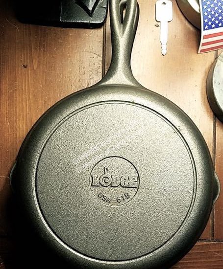
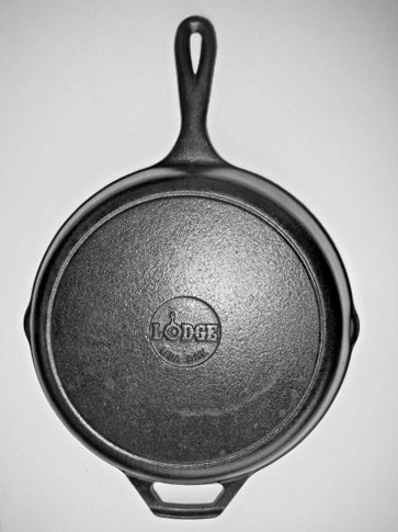
Lodge Cast Iron has been a part of American kitchens for over a century. The logo reflects this legacy. It often features traditional fonts and classic design elements. These elements connect it to the early 20th century when the company started. The use of a cast iron skillet in the logo is a nod to its core product.
The color scheme often includes black and white. This mirrors the simplicity and durability of cast iron cookware. The logo’s sturdy design reflects the ruggedness of American frontier life. This appeals to customers who value tradition and quality.
Incorporation Of Contemporary Trends
While honoring tradition, the Lodge Cast Iron logo also embraces modern trends. Recent updates have made the logo sleeker and more versatile. These changes reflect a shift towards a minimalist design. This appeals to modern consumers who prefer clean lines and simple aesthetics.
The company has also adapted the logo for digital platforms. This includes creating a responsive design that looks good on various devices. The logo’s scalability ensures it maintains clarity and impact, whether on a smartphone screen or a billboard.
Color variations and updated fonts also play a role. These elements help the logo stay relevant in a fast-changing market. While the core design remains recognizable, these tweaks allow it to evolve without losing its essence.
Marketing And Branding Strategies
Marketing and branding strategies play a crucial role in the success of any company. For Lodge Cast Iron, a well-crafted logo has been essential. It helps in creating a strong brand identity. Let’s explore the key aspects of their marketing and branding strategies.
Role Of Logo In Advertising
The Lodge Cast Iron logo is more than just a symbol. It is a mark of quality and tradition. Advertisements featuring the logo attract attention. They convey a sense of reliability and durability. This helps the brand stand out in a crowded market.
By consistently using the logo, Lodge Cast Iron creates brand recognition. Potential customers see the logo and recall positive experiences. This connection boosts the effectiveness of advertising campaigns. The logo becomes a trusted figure in the eyes of the audience.
Consumer Perception And Trust
A logo can shape consumer perception. For Lodge Cast Iron, the logo suggests heritage and craftsmanship. These qualities resonate with consumers looking for high-quality cookware. The logo reassures them they are making a wise investment.
Trust is vital in purchasing decisions. The Lodge Cast Iron logo builds this trust. Customers associate it with reliability and long-lasting products. This trust translates into repeat purchases and brand loyalty. A strong logo can be a powerful tool in gaining and retaining customers.
Collaborations And Special Editions
The history of the Lodge Cast Iron logo is rich and varied. Over the years, Lodge has collaborated with various brands and launched special editions. These collaborations and special editions have made their products unique and highly collectible.
Partnerships With Other Brands
Lodge Cast Iron has partnered with many popular brands. These partnerships allow them to create unique products. Each collaboration brings a new logo design. These logos often reflect the partner brand’s identity. For instance, a collaboration with a famous TV show might feature the show’s emblem. These special logos make the products stand out. Collectors and fans often seek these exclusive items.
Limited Edition Logos
Lodge also releases limited edition logos. These logos are usually for special occasions. Events like company anniversaries or holidays inspire these designs. Limited edition logos are often intricate and detailed. This makes them visually appealing. They also add a sense of exclusivity. Owning a piece with a limited edition logo feels special. It is a testament to Lodge’s creativity and commitment to quality.
Digital Era And Logo Adaptations
The digital era brought many changes to brand marketing. Companies had to adapt their logos for online platforms. This era saw Lodge Cast Iron make significant adjustments to their logo. The goal was to improve visibility and appeal to a broader audience.
Online Presence And E-commerce
Lodge Cast Iron enhanced its online presence with a modern logo. The updated design was simple and bold. It looked great on various digital platforms. This was crucial for e-commerce success.
The company optimized their logo for different screen sizes. This ensured a consistent brand image across devices. The move paid off with increased online sales.
Here are some key changes:
- Simpler design
- Bolder fonts
- Adaptive sizes
Social Media And Logo Visibility
Social media became a key channel for Lodge Cast Iron. The logo needed to stand out in a crowded space. The new design was clear and memorable. It worked well as a profile picture and in posts.
The company used the logo in various formats. This included high-resolution images and smaller icons. Consistency was maintained across all social media platforms. This increased brand recognition and engagement.
Some strategies used:
- Clear and bold design
- High-quality images
- Consistent use across platforms
Future Of The Lodge Logo
The Lodge Cast Iron logo has a rich history. It has evolved over time to reflect the brand’s growth and innovation. As we look towards the future, the Lodge logo is expected to undergo further changes. These changes will likely keep up with modern design trends while preserving the brand’s heritage.
Predicted Trends In Branding
Branding trends are always changing. Minimalism is a major trend. It focuses on simple and clean designs. Another trend is the use of bold colors. These colors grab attention. Logos today are also becoming more versatile. They need to work across different platforms. From social media to physical products.
Potential Logo Innovations
The future Lodge logo could see some exciting changes. One possibility is a more streamlined design. This would make the logo simpler and more modern. Another potential innovation is the use of digital elements. These could include animations for online use. The logo might also incorporate more eco-friendly colors. Reflecting a commitment to sustainability.
Frequently Asked Questions
What Is The History Of Lodge Cast Iron Logo?
The Lodge Cast Iron logo has evolved over time. It represents the company’s commitment to quality and tradition since its inception in 1896.
Why Did Lodge Cast Iron Change Its Logo?
Lodge Cast Iron updated its logo to modernize its brand. The new logo reflects the company’s growth while honoring its heritage.
When Was The First Lodge Cast Iron Logo Created?
The first Lodge Cast Iron logo was created in 1896. It symbolized the beginning of the company’s legacy in cast iron cookware.
How Has The Lodge Cast Iron Logo Evolved?
The Lodge Cast Iron logo has evolved from a simple design to a more refined one. It now incorporates modern elements while retaining classic features.
Conclusion
The Lodge Cast Iron logo has evolved thoughtfully over the years. Each change reflects the brand’s rich heritage and commitment to quality. Understanding this history helps appreciate the brand’s journey. The logo’s evolution mirrors the company’s growth and adaptability. It’s a blend of tradition and modernity, capturing the essence of Lodge Cast Iron.
This journey through time shows how a logo can tell a story. A story of dedication, innovation, and craftsmanship. Knowing this makes us value the brand even more. The Lodge Cast Iron logo stands as a testament to enduring quality.
