The FC Barcelona logo is iconic. Its evolution tells a unique story.
The history of the FC Barcelona logo is as rich and colorful as the club itself. From its early days in 1899 to the present, the logo has undergone several transformations. Each change reflects different eras and milestones in the club’s journey.
This blog post explores the fascinating evolution of the FC Barcelona emblem. We will delve into the origins, design changes, and the symbolism behind each iteration. Join us as we uncover the history and significance of one of the most recognizable logos in the world of football.
Origins Of Fc Barcelona
The history of FC Barcelona’s logo is rich and fascinating. It reflects the club’s deep roots and evolving identity. Understanding the origins of FC Barcelona gives us insight into its proud heritage.
Early Beginnings
FC Barcelona was founded in 1899. A group of Swiss, English, and Catalan footballers came together to form the club. They wanted to create a team that would represent their love for football.
Hans Gamper, a Swiss national, was a key figure in the club’s formation. He placed an ad in a local paper calling for players. Many responded, leading to the birth of FC Barcelona. Gamper later became the first president of the club.
Founding Members
The founding members of FC Barcelona were diverse. They included players from different nationalities, united by their passion for the game. This diversity is a cornerstone of the club’s identity.
The original team had 11 players. Among them were Arthur Witty, Otto Maier, and John Parsons. They played their first match on December 8, 1899, against a team of English expatriates. The match ended in a 1-0 defeat, but it marked the beginning of a legendary journey.
These early players laid the foundation for FC Barcelona. They set the stage for the club’s future successes and its enduring legacy.

Credit: www.footballkitarchive.com
First Club Crest
The first club crest of FC Barcelona is a symbol of heritage. It represents the club’s early identity and values. The crest has evolved, but its roots remain significant. The original crest offers a glimpse into the club’s beginnings.
Design Elements
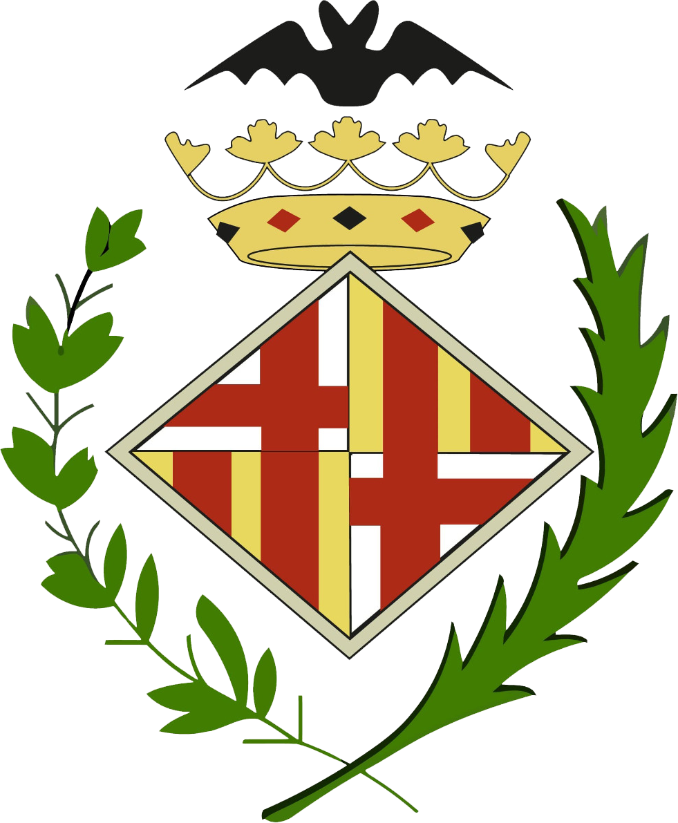
The first crest of FC Barcelona was simplistic. It featured a diamond shape. The top part had the St. George’s Cross. This symbolizes the patron saint of Catalonia. Below, the Catalan flag colors stood out. There was also a bat on top and laurel branches on the sides. At the bottom, a football was prominently displayed.
Symbolic Meaning
Each element in the crest had meaning. The St. George’s Cross showed the club’s Catalan roots. The Catalan flag colors represented regional pride. The bat symbolized protection and strength. Laurel branches stood for victory and honor. The football at the bottom highlighted the sport itself.
The design elements together conveyed a sense of identity. They reflected the club’s ambition and pride. Even today, these elements remain integral to the club’s identity.
Logo Redesign In 1910
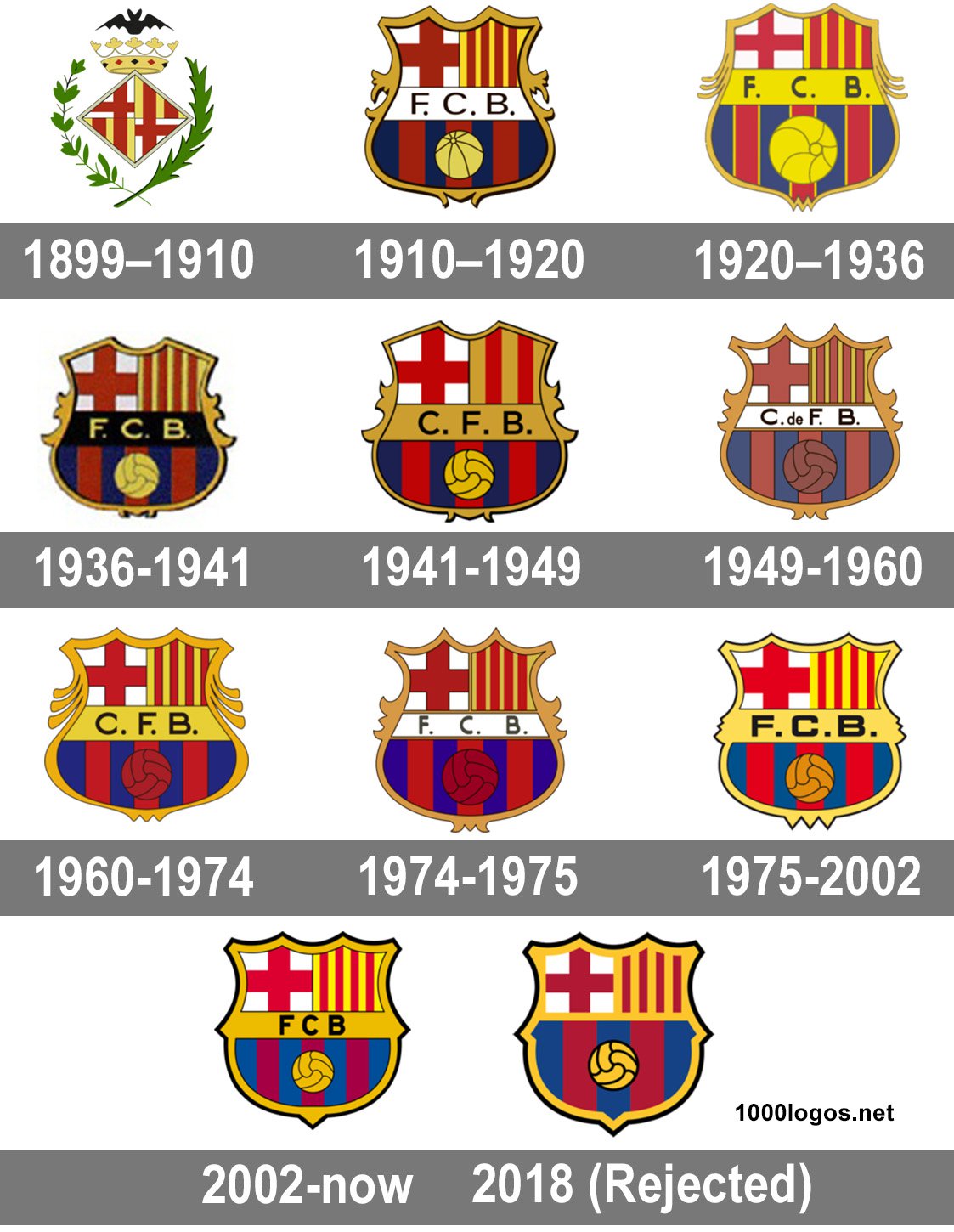
In 1910, FC Barcelona decided it was time for a new logo. The club wanted a design that reflected its identity and pride. This led to a significant logo redesign that year.
Competition And Selection
To find the best design, FC Barcelona held a competition. Artists and designers from around the region submitted their ideas. The club’s board reviewed all submissions carefully. After much deliberation, they selected the winning design. The chosen logo symbolized the club’s spirit and values.
New Features
The new logo introduced several key features. It included the iconic St. George’s cross, a symbol of Catalonia. The Catalan flag, known as the Senyera, was also incorporated. These elements highlighted the club’s strong regional identity. The design also featured the club’s initials, FCB, in the center. This placed the club’s name at the heart of the logo. The blue and red stripes, representing the team’s colors, completed the design. These colors have remained a core part of FC Barcelona’s identity.
The 1910 redesign was a pivotal moment for the club. It set the foundation for future logo evolutions. The new design captured the essence of FC Barcelona. It combined tradition with a modern touch, ensuring the logo would stand the test of time.

Credit: 1000logos.net
Post-civil War Changes
The history of FC Barcelona’s logo is a story of evolution. The Post-Civil War Changes mark a significant period in this evolution. The logo underwent several modifications reflecting the turbulent times.
Historical Context
Spain was in turmoil after the Civil War. This affected many aspects of life, including football clubs. FC Barcelona, a symbol of Catalan identity, faced political pressure. The regime imposed changes to enforce Spanish nationalism.
Impact On The Logo
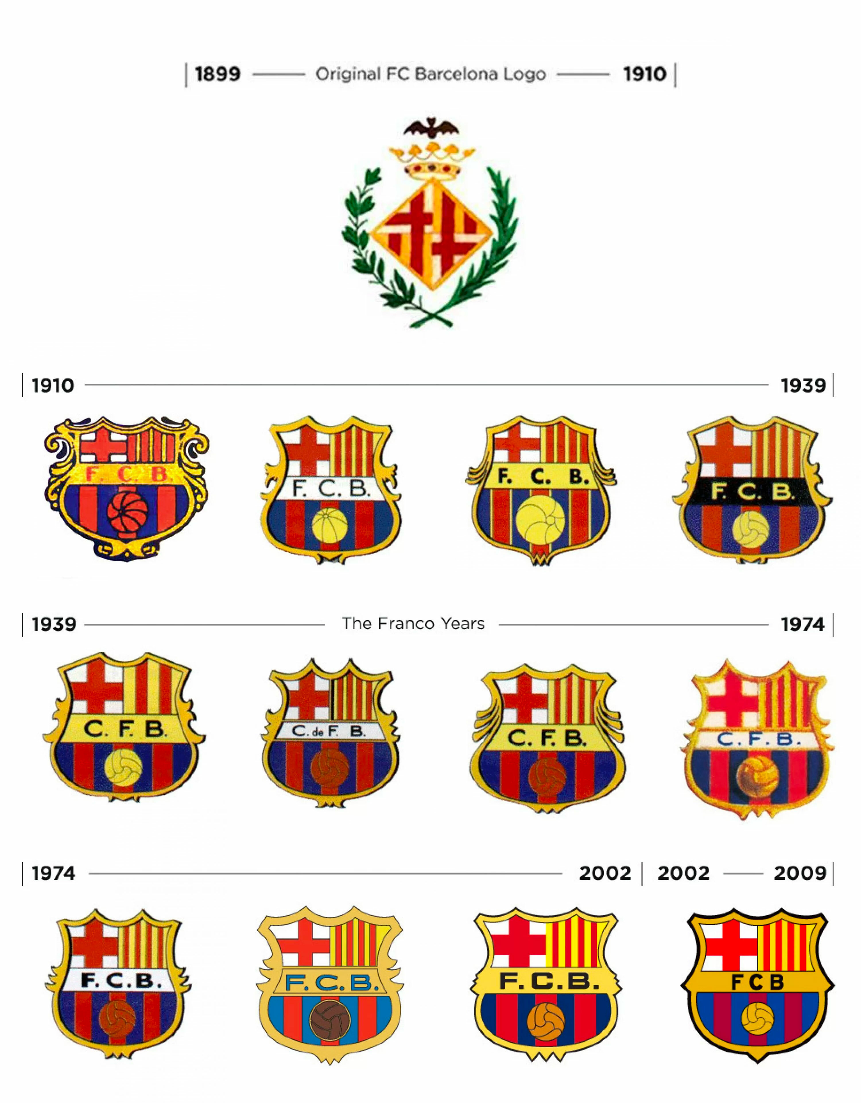
The FC Barcelona logo had to adapt to the new political landscape. The Catalan flag was removed from the design. This move aimed to suppress Catalan identity. The club’s initials changed from “FCB” to “CFB” (Club de Fútbol Barcelona). This change was to Spanishize the club’s image.
Below is a table summarizing the key changes:
| Pre-Civil War | Post-Civil War |
|---|---|
| FCB (Futbol Club Barcelona) | CFB (Club de Fútbol Barcelona) |
| Catalan flag present | Catalan flag removed |
These changes were not just aesthetic. They were symbolic of the broader political climate. The club’s identity was being reshaped under the regime’s influence. Despite these changes, FC Barcelona remained a beacon of Catalan pride.
The logo’s evolution during this period is a testament to the club’s resilience. It adapted to survive, yet retained its core identity. The post-Civil War logo changes are a crucial chapter in FC Barcelona’s rich history.
Modernization In The 1970s
The 1970s marked a significant period for the FC Barcelona logo. The club decided to modernize its emblem to reflect the changing times. This modernization effort included updating the design elements and embracing new technologies.
Design Trends
During the 1970s, design trends leaned towards simplicity and clarity. FC Barcelona adopted these trends to create a cleaner and more streamlined logo. The updated design featured bolder lines and a simplified color palette. The goal was to make the logo more recognizable and modern. This transformation aligned with the broader design movements of the era.
Technological Advances
Technological advances played a crucial role in the logo’s modernization. The use of modern printing techniques allowed for more precise and durable designs. Enhanced reproduction methods ensured that the logo maintained its integrity across various platforms. This was essential for promoting the club’s identity consistently. The integration of these technologies helped solidify the updated logo’s place in the club’s history.
21st Century Updates
In the 21st century, FC Barcelona’s logo underwent significant changes. These updates reflected the club’s modern identity and global influence. The design team aimed to maintain tradition while embracing the digital age and expanding the brand’s global reach.
Digital Adaptation
FC Barcelona’s logo needed to adapt to the digital world. Simplified designs became crucial for online platforms. The club opted for a cleaner, more streamlined look. This ensured the logo remained recognizable on small screens.
The design focused on clarity. Unnecessary details were removed. The new logo maintained its core elements. This balance kept the essence of FC Barcelona intact.
Global Branding
FC Barcelona aimed to strengthen its global brand. The logo played a key role in this strategy. A universal design helped connect with fans worldwide. The simplified logo was easily identifiable across cultures.
Merchandise and marketing materials showcased the updated logo. This consistency reinforced the club’s identity. The changes helped FC Barcelona stand out in a crowded sports market.
The 21st century updates to FC Barcelona’s logo highlighted the club’s commitment to innovation. Adapting to digital needs and enhancing global branding were essential steps. The club’s logo continues to be a symbol of pride and tradition.
Symbolism In The Logo
The FC Barcelona logo symbolizes the club’s rich history. The design features the Catalan flag and the city’s patron saint. The iconic blue and red stripes represent the team’s traditional colors.
The FC Barcelona logo stands as a testament to the club’s rich history. Every element in the logo tells a story, reflecting the club’s values and heritage. The design combines tradition with modernity, making it instantly recognizable worldwide.Colors And Shapes
The colors in the FC Barcelona logo are bold and vibrant. Blue and garnet stripes dominate the design, symbolizing strength and passion. These colors have been part of the club since its founding. Yellow and red stripes, representing the Catalan flag, also feature prominently. They highlight the club’s strong regional identity. The logo’s shape is a shield, a common element in European football clubs’ logos. The shield is divided into four quarters, each with its own significance. The top left features the cross of Saint George, the patron saint of Barcelona. The top right displays the Catalan flag. The bottom half contains the club’s initials “FCB” and a football, linking the club to its sport.Cultural Significance
The FC Barcelona logo holds deep cultural meaning for its fans. The Catalan flag in the logo signifies pride in Catalonia’s heritage and identity. The cross of Saint George represents the city’s patron saint, linking the club to its local roots. For fans, the logo is more than just a symbol. It embodies their passion and loyalty to the club. The elements of the logo connect them to Barcelona’s history and culture. Each match is not just a game, but a celebration of this rich heritage. The logo has evolved over the years, yet its core symbolism remains unchanged. This continuity ensures that the club’s values are always present. Fans see the logo as a badge of honor, representing their unwavering support. “`Fan Reactions
Fan reactions to the FC Barcelona logo have always been intense. The logo is more than a symbol. It represents history and pride. Over the years, fans have had strong opinions about changes to the logo.
Public Opinion
Fans often express their views on social media. Every change in the logo sparks debates. Some fans love the updates. Others feel nostalgic about the old designs. Public opinion is a mix of excitement and resistance. The logo is part of the club’s identity. Fans want it to stay true to its roots.
Identity And Pride
The FC Barcelona logo is a source of pride. It embodies the club’s values. Fans feel a deep connection to it. The colors and symbols resonate with their identity. Every element of the logo has a meaning. The cross, the stripes, the colors—all signify something special. Fans wear the logo with pride. It is not just a design. It is a statement of belonging.

Credit: www.hyperakt.com
Frequently Asked Questions
What Is The Origin Of Fc Barcelona’s Logo?
The FC Barcelona logo was first introduced in 1910. It was created through a competition among club members, resulting in the iconic crest design.
How Has The Fc Barcelona Logo Changed Over Time?
The FC Barcelona logo has undergone several modifications. The most notable change was in 2002, simplifying the design and modernizing the crest.
What Do The Colors In The Fc Barcelona Logo Represent?
The colors in the FC Barcelona logo represent the Catalan flag. The red and yellow stripes symbolize Catalonia’s heritage and pride.
Why Is There A St. George’s Cross In The Fc Barcelona Logo?
The St. George’s cross in the FC Barcelona logo represents the patron saint of Catalonia. It signifies the club’s deep-rooted connection to the region.
Conclusion
The FC Barcelona logo has evolved through the years, reflecting its rich history. Each design change marks a significant era. Fans cherish these emblems, embracing their deep connections. The logo not only represents the club but also its values and pride.
As time passes, the logo continues to inspire loyalty and passion. FC Barcelona remains a symbol of football excellence and tradition. The journey of its logo mirrors the club’s growth and legacy. This iconic emblem will always hold a special place in fans’ hearts, uniting them worldwide.

