


Colors play a crucial role in brand identity. They evoke emotions and set the tone.
Choosing the right color palette is essential for new brand design. It helps convey the brand’s message and values clearly. Aesthetic color palettes can make your brand stand out and attract the right audience. The right mix of colors can create a memorable and visually appealing brand image.
This blog post will explore twelve stunning color palettes for your brand. We’ll also provide their aesthetic hex codes. Whether you’re starting a new brand or refreshing an existing one, these palettes will inspire you. Dive in to find the perfect colors that speak for your brand.

Creating a new brand involves many steps. One of the most important is selecting the right aesthetic color palette. The colors chosen will affect your brand’s look and feel. They can evoke emotions and convey messages. This is why understanding color theory is crucial for any brand design.
Color has a powerful impact on people. It can influence how they feel about a brand. Different colors can evoke different emotions. For example:
Choosing the right color can help you connect with your audience. It can make your brand more memorable. It can even influence purchasing decisions.
Picking the perfect palette involves several steps. Here are some tips to help:
Using these steps, you can create a cohesive and appealing color scheme. Your brand will be visually engaging. It will attract the right audience and convey your message effectively.
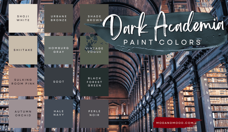
Earthy tones evoke a sense of nature and serenity. These colors are inspired by elements like soil, rocks, and foliage. They provide a grounded and organic feel to any design. Earthy tones are perfect for brands that want to convey stability and authenticity. They are versatile and timeless, making them a popular choice for new brand designs.
Choosing the right hex codes is crucial for consistency. Here are some popular earthy tones with their hex codes:
Many brands use earthy tones to create a natural and inviting atmosphere. Here are some examples:
These brands successfully use earthy tones to enhance their identity. They connect with their audience by evoking feelings of nature and calmness.
Pastel colors are soft, soothing shades perfect for new brand designs. They offer a gentle, calming effect and are visually appealing. Pastels are versatile and work well in various industries. They bring a sense of calm and serenity to any design.
Here are some popular pastel color hex codes for your brand:
Pastels create a friendly and approachable brand image. They evoke feelings of peace and relaxation. Pastels are easy on the eyes and reduce visual fatigue. They work well with other colors and enhance readability. Pastels appeal to a broad audience. They fit well in various design elements, from logos to websites.
Choosing a bold and vibrant color palette can make your brand stand out. Bold colors catch the eye and leave a lasting impression. They are great for creating a strong brand identity. Vibrant colors convey energy, enthusiasm, and confidence. If you want your brand to be memorable, bold and vibrant colors are the way to go.
Here are some hex codes for bold and vibrant colors:
| Color | Hex Code |
|---|---|
| Bright Red | #FF0000 |
| Electric Blue | #0000FF |
| Sunny Yellow | #FFFF00 |
| Vivid Green | #00FF00 |
| Hot Pink | #FF69B4 |
| Deep Purple | #800080 |
Bold colors can have a significant impact on your brand. They can:
Incorporate bold colors into your brand design to make a strong statement. Use these colors in your logo, website, and marketing materials. This will help your brand become more recognizable and memorable.
Monochromatic schemes are a timeless choice for brand design. They use different shades, tints, and tones of a single color. This creates a cohesive and polished look. Monochromatic palettes are easy to work with and versatile. They help maintain a clean and professional appearance for your brand.
Hex codes are essential for creating consistent monochromatic schemes. These codes help you achieve the right shades and tones. Here are some hex codes for popular monochromatic palettes:
| Base Color | Hex Code | Shade |
|---|---|---|
| Blue | #0000FF | Base |
| Blue | #0000CC | Darker |
| Blue | #3333FF | Lighter |
| Green | #008000 | Base |
| Green | #006600 | Darker |
| Green | #00CC00 | Lighter |
Monochromatic colors can add depth to your design. To achieve this, use various shades and tints of the base color. This creates a sense of dimension. Here are some tips:
By using these techniques, you can create a visually appealing design. Monochromatic schemes are not just simple; they are also effective. They help your brand stand out without overwhelming the viewer.

Aesthetic color palettes are visually pleasing color combinations. They help create a brand’s unique visual identity.
Hex codes represent colors in web design. Each code starts with a # followed by six characters.
An aesthetic color palette makes your brand look cohesive. It attracts and retains customer interest.
Choosing the right color palette is crucial for brand success. Colors evoke emotions and create impressions. The aesthetic hex codes shared here can guide your design. Experiment with these palettes to find what best represents your brand. Remember, simplicity often resonates more with audiences.
Start with one palette and refine as needed. A cohesive look strengthens your brand identity. Keep your target audience in mind while designing. Consistency in color use builds trust and recognition. Happy designing!

