


The Philadelphia 76ers have a rich history. Their logo is iconic in the NBA.
Understanding the evolution of the 76ers’ logo is fascinating. This basketball team’s emblem has changed over the years, reflecting different eras and styles. Each version of the logo tells a story about the team’s journey and identity. From its early days to the modern design, the 76ers’ logo captures the spirit of Philadelphia and its passionate fans.
In this blog post, we’ll explore the history, symbolism, and meaning behind the 76ers’ logo. Join us as we uncover the transformation and significance of this memorable symbol in the world of basketball.
The early years of the Philadelphia 76ers are rich with history. The team’s logo has evolved over time, reflecting its proud heritage and the spirit of the game.
The first logo design of the 76ers appeared in 1963. It featured a simple yet impactful design. A large, bold number “76” stood at the center. Thirteen stars encircled the number, symbolizing the original American colonies. This design captured the essence of the team’s name and its connection to American history.
The color scheme of the first logo was red, white, and blue. These colors represented the American flag. The red symbolized strength and valor. White stood for purity and innocence. Blue represented vigilance, perseverance, and justice. This patriotic color scheme helped establish the team’s identity and connect with fans.
Credit: www.designyourway.net
The 1960s saw significant changes in the 76ers logo. The design evolved to reflect a more modern and dynamic image. The star-spangled basketball symbolized unity and pride in the team.
The 1960s were a pivotal decade for the Philadelphia 76ers. The team underwent significant changes, including a major redesign of their logo. This period marked a shift towards a more modern and dynamic image, reflecting the evolving trends of the era.The Philadelphia 76ers’ logo has evolved significantly since its inception. One of the most notable changes occurred in the 1970s. This redesign aimed to modernize the team’s image, reflecting the vibrant and dynamic spirit of the era. The 76ers wanted a logo that resonated with both the players and the fans. Let’s delve into the details of this iconic redesign.
The 1970s redesign introduced bold, fresh elements to the 76ers logo. The most striking change was the inclusion of a large, red basketball. This basketball was placed behind the number ’76’, making it the focal point. The number ’76’ itself was styled with a modern, sleek font. This gave it a crisp and professional look.
Additionally, three stars were added above the ’76’. These stars represented excellence and a nod to the American flag, emphasizing the team’s Philadelphia roots. The use of red and blue colors remained, but they were made more vibrant to catch the eye. This new design was meant to be both visually appealing and symbolic.
Fans had mixed reactions to the new logo. Many appreciated the fresh, modern look. They felt it captured the energetic spirit of the 1970s. The vibrant colors and sleek design made the logo stand out, and many fans embraced the change enthusiastically.
However, some long-time supporters were nostalgic for the old logo. They missed the traditional elements that had been a part of the team’s identity. Despite this initial resistance, the new design quickly grew on many. Over time, it became an iconic symbol of the 76ers’ brand.
Overall, the 1970s redesign was a bold move that paid off. It helped to modernize the team’s image and attract new fans. The logo remains a significant part of the team’s history, representing a period of change and growth.
Credit: 1000logos.net
The 1980s and 1990s were transformative decades for the Philadelphia 76ers. The team saw several changes in their logo and branding. This period was marked by minor tweaks and cultural shifts.
The logo from the early 1980s remained mostly consistent. It featured a bold “76ers” wordmark, with the number 7 incorporating a basketball motif. This design emphasized simplicity and clarity.
During the 1990s, the logo underwent subtle refinements. The colors became more vibrant, making the logo stand out. The typeface also saw slight modifications for a more modern feel.
| Year | Logo Change |
|---|---|
| 1982 | Introduction of a cleaner typeface |
| 1991 | Enhanced color palette |
The 76ers logo in the 1980s and 1990s became iconic. It represented a team full of energy and potential. The logo was seen everywhere, from jerseys to merchandise.
Fans embraced the logo’s bold and dynamic design. This period also saw the rise of basketball culture. The 76ers logo became a symbol of pride for Philadelphia residents.
The logo’s visibility grew with the team’s success. It became synonymous with the thrilling games and memorable moments of the era.
The 2000s marked a significant period for the Philadelphia 76ers. They decided it was time for a fresh look. This rebranding effort aimed to modernize the team’s image. The new logo reflected a bolder, more dynamic identity.
The 76ers introduced a new logo in the early 2000s. This design featured a more vibrant color palette. The classic red, white, and blue remained. But with added gold elements, the logo felt more dynamic. The updated look aimed to capture the excitement of basketball. A stylized basketball swoosh added movement and energy. This logo marked a departure from the traditional design. It embraced a contemporary, forward-looking approach.
Rebranding extended beyond the logo. The 76ers’ marketing strategy focused on engaging fans. They wanted to create a strong connection with their audience. The new logo played a central role in this effort. Merchandise featuring the new design became widely available. This included jerseys, hats, and other fan gear. The team also revamped their digital presence. Social media and the official website showcased the new logo. These efforts aimed to build a cohesive, modern brand identity. The 76ers’ rebranding in the 2000s was a bold move. It helped to rejuvenate the team’s image and connect with a new generation of fans.
The modern era of the Philadelphia 76ers has seen a blend of tradition and innovation. Their logo has evolved to represent this dynamic team. The logo symbolizes pride, history, and a vision for the future.
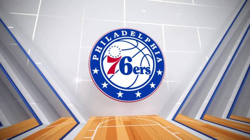
The current logo of the 76ers was introduced in 2015. It combines classic elements with a modern touch. The design is a nod to the team’s rich history while embracing a sleek, contemporary look.
The current logo features a red, white, and blue color scheme. This reflects the team’s patriotic spirit. The number 76 is central to the design. It is set within a blue circle, surrounded by 13 stars. The stars represent the original 13 colonies, a tribute to Philadelphia’s historical significance.
Bold fonts and clean lines make the logo stand out. The design is simple yet impactful. The use of traditional colors and symbols connects the team to its roots. At the same time, the modern elements highlight the team’s forward-thinking approach.
The Philadelphia 76ers logo holds a rich history. Each element signifies something special. This section dives into the hidden meanings and elements of the logo.
The number 76 is not just a number. It represents the year 1776, when the United States declared independence. This connection to freedom and history makes the logo powerful.
Also, the star motif is significant. The 13 stars symbolize the original 13 colonies. This is a nod to the country’s foundation and struggles for independence.
| Element | Meaning |
|---|---|
| Number 76 | Year of Declaration of Independence |
| 13 Stars | Original 13 Colonies |
| Basketball | Sport and team identity |
The basketball in the logo represents the sport itself. It highlights the team’s identity and passion. The colors red, white, and blue stand for patriotism. They reflect the American flag, embodying national pride.
Each element is carefully designed. Together, they tell a story of history, patriotism, and sport. The 76ers logo is more than just a symbol. It’s a piece of American history and pride, woven into the fabric of the team.
The Philadelphia 76ers’ logo holds a special place in sports culture. It embodies the team’s rich history and its connection to the city. Fans identify with the logo, and it carries significant meaning in the world of basketball.
The 76ers’ logo is more than just a symbol. It is a badge of honor for fans. It represents loyalty and passion. Fans wear the logo with pride, showing their support for the team. The logo unites fans, creating a strong community. It also connects generations of fans who have cheered for the 76ers over the years.
The logo plays a crucial role in merchandising. It appears on jerseys, hats, and other gear. Fans purchase these items to show their team spirit. Merchandise sales help the team financially, allowing them to invest in players and facilities. The logo’s design also influences the popularity of the merchandise. A well-designed logo attracts more buyers and boosts sales.
Credit: logos-world.net
The 76ers logo originated in 1963. It symbolizes the team’s Philadelphia roots and the spirit of American independence.
The 76ers logo has evolved several times. Each redesign reflects contemporary design trends while maintaining core elements like the basketball and patriotic colors.
The stars in the 76ers logo represent the original 13 colonies. They highlight the team’s connection to American history.
The number 76 signifies the year 1776. It’s a nod to the Declaration of Independence and Philadelphia’s historic role.
The 76ers logo has a rich and dynamic history. Each change tells a story. It reflects the team’s evolution over the years. Fans connect deeply with the symbols. They represent not just a team, but a community. The logos show pride, passion, and perseverance.
They are more than just images. They are a part of the 76ers’ legacy. The team’s spirit shines through every design. From past to present, the logo embodies the heart of the 76ers.

