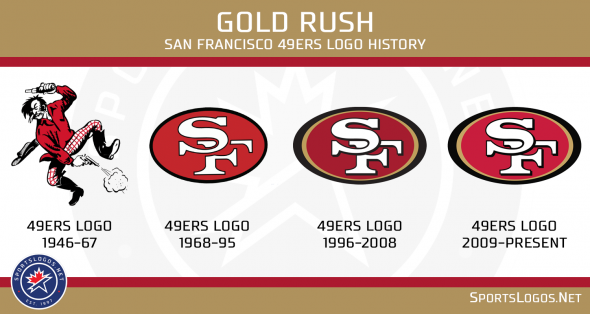
49Ers Logo History: Evolution of an Iconic NFL Emblem
The 49ers logo has a rich history. It reflects the team’s legacy and evolution.
Since their inception in 1946, the San Francisco 49ers have become a symbol of pride for fans. The logo has changed over the decades, showcasing different designs and styles. Each variation tells a story about the team’s journey and identity.
The iconic logo we see today wasn’t always the same. It has gone through several transformations, each representing a different era in the team’s history. Understanding the logo’s evolution gives us insight into the 49ers’ legacy and their impact on the sport. Let’s take a journey through time and explore the fascinating history of the 49ers logo.

Early Beginnings
The San Francisco 49ers, a name synonymous with football glory, had humble beginnings. The journey of their iconic logo reflects the team’s rich history and evolution. Let’s explore the origins and influences behind the 49ers’ logo.
Original Design
The original logo of the 49ers was created in 1946. It featured a gold miner, which was a nod to the California Gold Rush of 1849. This miner was depicted in a cartoonish style, holding a pistol and wearing a red shirt and cowboy hat. The logo was playful and full of character, capturing the spirit of the times.
Influences And Inspiration
The 49ers’ logo drew inspiration from several sources. The California Gold Rush was a primary influence, as it represented the pioneering spirit of those who sought fortune and adventure. The colors red and gold were chosen to symbolize the team’s fiery passion and the golden opportunities of California.
Additionally, the design was influenced by the Western-themed imagery popular in the 1940s. Cowboys, miners, and rugged landscapes were common motifs in media and culture. This style resonated with the public and helped establish the 49ers’ identity.
The combination of historical references and contemporary trends made the 49ers’ logo both unique and memorable. It set the stage for the team’s future success and enduring legacy.
First Major Redesign
The San Francisco 49ers have a rich history. Their logo has evolved with time. The first major redesign marked a significant shift. This redesign aimed to modernize the team’s image. Fans had mixed reactions to these changes.
Modernization Efforts
The first major redesign happened in 1968. The 49ers decided to refresh their look. They introduced a more polished design. The new logo featured a stylized “SF” inside an oval. This was a big change from the previous logo. The older logo had a more cartoonish look. The new one looked cleaner and more professional.
The team wanted to stay relevant. They aimed to keep up with changing times. Modernizing the logo was part of this effort. The new design reflected a more serious tone. It aimed to appeal to a broader audience. The redesign helped the team build a stronger brand.
Fan Reactions
Fans had mixed feelings about the redesign. Some loved the new look. They felt it made the team look more professional. Others missed the old, playful design. They felt a sense of nostalgia for the original logo. Over time, most fans accepted the change.
The redesign sparked many discussions. Fans debated the pros and cons. Some felt the new logo lacked character. Others believed it was a step in the right direction. The team continued to evolve. The logo became a symbol of their journey. It represents both change and tradition.
The 1980s Era
The 1980s era marked a significant period in the history of the 49ers logo. This decade brought about bold changes that reflected the team’s evolving identity. The logo became a symbol of strength, unity, and cultural impact. Let’s dive deeper into how the 1980s logo shaped the 49ers’ brand.
Bold Changes
In the 1980s, the 49ers introduced a new logo design. The logo featured a more refined and polished look. The iconic “SF” initials inside an oval shape were retained. However, the colors were bolder and more vibrant.
The red and gold colors were intensified. This gave the logo a striking appearance. The font was also updated to a cleaner and more modern style. This change aimed to represent the team’s growing success and ambition.
Cultural Impact
The 1980s logo had a significant cultural impact. It became a symbol of pride for fans. The logo was prominently displayed on merchandise, from jerseys to hats.
The team’s success in the 1980s further amplified the logo’s popularity. The 49ers won multiple Super Bowls during this time. This success helped cement the logo’s place in sports history.
The logo also became a part of the broader pop culture. It appeared in movies, TV shows, and music videos. This widespread recognition helped the 49ers build a strong brand identity.
| Aspect | Change |
|---|---|
| Colors | Bolder red and gold |
| Font | Cleaner and modern |
| Popularity | Increased with team success |
In summary, the 1980s logo changes played a crucial role in shaping the 49ers’ identity. The bold design and cultural impact made it an enduring symbol of the team’s legacy.
Entering The 21st Century
As the San Francisco 49ers entered the 21st century, their logo evolved to reflect a new era while maintaining its historic roots. This period saw significant changes influenced by technological advancements and a commitment to tradition.
Technological Advancements
The 21st century brought new design tools. These tools allowed for more precise and detailed logos. The 49ers’ logo benefited from these advancements. The team used modern software to refine their logo. This ensured crisp lines and vibrant colors. Digital tools also helped in maintaining the logo’s consistency across various platforms.
Moreover, the shift to digital media made the logo more adaptable. It could now be resized without losing quality. This adaptability was crucial as the logo appeared on numerous devices and screens. From smartphones to billboards, the 49ers’ logo maintained its clarity and impact.
Maintaining Tradition
While embracing technology, the 49ers’ logo stayed true to its origins. The iconic red and gold colors remained. These colors represented the team’s rich history and identity. The oval shape of the logo was retained, symbolizing continuity and stability.
The classic interlocking “SF” initials were preserved. This design element connected fans to the team’s legacy. The careful balance of modern and classic elements ensured the logo resonated with both new and long-time fans. Tradition was respected, even as new technology was embraced.
The 21st-century evolution of the 49ers’ logo is a testament to the team’s dedication. A dedication to honoring its past while looking forward to the future.
Current Logo
The 49ers logo has evolved over the years, reflecting the team’s storied history. The current logo, introduced in 1996, has become an iconic symbol of the San Francisco 49ers. This logo is a key element of the team’s identity, recognized by fans and rivals alike.
Design Elements
The current 49ers logo features a bold, red oval with a white and black outline. Inside the oval, the letters “SF” are prominently displayed in an interlocking style. The letters are gold with a black outline, creating a striking contrast against the red background. The overall design is simple yet powerful, embodying the team’s strength and legacy.
Future Prospects
The current logo has stood the test of time, remaining largely unchanged since its introduction. Fans have grown attached to this design, which has become synonymous with the 49ers’ success. While some teams frequently update their logos, the 49ers have chosen stability. This decision reflects the team’s respect for tradition and its commitment to maintaining a consistent brand image.
Looking ahead, the 49ers will likely continue to use the current logo. Minor updates might occur to keep the design fresh, but major changes are unlikely. The logo’s enduring popularity ensures it will remain a key part of the 49ers’ identity for years to come.


Frequently Asked Questions
What Is The Origin Of The 49ers Logo?
The 49ers logo was first created in 1946. It symbolizes the Gold Rush era.
How Has The 49ers Logo Changed Over Time?
The 49ers logo has seen several updates. It evolved from a gold miner to the current “SF” design.
Why Did The 49ers Update Their Logo?
The 49ers updated their logo to modernize the brand. It helps keep the team’s image fresh and appealing.
Conclusion
The 49ers logo has evolved significantly over the years. Each design reflects the team’s rich history and culture. Fans cherish every version for its unique charm. The journey of their logo symbolizes growth and change. Future updates will likely continue to honor tradition while embracing modern trends.
This blend of old and new keeps the 49ers’ identity strong and fresh. The logo’s story is a testament to the team’s enduring legacy. As fans, we look forward to seeing how it evolves next.


