Chrysler Logo History: Evolution of an Iconic Emblem
The Chrysler logo has a rich history spanning nearly a century. From its origins to its current design, it reflects the brand’s evolution.
Understanding the Chrysler logo’s history offers insight into the company’s journey. The logo has changed several times, each redesign telling a story of innovation and adaptation. This iconic emblem not only represents the brand but also mirrors the automotive industry’s transformation.
By tracing the logo’s changes, we can appreciate Chrysler’s commitment to quality and design. Dive into this fascinating history to see how each version of the logo symbolizes a different era for the company. This exploration reveals how Chrysler has maintained its identity while adapting to modern times.

Early Beginnings
Chrysler’s journey began in the early 20th century. The company quickly rose to prominence. Let’s dive into the origins and early logo design of this iconic brand.
Founding Of Chrysler
Walter Chrysler founded the company in 1925. He had a vision for high-quality, affordable cars. This vision shaped the company’s early years and set the stage for its success.
The company was based in Detroit, the heart of the American auto industry. Detroit’s resources and talent pool helped Chrysler grow rapidly. It wasn’t long before Chrysler became a household name.
First Logo Design
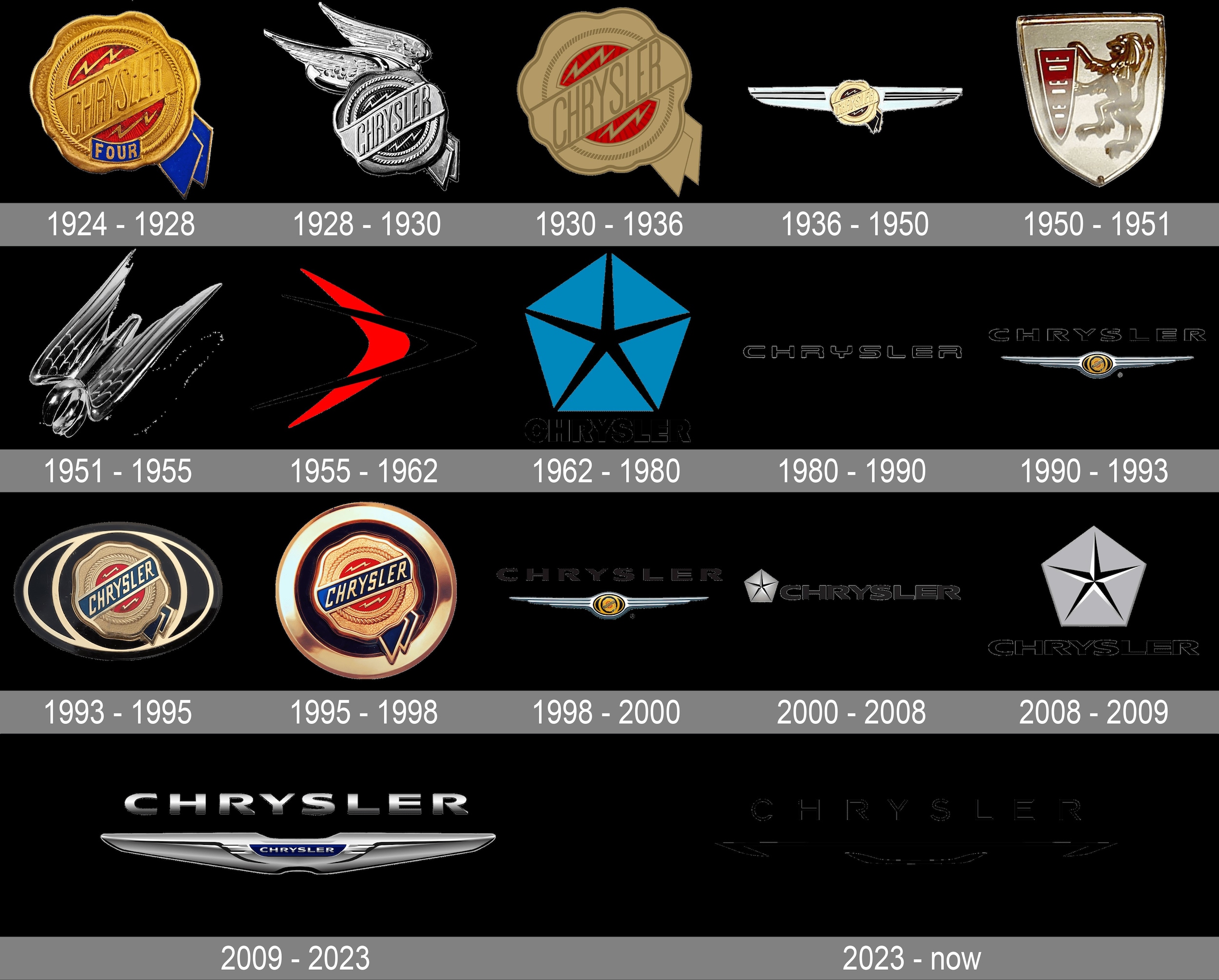
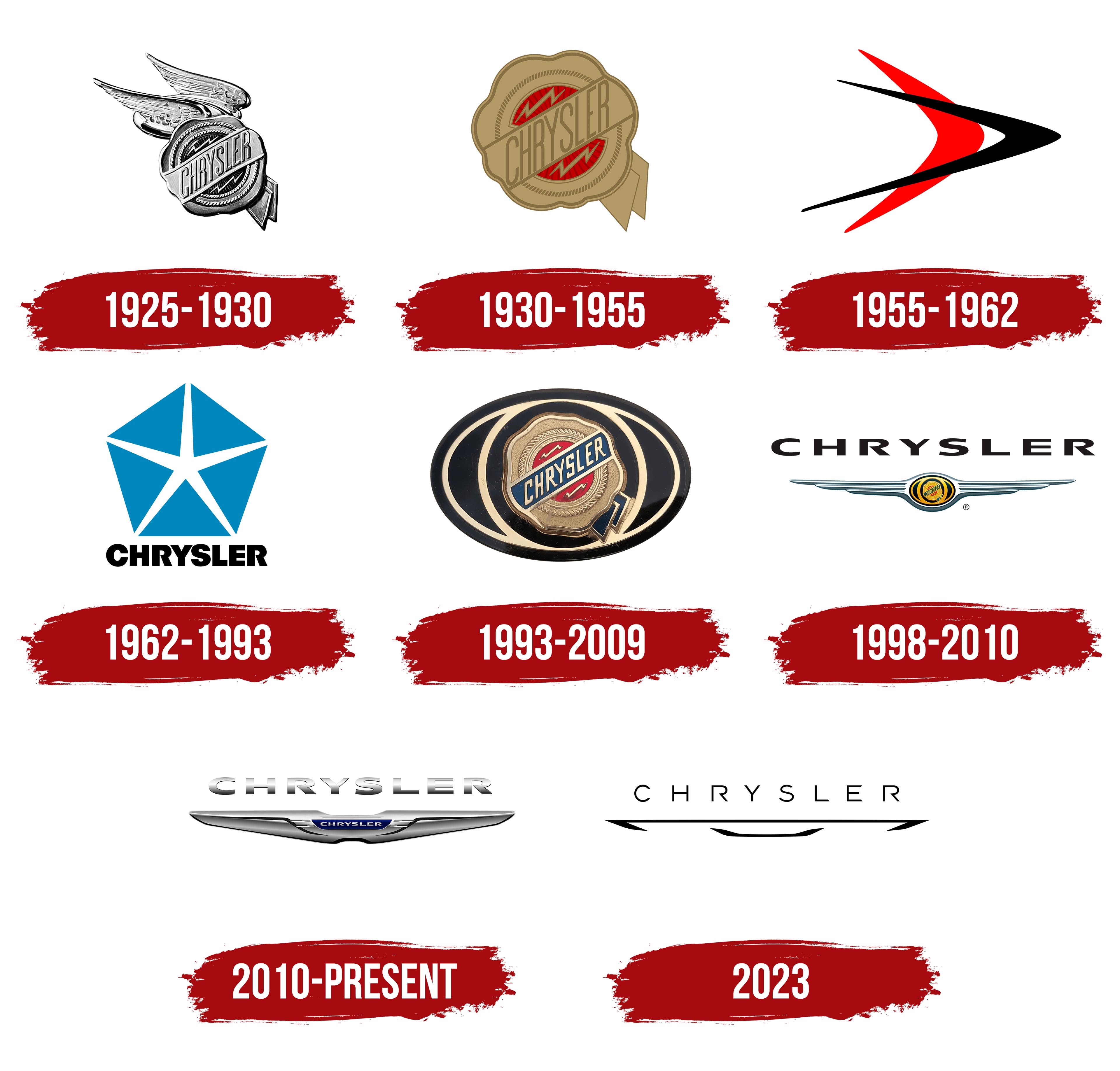
The first Chrysler logo appeared in 1925. It featured a wax seal design. This design symbolized quality and trust. The wax seal also included a ribbon and a lightning bolt. The ribbon stood for excellence, while the bolt represented speed and innovation.
The logo’s unique elements helped it stand out. It became a symbol of the brand’s commitment to quality and performance. The early logo set the stage for many future designs.

The Winged Emblem
The Chrysler logo has seen many changes over the years. One of the most iconic versions is the Winged Emblem. This design captures attention and symbolizes the brand’s evolution. Let’s dive into the history of this fascinating emblem.
Introduction Of Wings
The Winged Emblem first appeared in the 1990s. It was a bold shift from previous designs. Chrysler wanted a logo that stood out. The wings represent freedom and speed. These qualities align with the brand’s vision.
Symbolism And Design
The design of the Winged Emblem is intricate. It features a pair of elegant wings. These wings stretch out from a central medallion. The medallion often includes the Chrysler name. Sometimes, it also features the iconic pentastar.
Each part of the emblem has meaning. The wings symbolize freedom and progress. The central medallion represents the brand’s strength. The combination creates a powerful image.
The colors used are also significant. Silver and blue are common choices. These colors convey sophistication and trust. The design overall is sleek and modern.
The Winged Emblem has become a hallmark of Chrysler. It signifies quality and innovation. This iconic design continues to resonate with customers.
Art Deco Influence
The Chrysler logo has undergone several transformations over the years. One of the most significant influences on its design was the Art Deco movement. This artistic style, popular in the early 20th century, left a lasting mark on the automotive industry. Chrysler embraced Art Deco elements, creating a logo that was both stylish and modern.
1930s Design Changes
During the 1930s, Chrysler’s logo saw notable changes. The company adopted a more streamlined design. This period marked the introduction of sleek lines and geometric shapes. These elements reflected the Art Deco movement’s influence. The logo became more refined and elegant.
Impact Of Art Deco
Art Deco brought a sense of luxury and sophistication. Chrysler’s logo began to feature bold, symmetrical patterns. The use of metallic colors added a touch of modernity. This design shift aimed to appeal to a new generation of car buyers. The logo’s new look symbolized progress and innovation.
Art Deco’s influence extended beyond the logo. It shaped the overall branding of Chrysler. The company embraced this style in its advertisements and vehicle designs. This cohesive approach strengthened Chrysler’s brand identity.
Post-war Modernization
Chrysler’s logo history reflects the company’s post-war modernization. Its emblem evolved, showcasing innovation and adapting to new design trends. This transformation signaled Chrysler’s commitment to progress and growth.
The post-war era marked a significant shift for Chrysler. The company embraced modernization. Its logo also evolved to reflect this change. The new designs echoed a sense of progress. They showcased the company’s forward-thinking approach.Mid-20th Century Updates
During the mid-20th century, Chrysler made several logo updates. They aimed to keep up with the changing times. The company introduced streamlined, sleek designs. These logos were simpler and more modern. They focused on clarity and brand recognition. The new look appealed to a post-war audience.Technological Advancements
Technological advancements also influenced Chrysler’s logo. Improved printing techniques allowed for more detailed designs. The logos became more intricate. They featured finer lines and sharper edges. This new level of detail helped differentiate Chrysler from competitors. The logos reflected a commitment to innovation and quality. “`Pentastar Era
The Pentastar Era marks a significant chapter in Chrysler’s history. This period saw the introduction of an iconic logo that would become synonymous with the brand. The Pentastar logo brought a fresh look and new identity for Chrysler, reflecting its growth and innovation.
Birth Of The Pentastar
The Pentastar logo was born in 1962. Chrysler wanted a symbol that was timeless and versatile. They needed a logo that could be used across all their divisions. The chosen design was a simple yet striking five-pointed star inside a pentagon. This logo was the work of Lippincott & Margulies, a renowned design firm.
The Pentastar was more than just a symbol. It represented Chrysler’s unity and forward-thinking approach. The logo was easy to recognize and stood out in the automotive industry. It was a perfect blend of simplicity and elegance, which helped in branding.
Brand Identity Shift
The introduction of the Pentastar marked a shift in Chrysler’s brand identity. The company wanted to modernize its image and appeal to a broader audience. The new logo played a crucial role in this transformation. It signified a break from the old and an embrace of the new.
Chrysler’s vehicles began to carry the Pentastar proudly. It was visible on the grilles, hubcaps, and even in advertisements. This consistent use of the logo helped in creating a strong brand presence. The Pentastar became a symbol of quality and innovation.
During this era, Chrysler also focused on improving their products. They introduced new models and technologies. The Pentastar logo became a beacon of these advancements, symbolizing progress and excellence.
1990s Redesign
The Chrysler logo has seen numerous changes over the decades. The 1990s redesign marked a significant shift in its corporate identity. This redesign aimed to modernize the brand and align it with contemporary automotive trends.
New Corporate Image
The 1990s redesign introduced a sleek and stylish logo. Chrysler opted for a more streamlined look. The iconic pentastar was replaced with a new winged emblem. This design embraced modern aesthetics and signaled innovation. The wings symbolized speed and agility, reflecting Chrysler’s vision. The redesign was part of a broader effort to refresh the brand’s image.
Consumer Reception
Consumers had mixed reactions to the new logo. Some appreciated the fresh and modern design. They felt it represented progress and innovation. Others missed the traditional pentastar emblem. They felt a sentimental connection to the old logo. Despite mixed feelings, the new logo achieved its goal. It successfully modernized Chrysler’s image and appealed to a new generation of car buyers.
21st Century Transformations
The 21st century brought significant changes to the Chrysler logo. These transformations reflect the evolving identity of the brand. The new designs aim to connect with modern audiences. Each update tells a story of innovation and growth.
Modern Interpretations
In the early 2000s, Chrysler introduced a sleek, winged logo. This design marked a departure from previous emblems. The new look was bold and sophisticated, symbolizing progress and ambition.
The winged logo featured a silver and blue color scheme. It portrayed a sense of motion and speed. This design resonated with a younger, dynamic audience. It also emphasized Chrysler’s commitment to quality and performance.
Global Market Influence
Chrysler’s logo changes reflect its global ambitions. The company aimed to appeal to a broader audience. The modern design helped establish a strong international presence.
As Chrysler expanded into new markets, the logo became a recognizable symbol. It represented the brand’s values and vision. The updated emblem helped build trust and loyalty among new customers.
In summary, the 21st-century transformations of the Chrysler logo illustrate the brand’s evolution. The modern interpretations and global market influence highlight Chrysler’s dedication to innovation and excellence.
Legacy And Impact
The Chrysler logo has a rich legacy and a profound impact on the automotive world. This emblem is more than just a symbol. It represents innovation, quality, and American craftsmanship. Over the years, the Chrysler logo has evolved. Yet, it has always maintained its core identity.
Cultural Significance
The Chrysler logo holds cultural significance in America. It stands for the spirit of progress. Many see the logo as a symbol of reliability and trust. It is a familiar sight on roads across the nation. The logo’s design elements also reflect the era of its creation. Wings, pentastars, and seals show the brand’s journey through time.
Chrysler’s logo is often associated with luxury. It signifies a blend of elegance and performance. The brand has appeared in numerous films and TV shows. This has further cemented its place in popular culture. Car enthusiasts often admire the logo for its timeless appeal.
Future Of The Chrysler Logo
The future of the Chrysler logo promises exciting changes. As the brand moves towards electric and autonomous vehicles, the logo may evolve again. Yet, it will likely retain elements of its rich history.
Chrysler’s focus on innovation will drive logo design changes. New elements may reflect modern technology and sustainability. The logo will continue to be a beacon of quality and trust. It will remain a significant part of the brand’s identity.

Frequently Asked Questions
What Does The Chrysler Logo Represent?
The Chrysler logo represents the brand’s heritage and innovation. Its wings symbolize speed, while the central badge signifies quality and excellence.
How Has The Chrysler Logo Evolved?
The Chrysler logo has evolved multiple times since 1925. It has featured various elements like wings, ribbons, and pentastars, reflecting the brand’s evolution.
Why Did Chrysler Change Its Logo?
Chrysler changed its logo to modernize its brand image. Each redesign aimed to reflect contemporary design trends and the company’s forward-thinking vision.
What Is The Current Chrysler Logo?
The current Chrysler logo features a sleek, silver winged badge. It represents the brand’s commitment to luxury, elegance, and modernity.
Conclusion
The Chrysler logo tells a rich, evolving story. Each change reflects a new era. From wings to pentastars, it symbolizes innovation and heritage. This journey showcases the brand’s commitment to quality and style. The logo’s evolution mirrors Chrysler’s growth and adaptability.
Fans and car enthusiasts appreciate this visual history. Understanding the logo’s past offers insight into the brand’s identity. Chrysler’s legacy continues to inspire and drive forward.


