Lego Logo History: Evolution of an Iconic Brand Symbol
Lego is a brand known worldwide for its colorful building blocks. But have you ever wondered about the history of its logo?
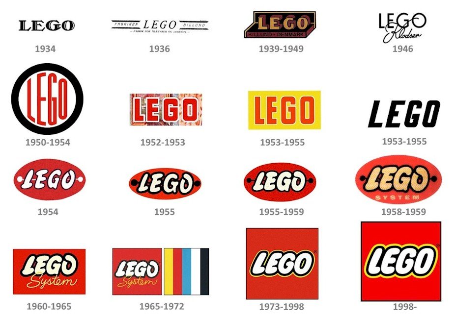
The Lego logo has a rich and interesting history. From its humble beginnings in the 1930s to the iconic design we see today, the logo has evolved significantly. Understanding this evolution offers a fascinating glimpse into the brand’s journey. Each change in the logo reflects a step in Lego’s growth and adaptation to a changing world.
Whether you’re a Lego fan or just curious about brand histories, exploring the Lego logo’s development is both fun and informative. Let’s dive into the colorful story behind the Lego logo and see how it has transformed over the decades.
Early Beginnings
The history of the Lego logo is fascinating. It tells the tale of innovation and creativity. Lego, now a household name, began its journey in a small Danish workshop. Let’s explore the early beginnings of Lego and its logo evolution.
Founding Of Lego
Lego was founded in 1932 by Ole Kirk Christiansen. He was a carpenter in Billund, Denmark. Christiansen started by making wooden toys. These toys were simple but well-crafted.
| Year | Event |
|---|---|
| 1932 | Ole Kirk Christiansen founded Lego |
| 1934 | The name Lego was adopted |
By 1934, Christiansen named his company Lego. This name came from the Danish phrase “leg godt,” meaning “play well.” This was a fitting name for a toy company. The focus was on quality and play.
First Logo Design
The first Lego logo appeared in 1936. It was simple and unassuming. The logo was a black and white design. It featured the word “LEGO” in a straightforward font.
- 1936: The first logo was created
- Black and white design
- Simple and clear
The early logo represented the company’s humble origins. The focus was on the product, not flashy branding. This approach worked well for the small company.
As time went on, the Lego logo evolved. Each version reflected the company’s growth and innovation. But the first logo remains a symbol of Lego’s early beginnings.
1930s And 1940s Transformations
The Lego logo underwent significant changes during the 1930s and 1940s. These transformations reflected the brand’s evolution and growth. This period saw the introduction of color and the incorporation of the block element into the logo. These changes were crucial in establishing the brand’s identity.
Introduction Of Color
In the 1930s, the Lego logo started to include color. This was a major shift from the previous black-and-white design. The addition of color made the logo more vibrant and appealing. It helped the brand stand out in a crowded market.
A table representing the color changes:
| Year | Color | Description |
|---|---|---|
| 1934 | Red | Red was added to the logo |
| 1946 | Yellow | Yellow was introduced for a cheerful look |
Colors like red and yellow made the logo more lively. This change also helped to attract more attention from children and parents alike.
Incorporating The Block Element
The 1940s saw another significant change: the incorporation of the block element into the logo. This was a nod to the iconic Lego bricks. It was a strategic move that connected the logo to the product.
Key points about the block element:
- Symbolism: Represented the core product of Lego
- Recognition: Made the logo instantly recognizable
- Brand Identity: Strengthened the brand’s visual identity
The addition of the block element made the logo more unique. It visually linked the brand with its signature toy bricks. This change was vital in solidifying Lego’s brand image.
Post-war Era Changes
The post-war era brought significant changes to the Lego logo. During this time, Lego aimed to modernize and simplify its brand image. These changes helped establish a strong visual identity that resonated with consumers.
Logo Simplification
In the post-war era, Lego simplified its logo design. The company removed unnecessary details. This made the logo cleaner and more recognizable. Simplicity helped the brand stand out in a competitive market.
Emphasis On Modernity
Lego also emphasized modernity in its logo redesign. The new logo featured bold, clean lines. Modern elements appealed to a contemporary audience. This fresh look aligned with the brand’s innovative products.

1960s Innovations
The 1960s was a decade of significant change for Lego. The company introduced new elements that shaped its identity. These innovations laid the groundwork for Lego’s future success.
Playful Typography
In the 1960s, Lego’s logo saw a major transformation. The font became more playful and child-friendly. This new typography made the brand more appealing to kids. The letters were rounded and bold. This design choice reflected the fun nature of Lego toys. The bright colors used in the logo added to its charm. This playful typography became a key part of Lego’s identity.
Global Expansion Impact
The 1960s also marked Lego’s global expansion. The brand reached new markets worldwide. This expansion influenced the logo design. Lego needed a logo that was recognizable everywhere. The playful typography helped achieve this. It was simple and easy to read. People from different cultures could easily identify the brand. This global reach increased Lego’s popularity. The logo became a symbol of creativity and fun. It united children across the globe.
Bold Moves In The 1970s
Lego made bold moves in the 1970s by updating their logo to a bright, modern design. This new look captured the playful spirit of their products, making the brand easily recognizable to kids and parents alike.
In the 1970s, Lego made significant changes to its logo. These changes were bold and impactful. The company wanted to stand out and be easily recognized. This era marked a turning point for Lego’s brand identity.Red And Yellow Palette
Lego chose red and yellow as its main colors. These colors are bright and eye-catching. The red background with yellow text was a smart choice. It made the logo easy to spot. These colors also gave a sense of fun and excitement. The red and yellow palette became a key part of Lego’s identity.Increased Brand Recognition
With the new logo, Lego saw increased brand recognition. The bold colors and simple design were memorable. People began to associate these colors with Lego. The logo was easy to recognize, even from a distance. This helped Lego stand out in a crowded market. The changes in the 1970s set the stage for Lego’s future success.
1980s Refinements
The 1980s marked a significant period for the Lego logo. During this decade, the company focused on refining its brand identity. The logo saw some important changes that improved its design and appeal. Let’s dive into the specifics of these refinements.
Streamlined Design
The 1980s brought a streamlined design to the Lego logo. Previously, the logo had more complex elements. But in the 1980s, these elements were simplified. The company wanted a clean and modern look. They decided to focus on clarity and readability.
One of the most noticeable changes was the font. The font was made bolder and more uniform. This change made the logo easier to read from a distance. The letters also had a slight curve, which gave a friendly and inviting feel.
Another change was the background color. The logo adopted a bright red background. This choice made the logo more eye-catching. It stood out more on packaging and advertisements. The red background became a key part of Lego’s visual identity.
Embracing Minimalism
During the 1980s, Lego embraced minimalism in its logo design. The company realized that less is more. They wanted a logo that was simple yet memorable. This minimalist approach helped the logo to be easily recognizable.
One significant change was the removal of extra details. The logo no longer had unnecessary elements. This made the design cleaner and more straightforward. The focus was solely on the brand name.
The color scheme also played a role in minimalism. The logo used a limited palette of red, white, and black. This made it visually appealing and easy to reproduce. The minimalist design set the stage for future logo evolutions.
Overall, the 1980s refinements made the Lego logo more effective. The streamlined design and minimalist approach helped the brand to stand out. These changes contributed to the strong identity that Lego enjoys today.
Digital Age Adaptations
The Digital Age has brought significant changes to how brands present themselves. For Lego, this meant adapting their iconic logo to fit various digital platforms. These adaptations ensured consistency and brand recognition across all media.
Logo For Digital Platforms
Adapting the Lego logo for digital platforms was crucial. The goal was to maintain its iconic look while ensuring clarity on screens. Lego made subtle changes to its logo for different digital uses. These changes included:
- Increasing the resolution for better clarity on high-definition screens.
- Adjusting color contrast to ensure visibility on various backgrounds.
- Creating different logo sizes to fit mobile, tablet, and desktop screens.
These adaptations allowed the Lego logo to remain recognizable and clear on any digital device.
Consistency Across Media
Maintaining consistency across all media is essential for brand identity. Lego ensured that their logo looked the same whether on TV, websites, or mobile apps. They achieved this by:
- Standardizing logo colors and fonts across all media.
- Using the same logo size ratios for different screen dimensions.
- Implementing strict guidelines for logo placement and usage.
These steps helped Lego create a unified brand presence in the digital world. Consistency builds trust and familiarity with their audience.
| Platform | Logo Adaptation |
|---|---|
| Mobile | High resolution, small size |
| Desktop | High resolution, medium size |
| TV | High resolution, large size |
The table above shows how Lego adapted its logo for various platforms. Each adaptation ensures the logo remains clear and recognizable.

Modern Day Identity
The Lego logo has seen many changes over the years. Today, it stands as a symbol of creativity and fun. The modern design reflects the brand’s commitment to innovation and play. Let’s dive into the features of the current logo and the legacy it carries.
Current Logo Features
The current Lego logo is simple yet striking. It features bold red and yellow colors. The word “LEGO” is in a white font. Each letter is rounded and playful. This design makes the logo easy to recognize. The bright colors grab attention and appeal to children and adults alike.
Brand Symbol Legacy
The Lego logo has a rich history. It started with a simple wooden toy company. Over the years, it became a global symbol of fun and creativity. Each version of the logo reflects the brand’s growth and evolution. The modern logo honors this legacy while looking to the future. It represents a timeless brand that continues to inspire.
Frequently Asked Questions
What Is The Origin Of The Lego Logo?
The Lego logo originated in 1934 when the company was founded. It has undergone several redesigns to evolve into the modern logo we recognize today.
How Has The Lego Logo Changed Over Time?
The Lego logo has changed multiple times since 1934. Each redesign has modernized the logo while maintaining its recognizable identity.
What Does The Current Lego Logo Represent?
The current Lego logo represents creativity, fun, and quality. It uses bright colors and bold lettering to appeal to children and adults alike.
When Was The Iconic Red Lego Logo Introduced?
The iconic red Lego logo was introduced in 1973. It has since become one of the most recognizable logos worldwide.
Conclusion
The Lego logo has evolved significantly over the years. Each change reflects the company’s growth and innovation. From its humble beginnings to its iconic status today, the Lego logo tells a story. This story connects with millions of fans worldwide.
The logo is more than a symbol; it represents creativity and imagination. As Lego continues to inspire, its logo remains a timeless emblem. Understanding its history enriches our appreciation for this beloved brand. The journey of the Lego logo is a testament to enduring quality and vision.


