


The NASA logo has evolved over the years. Each change tells a unique story.
The emblem, known worldwide, reflects NASA’s journey through space and time. From the original “Meatball” design to the sleek “Worm” logo, each iteration serves a purpose. These logos do more than represent an organization. They capture the essence of space exploration.
They embody the spirit of innovation and discovery. As we delve into the complete history of the NASA logo, we’ll uncover the significance behind each design. The logos symbolize the milestones of space travel and the vision of the future. This journey through history will reveal the artistry and thought behind every emblem. Join us as we explore the iconic symbols that have defined NASA’s legacy.
The NASA logo is a symbol of space exploration and innovation. This iconic emblem has evolved over the years, representing the agency’s mission and vision. Let’s dive into the fascinating history of the NASA logo.
In the early days, the NASA logo was simple yet significant. The first logo, known as the “meatball,” was designed in 1959. It featured a blue sphere, representing a planet, with white stars and a red chevron. The chevron symbolized aeronautics, while the stars represented space.
In 1975, NASA introduced the “worm” logo. This logo had a sleek, modern design with red, stylized letters spelling out NASA. The worm logo aimed to represent the futuristic vision of NASA during the space race.
The NASA logo is more than just a design. It embodies the spirit of exploration and discovery. The logo’s elements communicate NASA’s mission to explore space and advance aeronautical research.
The “meatball” logo became a symbol of trust and reliability. It was widely recognized and respected worldwide. The “worm” logo, although different, was seen as a bold step towards the future. Both logos played crucial roles in defining NASA’s brand identity.
| Logo | Year | Significance |
|---|---|---|
| Meatball | 1959 | Representation of planet, stars, and aeronautics |
| Worm | 1975 | Modern, futuristic vision of NASA |
Understanding the history of the NASA logo helps us appreciate its significance. Each version of the logo tells a story of NASA’s journey and achievements.

Credit: en.wikipedia.org
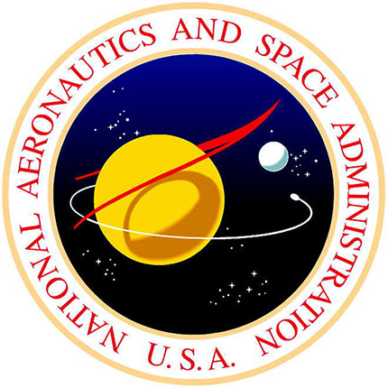
The NASA logo, known for its iconic design, has evolved significantly. The Original Insignia, often referred to as the “Meatball,” holds a special place in history. This section will explore the design elements and symbolism of this early emblem.
The Original Insignia features a round shape with a blue background. A red chevron, representing aeronautics, cuts through the circle. White stars scattered across the blue field symbolize space. The letters “NASA” prominently appear in the center, ensuring brand recognition.
The combination of these elements creates a dynamic and visually appealing logo. The use of bold colors and simple shapes makes it easily recognizable. This design has stood the test of time and remains a beloved symbol of exploration and innovation.
Each element in the Original Insignia has a deeper meaning. The blue background represents the boundless sky and outer space. The red chevron indicates aeronautics and advanced technology. The white stars symbolize the endless possibilities of space exploration.
The letters “NASA” stand for the National Aeronautics and Space Administration. Their central placement highlights the organization’s importance. Together, these elements convey a message of aspiration, achievement, and discovery.
Understanding the symbolism behind the NASA logo enhances its significance. It reflects the agency’s mission and the broader goals of human exploration.
The NASA “Meatball” logo is one of the most iconic logos in space history. It carries a rich history and a distinct design. This emblem is beloved by many and symbolizes NASA’s achievements and aspirations.
The Meatball logo was created in 1959. The National Advisory Committee for Aeronautics (NACA) needed a new emblem. James Modarelli, a NASA employee, designed it. NASA adopted the logo officially the same year. The design aimed to represent space exploration and aviation.
The Meatball logo has several distinct elements. A blue sphere represents a planet. A white starfield symbolizes space. A red vector signifies aeronautics. The NASA name curves across the logo in white. These elements together create a dynamic and memorable image.
The Worm Logo, introduced in 1975, represented a bold shift for NASA. This sleek and modern design aimed to refresh the agency’s image. It featured red, curvy letters spelling “NASA” without any crossbars. The logo, affectionately dubbed ‘the worm,’ became an icon of the space age.
Nasa aimed to create a modern and futuristic image. The Worm Logo reflected the technological advancements of the time. The streamlined design was simple yet impactful. It symbolized progress and innovation. This was a drastic change from the previous meatball logo. The Worm Logo was easy to reproduce on various materials. This practicality made it popular within the agency.
The public had mixed feelings about the new logo. Some people embraced the sleek and modern design. They felt it represented NASA’s cutting-edge technology. Others missed the traditional meatball logo. They felt the worm lacked the same charm and character. Over time, the Worm Logo gained a following. It became a symbol of the 1970s and 1980s space missions. Despite its initial controversy, it left a lasting impression.
The return of the NASA “Meatball” logo marked a significant shift. This beloved emblem, first introduced in 1959, made a comeback in 1992. Its revival was a nod to NASA’s rich heritage and a step forward in reconnecting with the public.
Several factors influenced the decision to bring back the “Meatball”. One primary reason was its strong emotional connection with both NASA employees and the public. The original logo, with its blue sphere, red chevron, and white stars, symbolized space exploration.
In the early 90s, NASA sought to recapture the public’s imagination. The “Meatball” had a nostalgic appeal that the newer “Worm” logo lacked. The return aimed to evoke a sense of pride and history.
Another reason was the desire for a unified brand identity. The “Meatball” provided a consistent and recognizable symbol that could be used across various platforms and missions.
The reintroduction of the “Meatball” had a profound impact on NASA’s branding. It helped re-establish a visual link to the agency’s golden era of space exploration. The logo became a symbol of trust and credibility, reinforcing NASA’s commitment to its mission.
With the “Meatball” back in place, merchandise sales surged. People wanted to own a piece of history. The logo’s timeless design made it popular on clothing, accessories, and educational materials.
Internally, the “Meatball” fostered a renewed sense of unity and purpose among NASA employees. It served as a reminder of the agency’s achievements and future ambitions.
Overall, the “Meatball” helped NASA reconnect with its audience. It bridged the past with the present, ensuring the agency’s legacy continued to inspire future generations.
The history of NASA’s logos is not just about its primary insignias. Special mission logos have also played a significant role. These logos represent specific missions and programs. Each tells a unique story and marks a milestone in space exploration.
The Apollo Program aimed to land humans on the moon. Its logo features a bold, stylized ‘A’ with a star in the crossbar. This simple yet powerful design symbolizes the spacecraft’s trajectory. The emblem also includes a silhouette of the moon. This highlights the mission’s primary goal. The Apollo logo became iconic, representing human ambition and achievement in space.
The Space Shuttle Era introduced a new phase of space travel. The shuttle program’s logo features the orbiter in a dynamic launch position. It often includes stars and a swooping trail. This signifies movement and progress. The colors are usually red, white, and blue. This pays homage to the United States. Each mission had its own unique patch. These patches featured detailed designs and mission-specific elements. The Space Shuttle logos captured the spirit of exploration and innovation.
The NASA logo has evolved significantly since its inception. Over the years, commemorative logos have marked key milestones and achievements. These special logos honor NASA’s rich history and significant events.
NASA has celebrated many milestones with unique logos. Each anniversary logo reflects the agency’s growth and progress.
| Anniversary | Year | Description |
|---|---|---|
| 10th | 1968 | Showcased NASA’s early achievements in space exploration. |
| 25th | 1983 | Highlighted key missions and technological advancements. |
| 50th | 2008 | Celebrated half a century of space innovation. |
Beyond anniversaries, NASA creates logos for major accomplishments. These logos often become iconic symbols of human achievement.
These logos tell stories of discovery, innovation, and the quest for knowledge. They remind us of what humanity can achieve through dedication and hard work.
Credit: www.nasa.gov
The future of NASA logos promises exciting possibilities. As NASA continues its mission to explore space, its logo will also evolve. The current logo reflects NASA’s rich history. But future designs will reflect new goals and technology. Let’s explore potential changes and design trends for NASA logos.
Future NASA logos may include more modern elements. This could mean sleeker lines and new color schemes. Logos might also represent new missions. Think of Mars exploration or deep space travel. Each mission could have its own unique logo. This approach can boost public interest and engagement.
Design trends often influence logos. Minimalism is a popular trend today. This means simple and clean designs. Future NASA logos might adopt this trend. Another trend is dynamic logos. These change based on context or platform. NASA’s logo could adapt to different media. Digital platforms might showcase animated logos. Print media might use static designs.
Another trend is the use of geometric shapes. These can symbolize precision and technology. NASA’s future logos might incorporate these shapes. This can give a modern and forward-looking feel. The use of bold typography is also trending. Future logos might feature strong, readable fonts. This ensures clarity and impact.
Credit: logos-world.net
The NASA logo, known as the “Meatball,” was created in 1959. It symbolizes space exploration with stars, a red chevron, and an orbiting spacecraft.
The NASA logo has undergone several changes. The “Worm” logo was introduced in 1975 and retired in 1992. The “Meatball” logo was then reinstated.
The “Meatball” logo represents space exploration. It features stars, a red chevron, and an orbiting spacecraft, symbolizing NASA’s mission.
The “Worm” logo was discontinued in 1992. NASA wanted to return to the classic “Meatball” logo, which held nostalgic and historical value.
The NASA logo tells a fascinating story. It evolved over decades. Each design reflects its time. From the “Meatball” to the “Worm,” each logo has significance. They symbolize innovation and exploration. The logos connect past achievements with future missions. They inspire space enthusiasts globally.
Understanding the NASA logo history deepens our appreciation. It shows how design can inspire. The logos are more than just images. They are symbols of human curiosity. The journey continues with each new mission. And so does the legacy of the NASA logo.

