Sprite Logo History: Evolution of an Iconic Brand Design
Sprite is one of the world’s most recognizable soft drink brands. Its logo has a fascinating history.
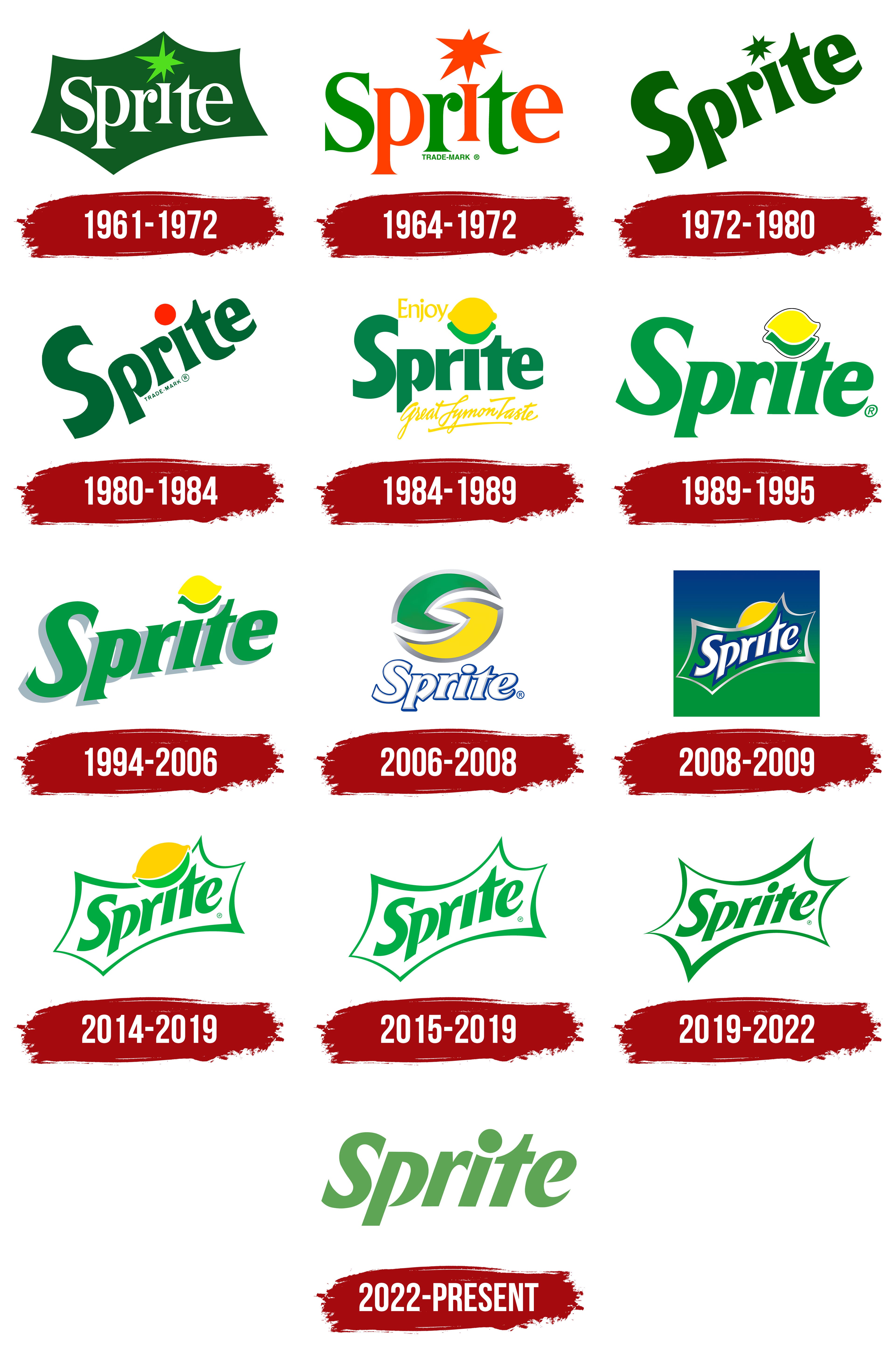
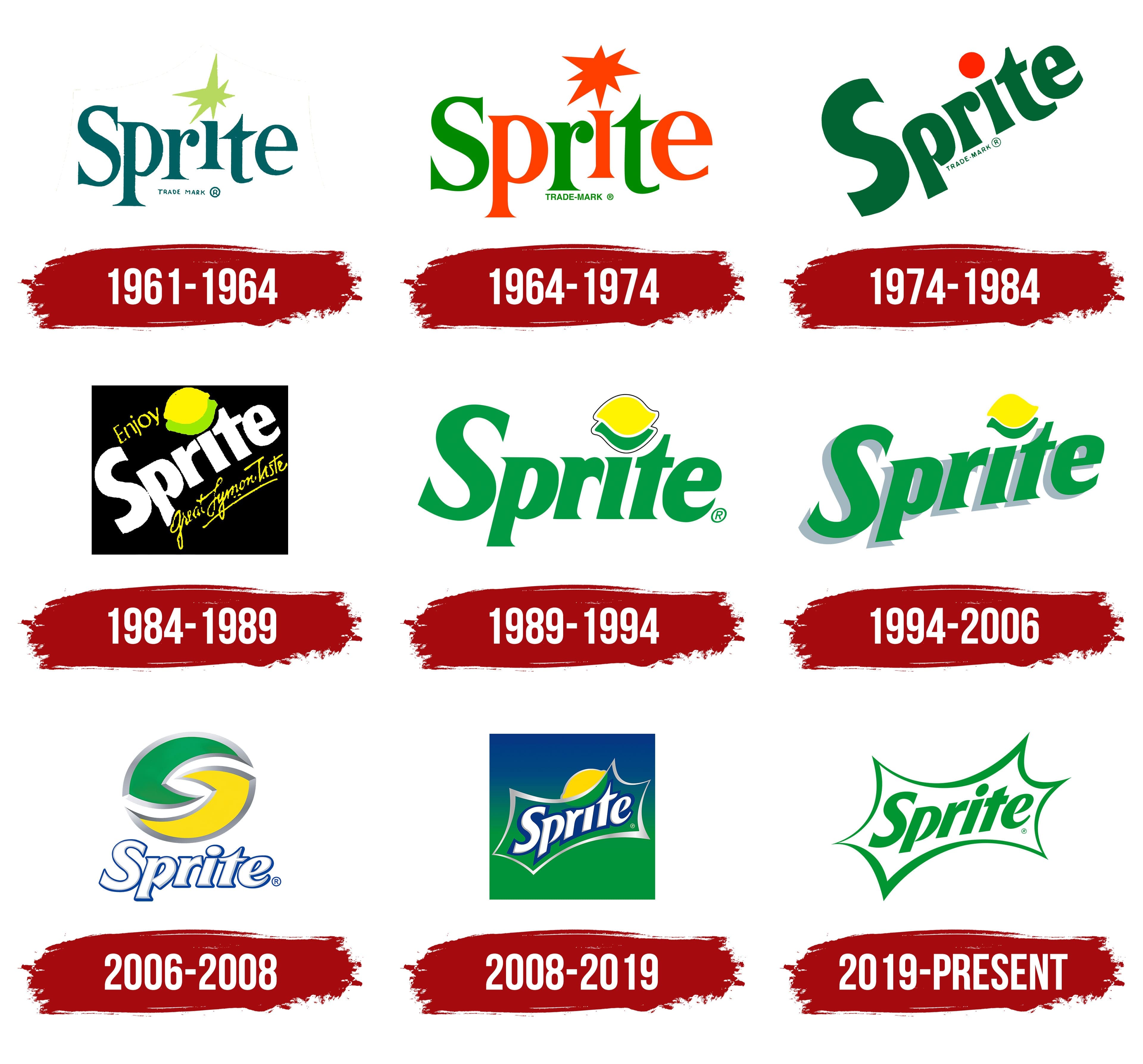
Understanding the evolution of the Sprite logo offers a glimpse into the brand’s journey. Over the years, the Sprite logo has seen several changes, each reflecting the brand’s growth and the changing times. From its early beginnings in the 1960s to the modern design, every iteration tells a story.
The logo’s transformation mirrors shifts in design trends and consumer preferences. Whether you’re a design enthusiast or just curious, exploring Sprite’s logo history is both interesting and insightful. Let’s dive into the story behind the iconic Sprite logo and see how it has evolved through the decades.

Early Beginnings
Sprite, a refreshing lemon-lime soda, has a rich history. Its logo has evolved over the decades. The journey of Sprite’s logo began in the early 1960s. Let’s dive into its early beginnings.
First Logo Design
Sprite was introduced by Coca-Cola in 1961. The first logo was simple yet effective. It featured a bold, green wordmark. The letters had a playful, bubbly feel. This design aimed to reflect the product’s refreshing nature.
The logo also included a small lemon and lime symbol. This emphasized the drink’s citrus flavor. The colors used were green and yellow, representing lemon and lime. This design set the stage for Sprite’s brand identity.
Initial Brand Identity
Sprite’s initial brand identity focused on refreshment and youthfulness. The brand targeted a younger audience. The logo’s playful design helped achieve this goal. It was simple but memorable.
Advertising campaigns also played a key role. They highlighted the beverage’s crisp, clean taste. The catchy slogan “Obey Your Thirst” resonated with many. This phrase became synonymous with Sprite.
In these early years, Sprite established a strong presence. The combination of a bold logo and effective marketing worked well. It laid a solid foundation for the brand’s future.

1960s Redesign
The 1960s marked a significant change for Sprite. This decade saw the introduction of a new logo. The redesign aimed to capture attention. It also reflected the brand’s unique identity. The changes made during this period became iconic. They set the stage for Sprite’s future branding.
Introduction Of The Lemon-lime Theme
The 1960s redesign introduced the lemon-lime theme. This theme became a core part of Sprite’s identity. It emphasized the refreshing flavor of the drink. The logo featured a lemon and lime motif. This was a visual representation of the beverage’s taste.
Incorporating fruits into the logo was a clever move. It made the product instantly recognizable. Consumers could immediately associate the logo with a refreshing drink. The lemon-lime theme was not just a design choice. It was a strategic decision to highlight the product’s unique selling point.
Incorporating Vibrant Colors
The redesign also focused on using vibrant colors. The logo featured bright green and yellow shades. These colors were eye-catching and memorable. They stood out on store shelves. The use of vibrant colors was a key factor in the logo’s success.
In addition to green and yellow, white was also used. This created a clean and crisp look. The color scheme was not only attractive. It also conveyed a sense of freshness. The vibrant colors helped to establish Sprite as a modern and lively brand.
| Color | Representation |
|---|---|
| Green | Freshness |
| Yellow | Energy |
| White | Cleanliness |
The combination of these elements made the 1960s redesign a success. It set the foundation for Sprite’s branding in the years to come. The lemon-lime theme and vibrant colors became synonymous with the brand. They helped to create a strong and lasting impression.
1970s Modernization
The 1970s brought significant changes to Sprite’s branding. The company aimed to modernize its image. This decade saw a transformation in the logo design. The goal was to make it more appealing and contemporary. Let’s delve into the details of these changes.
Streamlined Logo
Sprite introduced a more streamlined logo in the 1970s. The new design was simpler. It featured cleaner lines and fewer elements. This change made the logo more recognizable. The minimalistic approach resonated with the audience.
The streamlined logo also aimed for a modern look. It represented the brand’s fresh and clear image. This update helped solidify Sprite’s position in the market. The streamlined design became iconic over time.
Bold Typography
The typography in the 1970s logo was bold. The letters were thick and prominent. This style made the brand name stand out. The bold text was easy to read. It grabbed attention quickly.
The choice of bold typography reflected confidence. It showed that Sprite was a strong and reliable brand. This design choice played a crucial role in brand recognition. The bold letters left a lasting impression on consumers.
1980s Innovations
The 1980s marked a transformative period for the Sprite logo. This decade saw the introduction of new, dynamic elements that helped enhance brand recognition. These innovations played a crucial role in solidifying Sprite’s place in the beverage industry.
Incorporating Dynamic Elements
In the early 1980s, Sprite began to incorporate more dynamic elements into its logo. The design featured vibrant colors and bold lines. This approach aimed to capture the youthful and energetic spirit of the brand.
The introduction of a more playful font also added to the logo’s appeal. This font was modern and easy to read, making the logo more attractive to a younger audience.
Another significant change was the inclusion of a lemon-lime symbol. This symbol highlighted Sprite’s refreshing flavor and made the logo more visually appealing.
Enhanced Brand Recognition
The innovations of the 1980s played a key role in enhancing Sprite’s brand recognition. The new logo was more memorable and easier to identify. This helped Sprite stand out on crowded store shelves.
One of the most effective strategies was the consistent use of the lemon-lime colors. These colors became synonymous with Sprite and helped reinforce its brand identity.
Additionally, the updated logo was used across various marketing materials. This consistent use helped build a strong brand image in the minds of consumers.
Overall, the 1980s innovations in the Sprite logo design were instrumental in strengthening the brand’s market presence. The dynamic elements and enhanced recognition helped Sprite connect with a broader audience and establish itself as a leader in the soft drink industry.
1990s Refresh
The 1990s brought a fresh and exciting change to Sprite’s branding. This decade was pivotal for the company, as it embarked on a journey to modernize its logo and connect with a new generation of consumers.
Introduction Of The Blue Wave
In the early 1990s, Sprite introduced a significant update to its logo. The new design featured a dynamic blue wave. This wave added a sense of motion and energy. It represented the brand’s refreshing and lively character. The blue wave became a central element of Sprite’s visual identity. It complemented the familiar green and yellow colors, creating a vibrant and eye-catching logo.
Targeting Younger Audiences
During the 1990s, Sprite shifted its focus to younger audiences. The new logo played a crucial role in this strategy. The energetic design of the blue wave appealed to the youth. Sprite also launched campaigns that resonated with the younger generation. These campaigns were edgy and bold. They featured slogans like “Obey Your Thirst”. This approach helped Sprite establish a strong connection with young consumers. It positioned the brand as cool and trendy.
The 1990s refresh was a successful move for Sprite. The brand’s new logo and marketing strategies resonated well with the target audience. This era marked a significant chapter in Sprite’s logo history, setting the stage for future innovations.

2000s Simplification
The 2000s saw Sprite simplify its logo. The design became cleaner, focusing on the iconic green and yellow colors.
In the 2000s, Sprite decided to simplify its logo. This change aimed to keep the design clean and modern. They wanted to appeal to a younger audience. The new logo focused on clarity and simplicity.Minimalist Design
Sprite opted for a minimalist design. The logo featured fewer elements. It used a bold, sans-serif font. The green and yellow colors were kept. These colors reflect freshness and energy. The lemon-lime icon was simplified. This icon became a key part of the brand identity.Global Brand Consistency
Consistency was crucial for Sprite’s global presence. The simplified logo was easy to recognize. It worked well in different cultures. Sprite ensured the logo looked good on all packaging. This included cans, bottles, and advertising materials. The uniform look helped build a strong brand.2010s Evolution
The 2010s marked a significant period for the Sprite logo. This decade saw the brand embracing its roots while adapting to the digital age. These changes helped Sprite stay relevant and fresh. Let’s explore the key elements of this evolution.
Return To Classic Elements
Sprite reintroduced familiar design elements from its past. The iconic green color made a strong comeback. The lemon-lime imagery became more prominent. These classic features resonated with long-time fans. They also attracted new ones. Nostalgia played a big role in this strategy.
Emphasis On Digital Presence
During the 2010s, Sprite focused on enhancing its digital presence. The logo was optimized for online platforms. It became more versatile and adaptable. This ensured consistent branding across social media and websites. The digital-friendly design appealed to the younger audience.
Sprite also used digital marketing campaigns. These campaigns leveraged the new logo effectively. The brand engaged with its audience through interactive content. This approach boosted Sprite’s visibility and popularity online.
Current Design
The Sprite logo has evolved over the years, reflecting the brand’s dynamic nature. The current design showcases a modern and fresh look, embodying the essence of the drink. This section delves into the key aspects of the current Sprite logo design.
Modern Aesthetics
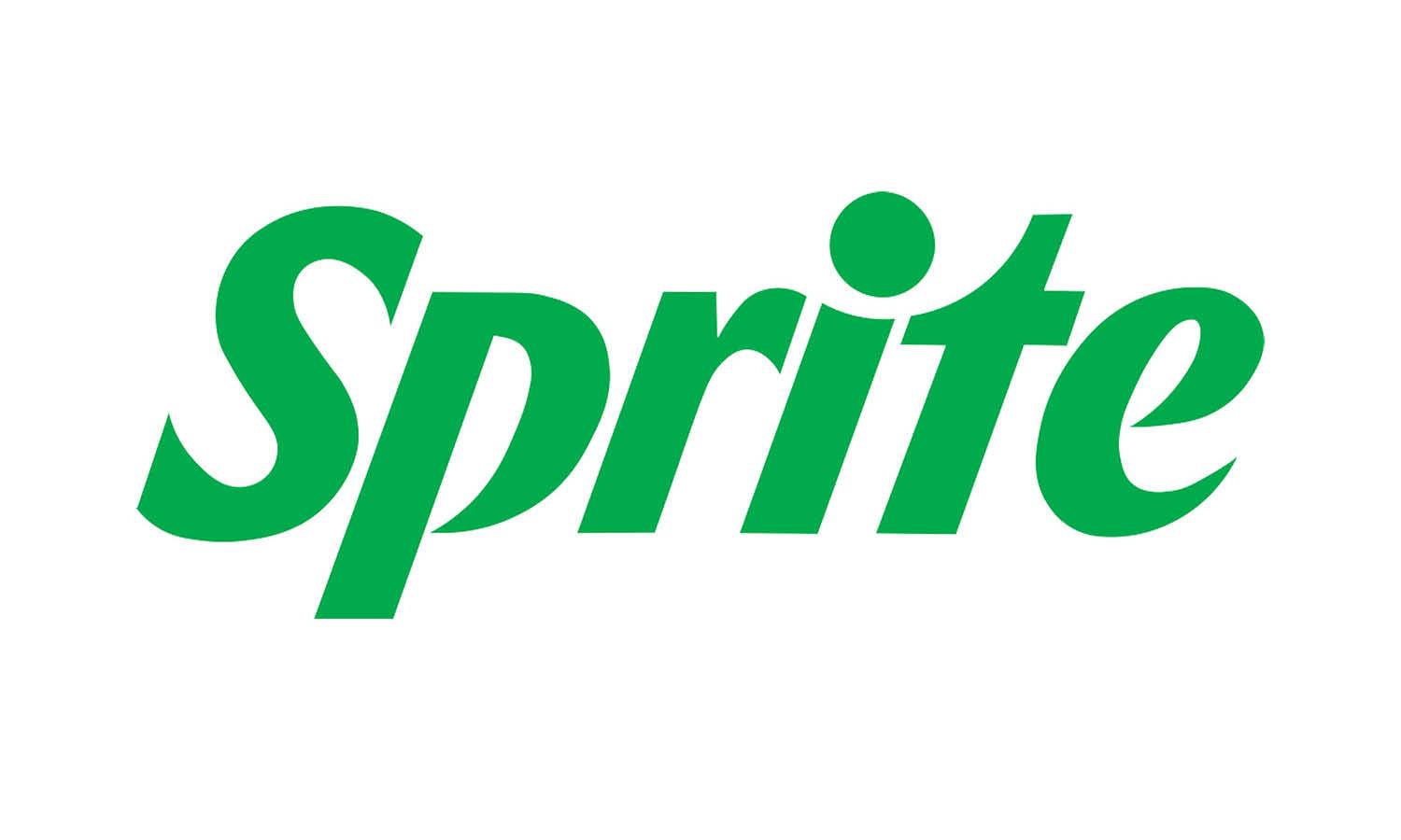
The current Sprite logo features clean lines and a minimalist approach. The design uses a vibrant green color, representing freshness and energy. The font is sleek, offering a contemporary feel that appeals to younger audiences. The lemon-lime imagery remains central, emphasizing the drink’s citrus flavor.
Sustainability Focus
Sprite has also integrated sustainability into its logo design. The new look promotes an eco-friendly image, aligning with the brand’s commitment to the environment. The logo’s green elements symbolize Sprite’s efforts to reduce its carbon footprint. This design choice resonates with environmentally conscious consumers.
Frequently Asked Questions
What Is Sprite’s Original Logo?
Sprite’s original logo, introduced in 1961, featured a green and blue design with a stylized lemon-lime emblem. It represented the fresh, citrus flavor of the drink.
How Has Sprite’s Logo Evolved?
Sprite’s logo has evolved through various redesigns, reflecting contemporary trends. The updates have maintained the iconic green color, ensuring brand recognition.
When Did Sprite Change Its Logo?
Sprite has changed its logo multiple times. Significant redesigns occurred in 1987, 2006, and 2019, each modernizing the brand’s image.
Why Did Sprite Update Its Logo?
Sprite updates its logo to stay relevant, attract new audiences, and reflect modern design trends. Each redesign aims to keep the brand fresh.
Conclusion
Sprite’s logo history reflects its evolution and growth. Each redesign brought fresh energy. The brand maintained its core identity, yet adapted to modern trends. This journey shows Sprite’s dedication to staying relevant. Their logo changes keep the brand lively and appealing.
Understanding this evolution gives insight into Sprite’s branding strategy. The logo’s journey is as refreshing as the drink itself. Sprite’s visual identity continues to captivate and inspire. Stay tuned for future updates and transformations.


