


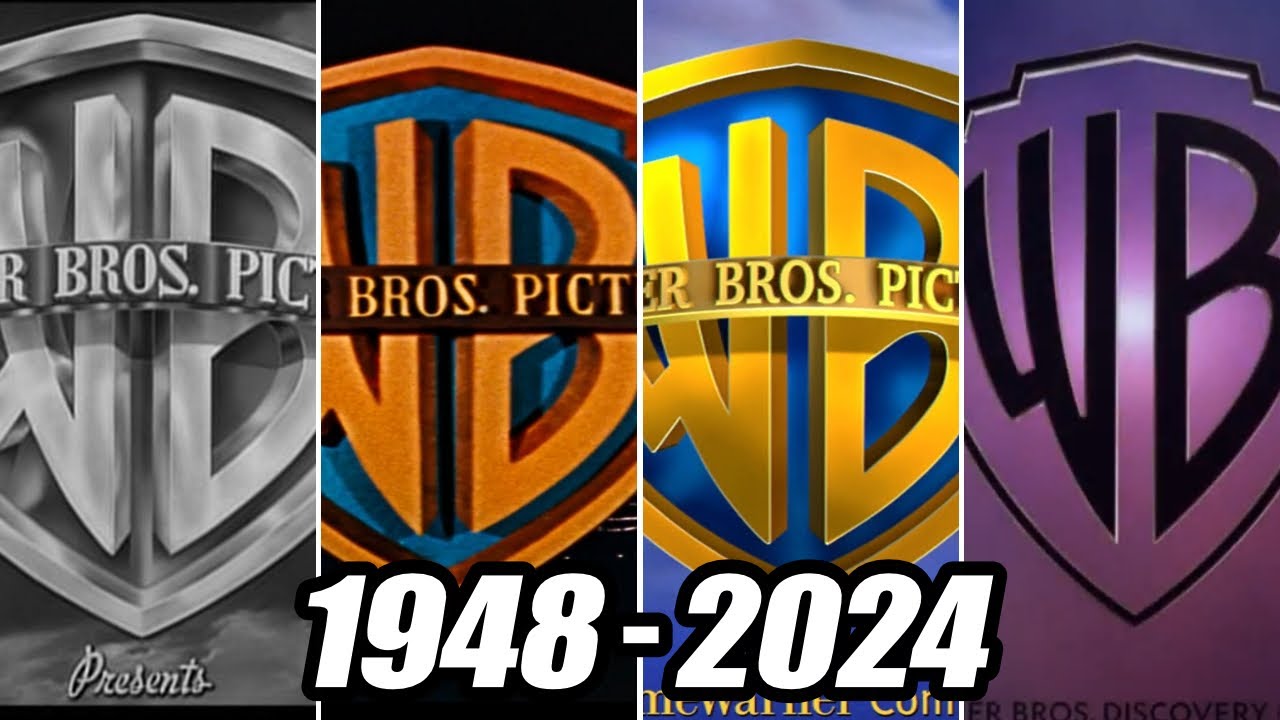
The Warner Bros logo is iconic. It has evolved over decades.
This logo represents one of the most famous studios in Hollywood. Each change in the logo’s design tells a story. From its early days to the modern era, it reflects the studio’s growth. Warner Bros, founded in 1923, has shaped the film industry.
Its logo is a symbol of entertainment. The shield and the letters WB are recognized worldwide. The design changes mirror the technological and creative shifts in cinema. Today, we’ll explore the fascinating journey of the Warner Bros logo. From black-and-white beginnings to the colorful present, each version has its charm. Let’s dive into the history of this legendary symbol and see how it has transformed over time.
The story of Warner Bros begins with four ambitious brothers. Their journey from humble beginnings to Hollywood giants is fascinating. This section delves into their origins and early logo design.
Warner Bros was founded by four brothers: Harry, Albert, Sam, and Jack Warner. They were the sons of Polish immigrants who settled in the United States.
In the early 1900s, the brothers started in the film industry. They began by showing movies in Ohio and Pennsylvania. Their first theater was called the Cascade, located in New Castle, Pennsylvania.
By 1923, the brothers had established Warner Bros Pictures, Inc. They wanted to create a company that produced and distributed films. This marked the beginning of their journey to success.
The first Warner Bros logo was simple. It featured a shield with the initials WB inside it. This design was meant to symbolize strength and protection.
As the company grew, the logo evolved. In the 1930s, the shield became more detailed. A banner with the words “Warner Bros Pictures, Inc.” was added. This version of the logo became iconic.
In the 1940s, the logo saw another change. The shield remained, but the design became more streamlined. The words were simplified to just “Warner Bros.” This version was used for many years.
Throughout its history, the Warner Bros logo has seen many changes. Yet, the shield has always remained a key element. This has helped the logo stay recognizable and strong.
Warner Bros has a rich history. The 1920s and 1930s were crucial in shaping its identity. This period saw the rise of the studio’s logo, evolving with the times. Let’s dive into the details of this transformation.
In the 1920s, Warner Bros used a simple shield logo. It featured a “WB” monogram, representing Warner Bros. The design was straightforward. It was easy to recognize. During the silent film era, this logo became iconic. Audiences began to associate it with quality entertainment.
The 1930s brought a major change. The studio introduced sound in movies. This was a groundbreaking development. With this, the Warner Bros logo also evolved. They added sound waves to the shield. It symbolized their leap into the future. This new logo reflected innovation. It showcased their commitment to progress.
Warner Bros was now a leader in the industry. Their logo was a symbol of excellence. The changes in the 1930s set the stage for decades of success.
The Golden Age of Hollywood, spanning the 1930s to the 1950s, marked a transformative era in the film industry. This period saw the rise of iconic studios, legendary stars, and unforgettable movies. Warner Bros played a significant role during this time, leaving a lasting impact with its distinct logo.
The Classic Shield Design of Warner Bros’ logo became synonymous with quality films. This iconic emblem featured a shield with the letters “WB” prominently displayed. The design exuded strength and reliability, making it recognizable worldwide. It became a symbol of the studio’s commitment to storytelling and innovation.
Technicolor revolutionized the film industry by bringing vibrant colors to the screen. Warner Bros embraced this technology, enhancing the visual appeal of their movies. The logo’s bright colors stood out even more, catching the audience’s attention. This use of Technicolor helped Warner Bros’ films become visually stunning and memorable.
After World War II, Warner Bros saw many changes. The company wanted to stay fresh and modern. They knew a new look would help. So, they started to innovate. They made changes to the logo and branding. These changes reflected the new era.
The 1950s brought television into many homes. Warner Bros saw this as a chance. They wanted to reach more people. The logo had to work on TV screens. So, they made it simple and clear. This helped the logo stand out.
They used bright colors and bold lines. The shield shape became more defined. This new look was easy to recognize. It worked well on TV and in print. The logo became a symbol of quality entertainment.
In the 1980s, Warner Bros updated their logo again. They wanted a sleek and modern look. They kept the shield shape but made it more stylish. The letters WB were bold and clean. This new logo showed growth and innovation.
They also focused on digital media. The logo had to look good on computers and video games. So, they tested the design on different screens. This helped ensure it looked great everywhere. The modern logo was a hit with fans.
The 1970s and 1980s were pivotal decades for Warner Bros. The company underwent significant changes during this time. These years saw a streamlined logo design and the expansion into new media.
During the 1970s, the Warner Bros logo underwent a major transformation. The company decided to simplify its iconic shield. This new design featured a bold, clean look, focusing on the letters “WB”. The change aimed to make the logo more modern and versatile.
The simplified design helped Warner Bros maintain a strong brand identity. It was easier to recognize and adapt across different platforms. The new logo was also more suitable for the emerging digital age.
In the 1980s, Warner Bros started expanding into new media. This was a time of technological advancements and growing entertainment options. Warner Bros seized the opportunity to diversify its portfolio.
They entered the television industry with great success. Shows produced by Warner Bros became household names. The company also ventured into home video, creating a new revenue stream. This expansion strategy helped Warner Bros stay competitive and relevant.
The 1980s also saw Warner Bros exploring the music industry. They acquired various record labels and produced hit albums. This move further strengthened their presence in the entertainment world.
The Warner Bros logo has undergone significant changes over the years. The digital age brought a new dimension to its design. This era saw the introduction of 3D elements and computer-generated imagery (CGI). These advancements helped to modernize the iconic shield. Below, we explore key aspects of this transformation.
The 3D logo introduction marked a significant leap. The flat, two-dimensional design evolved into a more dynamic form. This change enhanced the visual appeal. The shield gained depth and texture, creating a more modern look.
Here is a comparison:
| Feature | 2D Logo | 3D Logo |
|---|---|---|
| Depth | Flat | Three-dimensional |
| Texture | Smooth | Detailed |
| Visual Appeal | Basic | Modern |
CGI played a crucial role in the logo transformation. Computer-generated imagery allowed for intricate details. This technology made the logo appear more realistic. The shield now had shadows and highlights, adding to its depth.
Key benefits of CGI include:
CGI helped keep the logo relevant in the digital age. The changes ensured that the Warner Bros brand stayed current. This transformation reflected the company’s innovation and commitment to quality.
The 21st century brought significant changes to the Warner Bros logo. This rebranding aimed to modernize the iconic emblem while ensuring it retained its classic appeal. The updated design reflects the company’s evolution and its commitment to staying relevant in a rapidly changing entertainment industry.
The new Warner Bros logo features a streamlined design. The iconic shield shape remains, but with cleaner lines and a more minimalist approach. The once detailed elements have been simplified. This gives the logo a contemporary look while maintaining its recognizable form.
This modern approach ensures the logo is versatile. It can easily adapt to various digital and print formats. The simplified design also allows for better scalability. Whether on a large billboard or a small mobile screen, the logo retains its clarity and impact.
With the rebranding, Warner Bros aimed to enhance its global recognition. The new logo is designed to be universally appealing. The classic blue and gold color scheme remains, symbolizing trust and excellence. This helps in maintaining a connection with the brand’s rich history.
The updated logo also aligns with Warner Bros’ international reach. It is easily recognizable across different cultures and markets. This consistency supports the brand’s global presence, ensuring that audiences everywhere can identify and connect with Warner Bros.
Below is a comparison table showing the key differences between the old and new logos:
| Aspect | Old Logo | New Logo |
|---|---|---|
| Design | Detailed | Simplified |
| Color Scheme | Blue and Gold | Blue and Gold |
| Scalability | Limited | High |
The rebranding of the Warner Bros logo in the 21st century demonstrates the company’s ability to evolve with the times. The streamlined design and enhanced global recognition ensure the logo remains iconic and relevant in the modern era.
The Warner Bros logo has a rich history. It has evolved, yet its legacy continues. The iconic shield represents a century of storytelling magic. Let’s explore how this emblem has stood the test of time.
The current Warner Bros logo was introduced in 2019. It features a sleek, modern design while retaining the classic shield shape. The letters “WB” are stylized and integrated into the shield, giving a contemporary feel. This update aligns with Warner Bros’ forward-thinking approach, blending tradition with innovation.
The color palette is now a vibrant blue and white. This change symbolizes freshness and dynamism. The logo is versatile, appearing in various forms across different media platforms. It adapts to both digital and traditional formats seamlessly.
The Warner Bros logo has made a significant impact on pop culture. Recognizable worldwide, it evokes nostalgia and excitement. It signals the start of beloved films and TV shows, creating an emotional connection with audiences.
The shield has appeared in countless parodies and homages. It’s a symbol of quality entertainment. From Looney Tunes to Harry Potter, the logo is synonymous with blockbuster franchises. This deep connection with audiences enhances Warner Bros’ brand identity.
In conclusion, the Warner Bros logo is more than just a symbol. It’s a legacy that continues to evolve and inspire.
The Warner Bros logo has evolved since its creation in 1923. It has undergone several redesigns reflecting changes in the company’s branding and technology.
The Warner Bros logo has changed from a shield design to a more modern look. Each change represents technological advances and branding shifts.
The first Warner Bros logo was introduced in 1923. It featured a simple shield with the initials “WB” prominently displayed.
Warner Bros updated their logo to stay current with design trends. Each update modernized the brand while maintaining its iconic elements.
The Warner Bros logo has evolved over the years. Each change reflects a new era. From the classic shield to the sleek design today, it tells a story. The logo remains iconic and instantly recognizable. Fans appreciate its rich history and significance.
Warner Bros continues to innovate and entertain. Their logo is a symbol of quality and creativity. Stay tuned for more exciting updates from this legendary studio.

