History of Wendy’s Logo: Evolution and Iconic Design
Wendy’s is a well-known fast-food chain with an iconic logo. The logo has evolved over time, reflecting changes in the brand.
The history of Wendy’s logo is fascinating. It tells the story of how the brand has grown and adapted. Wendy’s started with a simple design, but as the company expanded, the logo changed. Each version of the logo has a unique story and meaning.
From the classic redhead girl to the modern design, every change has a reason. Understanding these changes helps us appreciate the brand’s journey. Let’s dive into the history of Wendy’s logo and see how it has transformed over the years.

Founding Of Wendy’s
Wendy’s is a well-known fast-food chain with a rich history. It all began with a man named Dave Thomas. His vision led to the creation of Wendy’s, which has grown into a beloved brand. Let’s explore the founding of Wendy’s in more detail.
Dave Thomas’ Vision
Dave Thomas had a passion for good food and great service. He wanted to create a place where families could enjoy delicious meals together. In 1969, he turned this dream into reality. He named the restaurant after his daughter, Wendy.
Dave believed in using fresh, quality ingredients. He focused on making burgers that were made to order. This set Wendy’s apart from other fast-food chains. His vision was simple: serve great food quickly, without compromising on quality.
Opening Of The First Restaurant
The first Wendy’s restaurant opened on November 15, 1969. It was located in Columbus, Ohio. The restaurant became popular for its square-shaped patties. This unique shape made Wendy’s burgers stand out.
Customers loved the friendly atmosphere and tasty food. The success of the first restaurant led to the opening of more locations. Wendy’s quickly became a favorite spot for many families. Dave’s dedication to quality and service made Wendy’s a trusted name in fast food.

Original Logo Design
Wendy’s original logo design is iconic and instantly recognizable. This logo marked the beginning of Wendy’s journey in the fast-food industry. It represents the brand’s identity and values.
Inspiration And Concept
The original Wendy’s logo drew inspiration from founder Dave Thomas’s daughter. Her name is Melinda Lou, but they called her Wendy. The logo featured a young, red-haired girl with pigtails. The idea was to create a friendly and welcoming image. This image aimed to appeal to families and children.
Elements Of The First Logo
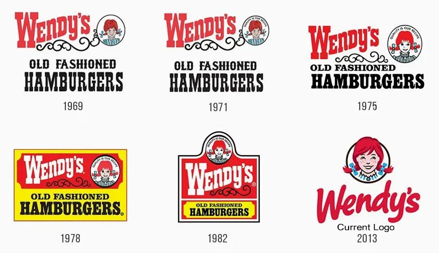
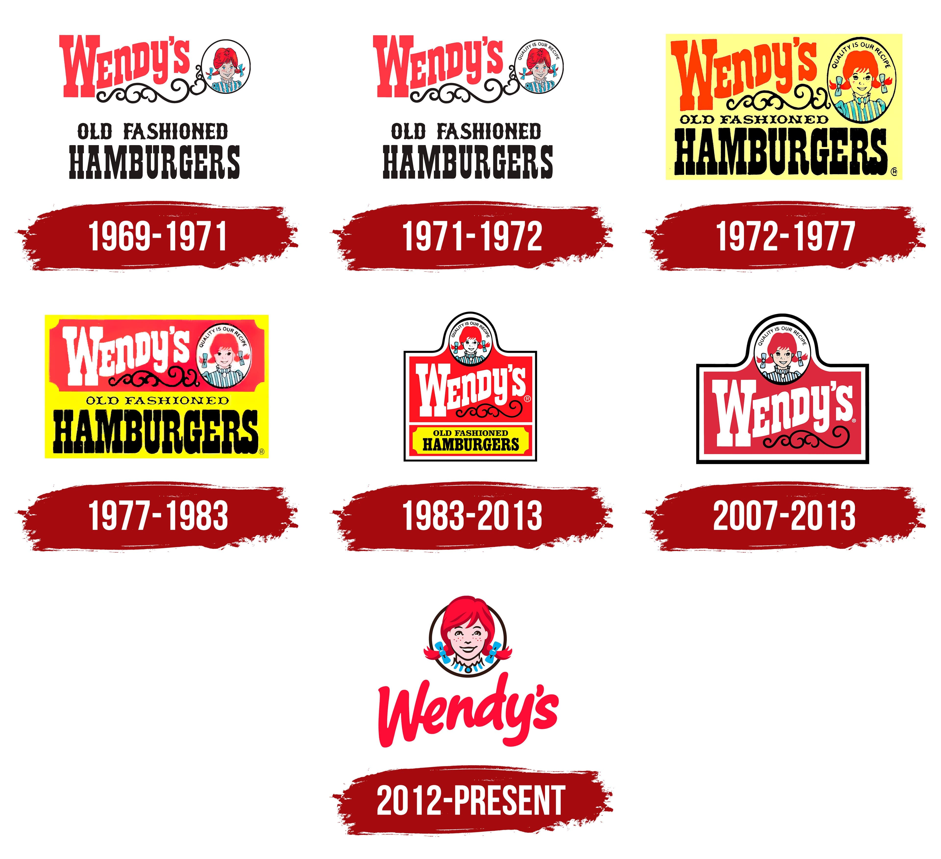
The first logo had a charming and simple design. The girl’s face was the focal point. She wore a blue and white striped dress. Her bright red hair made her stand out. The logo also featured the words “Quality Is Our Recipe”. This slogan emphasized Wendy’s commitment to quality food. The typeface was bold and easy to read. The colors were vibrant and eye-catching. All these elements combined to create a memorable logo. It helped Wendy’s build a strong brand presence.
1970s Logo Changes
The 1970s were a transformative decade for Wendy’s, especially regarding its logo. Wendy’s wanted a fresh look to stand out from competitors. This decade saw several key changes that shaped the brand’s identity.
Early Modifications
In the early 1970s, Wendy’s made some significant updates to its logo. The original design featured a simple, straightforward look. The company wanted a more playful and friendly appearance. Wendy’s added a young girl with red pigtails to the logo. This character, named after the founder’s daughter, became the brand’s face.
The font of the logo also changed during this period. The new font was bolder and more whimsical. It aimed to attract families and children. The color scheme shifted to a bright red and yellow. These colors were eye-catching and created a warm, inviting feel.
Introduction Of The Slogan
Another critical change in the 1970s was the introduction of a slogan. Wendy’s wanted to emphasize its commitment to quality. The slogan “Quality is our Recipe” was introduced. This phrase appeared alongside the logo. It helped to reinforce the brand’s values.
The slogan change was crucial for marketing. It differentiated Wendy’s from other fast-food chains. Customers began to associate Wendy’s with fresh, high-quality ingredients. This focus on quality became a cornerstone of the brand’s identity.
The combination of the updated logo and the new slogan helped Wendy’s grow. The brand became more recognizable and trusted. These changes laid the foundation for Wendy’s future success.

1980s Logo Evolution
The 1980s marked a significant period for Wendy’s logo. This era saw the brand make important changes. These changes aimed to modernize and refresh its image.
Modernization Efforts
During the 1980s, Wendy’s undertook modernization efforts. The goal was to keep the brand relevant. They tweaked the logo’s design elements. The font became bolder and more readable. This made the logo stand out more.
The color scheme also saw adjustments. Brighter shades of red and yellow were used. This gave the logo a more vibrant look. These changes attracted new customers. At the same time, they retained loyal fans.
Impact On Brand Identity
The logo evolution had a big impact. It helped Wendy’s build a stronger brand identity. The new logo was more than just a visual update. It represented the brand’s commitment to quality and innovation.
Consumers began to associate the new logo with fresh, tasty food. This strengthened brand loyalty. The updated logo also made Wendy’s more recognizable. This was crucial in a competitive market.
1990s Logo Redesign
In the 1990s, Wendy’s decided to update its logo. The fast-food chain wanted a fresh, modern look. This redesign aimed to simplify and refine the existing logo while keeping its essence intact.
Simplification And Refinement
The previous Wendy’s logo had a lot of details. The company decided to remove some of these elements to make the logo cleaner and easier to recognize. They kept the iconic image of Wendy, the little girl with red pigtails. But, they simplified her facial features and hairstyle.
They also made changes to the font. The letters became bolder and simpler. This made the logo more readable at a glance. The background was made less busy by removing some intricate patterns.
| Element | Old Logo | New Logo |
|---|---|---|
| Wendy’s Image | Detailed facial features, complex hairstyle | Simplified features, cleaner hairstyle |
| Font | Complex, ornate | Bold, simple |
| Background | Intricate patterns | Cleaner, less busy |
Consumer Reception
The new logo received mixed reviews at first. Some long-time customers missed the old, familiar design. But many people appreciated the new, simpler look. They found it easier to read and recognize from a distance.
Over time, the new logo grew on people. It became a symbol of the brand’s modern approach while still holding onto its roots. The simplified design also made it easier for the logo to be used in various formats, like packaging and advertising materials.
Wendy’s saw an increase in brand recognition. The simplified logo helped the brand stand out in the crowded fast-food market.
2000s Logo Update
In the 2000s, Wendy’s decided to update its logo. The goal was to keep the brand fresh and relevant. This was important as the digital age was emerging. The new design aimed to balance modern trends and the brand’s classic feel.
Adaptation To Digital Age
The 2000s logo update focused on digital adaptability. The previous design was complex. It needed simplification for digital use. The new logo had bolder lines. It was more streamlined. This made it easier to display on screens. Websites and mobile apps needed clear visuals. The updated logo met these requirements.
Another change was the font. The old serif font was replaced. The new font was sans-serif. It was more readable on digital platforms. The colors were also tweaked. The red was made brighter. This helped it stand out in online environments.
Maintaining Brand Consistency
While updating the logo, consistency was key. The iconic image of Wendy was kept. It was slightly modernized but still recognizable. This helped maintain brand loyalty. Customers knew the brand at a glance.
The logo still featured the classic red and yellow. These colors were part of Wendy’s identity. The tagline remained unchanged. “Quality is Our Recipe” was still visible. This kept the brand message clear.
The 2000s update balanced modern needs and tradition. It adapted to the digital age while keeping core elements. This ensured Wendy’s stayed relevant and familiar.
Current Logo
The current logo of Wendy’s is a modern take on the classic design. It reflects the brand’s commitment to quality and staying relevant in a changing market. The updated logo keeps the friendly and familiar image while introducing sleeker lines and a contemporary feel.
Design Elements
The logo features Wendy with her iconic red pigtails and freckles. The text “Wendy’s” is written in a bold, cursive font, which adds a nostalgic touch. The colors are vibrant, with red, white, and blue being the primary palette. The red stands out, drawing attention and evoking warmth and friendliness.
Significance And Recognition
The current logo maintains the brand’s identity and helps it stand out. The familiar face of Wendy ensures customers recognize the brand instantly. This recognition builds trust and loyalty, essential for retaining customers. The logo’s design also conveys a sense of tradition and quality, important aspects of Wendy’s brand message.
Frequently Asked Questions
When Was The First Wendy’s Logo Created?
The first Wendy’s logo was created in 1969. It featured a smiling, pig-tailed girl, representing the founder’s daughter.
How Has Wendy’s Logo Evolved Over Time?
Wendy’s logo has evolved several times. Major changes occurred in 1971, 1983, 2013, and 2021, reflecting modern design trends.
What Does Wendy’s Current Logo Represent?
Wendy’s current logo represents a more contemporary look. It maintains the iconic red-haired girl while enhancing brand recognition.
Why Did Wendy’s Change Their Logo In 2013?
Wendy’s changed their logo in 2013 to refresh their brand image. The update aimed to attract a modern audience.
Conclusion
The Wendy’s logo has changed over the years. Each version tells a story. From the classic red-haired girl to the modern, sleek design. Every update reflects the brand’s growth and values. Wendy’s stays true to its roots while embracing change.
The logo evolution shows a blend of tradition and innovation. It’s more than a symbol; it connects with customers. Wendy’s continues to inspire trust and loyalty through its iconic image. This journey of the logo is a testament to Wendy’s enduring legacy.


