


H&M is a well-known clothing brand. Its logo is iconic and recognizable worldwide.
Understanding the H&M logo’s history and meaning can be fascinating. The H&M logo is more than just a design; it tells a story. Founded in 1947, the brand has evolved over the decades. The logo has changed too, reflecting the brand’s growth and vision.
By decoding the H&M logo, we uncover its rich history and the values it represents. This exploration will reveal how the logo embodies the brand’s identity and connects with its audience. Join us as we delve into the symbol and meaning behind one of the world’s favorite clothing brands.
The H&M logo is a symbol recognized worldwide. It embodies the brand’s commitment to fast fashion and affordability. Understanding the origins of the H&M logo provides insight into its journey and evolution. This section delves into the early years and the initial design of the iconic H&M logo.
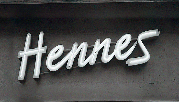
H&M, short for Hennes & Mauritz, started in 1947. The company’s founder, Erling Persson, launched the first store in Västerås, Sweden. The original store was named “Hennes,” which means “Hers” in Swedish. It catered exclusively to women’s clothing.
In 1968, Persson acquired a hunting and fishing equipment store named Mauritz Widforss. The merger of these two names gave birth to Hennes & Mauritz. This marked the beginning of H&M as we know it today.
The initial H&M logo was simple yet effective. It featured a straightforward and clean design. The logo consisted of the letters “H” and “M” in a serif font. The simplicity of the design reflected the brand’s straightforward approach to fashion.
Over the years, the logo evolved to adapt to changing trends. Yet, it always retained its core elements. Today, the H&M logo remains iconic and instantly recognizable. It continues to symbolize the brand’s dedication to style and affordability.

Credit: www.linkedin.com
The H&M logo has evolved over the decades, reflecting the brand’s growth and transformation. From its early days to its modern look, each change tells a story of its own. Let’s dive into the key changes and modern iterations of the H&M logo.
The H&M logo has undergone several transformations since its inception. Each change aimed to make the brand more recognizable and memorable.
| Year | Change |
|---|---|
| 1947 | Hennes logo was simple and elegant, focusing on the word “Hennes”. |
| 1968 | After the merger with Mauritz, the logo changed to Hennes & Mauritz. |
| 1974 | The company rebranded to HM, introducing the iconic red and white colors. |
| 1990s | The logo was refined with a cleaner, more modern font. |
In the recent years, the H&M logo has seen subtle tweaks to keep it fresh and relevant. These changes ensure the brand stays modern and appealing to its global audience.
The H&M logo is a testament to the brand’s ability to evolve while staying true to its roots. Each iteration reflects the company’s commitment to innovation and style.
The H&M logo is more than just a brand mark. It tells a story of simplicity, elegance, and modernity. The design reflects the brand’s core values and connects with its global audience. Understanding the symbolism in the H&M logo can provide deeper insights into the brand’s identity.
The H&M logo features a simple and striking color scheme. The bright red color stands out and grabs attention. Red symbolizes energy, passion, and excitement. It reflects the vibrant and dynamic nature of the fashion brand. The bold, sans-serif font used in the logo is modern and clean. It conveys simplicity and sophistication. The rounded edges of the letters add a friendly and approachable feel.
There are subtle meanings embedded within the H&M logo. The intertwining of the letters ‘H’ and ‘M’ represents connection and unity. It signifies the brand’s commitment to bringing people together through fashion. The minimalistic design reflects the Scandinavian roots of the brand. It emphasizes functionality and quality.
Understanding the design philosophy behind the H&M logo reveals much about the brand’s identity. H&M, known for its stylish and affordable clothing, has a logo that perfectly aligns with its core values. This section delves into the minimalism and brand identity that define H&M’s logo.
The H&M logo embodies minimalism. It features a simple and clean design. The logo uses a bold, sans-serif typeface, which is easy to read. The red color of the logo stands out, making it memorable.
Minimalism in the logo reflects H&M’s approach to fashion. Their clothing lines are often straightforward yet stylish. The logo’s simplicity makes it versatile for various marketing materials. It also ensures the logo is recognizable at a glance.
The H&M logo is a key part of the brand’s identity. It signifies the brand’s commitment to providing trendy yet affordable clothing. The logo’s bold red color conveys energy and passion.
H&M’s logo has remained consistent over the years. This consistency helps build a strong brand identity. Customers can easily associate the logo with the brand’s values and offerings.
In summary, the design philosophy behind the H&M logo focuses on minimalism and strong brand identity. This approach ensures the logo is both recognizable and reflective of the brand’s core values.
The H&M logo plays a crucial role in shaping the brand’s perception. A logo is more than just a visual symbol; it communicates the brand’s values and identity. The H&M logo has evolved over the years to reflect changes in fashion and consumer preferences. This evolution impacts how customers and the market perceive the brand. Below, we explore two key aspects of this impact: Customer Recognition and Market Position.
The H&M logo is instantly recognizable. The clean, bold font and the red color catch the eye. This helps customers identify the brand quickly. A memorable logo builds trust and loyalty. It creates a sense of familiarity. Customers know what to expect from H&M. The logo’s consistency over the years has reinforced this recognition. It signifies quality and modern fashion. This strong recognition helps H&M stand out in a crowded market.
The H&M logo also plays a role in defining the brand’s market position. It conveys a sense of affordability and trendiness. These are key aspects of H&M’s brand identity. The logo’s design suggests a modern and accessible brand. This appeals to a wide audience. The logo’s simplicity and boldness reflect H&M’s commitment to fashion-forward yet affordable clothing. It helps position H&M as a go-to destination for trendy and budget-friendly fashion. The consistent logo design supports H&M’s place as a leader in the fast-fashion industry.

Credit: www.designhill.com
The H&M logo stands out in the crowded fashion industry. Comparing it with competitors helps understand its unique position. Competitor logos often reflect their brand identity and ethos.
Fashion industry logos vary widely. They represent the diversity of brands. Each logo tells a story. For example, the Zara logo uses a sleek, modern font. It reflects minimalism and sophistication. The Nike logo, a simple swoosh, symbolizes speed and motion. It speaks to athletes and active individuals.
H&M’s logo, with its simple “H” and “M,” is different. It’s bold and straightforward. It conveys accessibility and affordability. This simplicity appeals to a wide audience. It contrasts with more intricate logos. This makes it easy to remember.
H&M’s logo has standout features. Its red color is eye-catching. Red is associated with energy and passion. This color choice resonates with H&M’s youthful target market. The font is another key feature. It’s clear and legible. No fancy scripts or cursives. Just plain, readable letters. This suggests reliability and trust.
In comparison, other brands use different strategies. Gucci’s logo, for instance, uses interlocking Gs. It symbolizes luxury and exclusivity. Chanel’s interlocking Cs represent elegance and timelessness. These logos target a different market segment.
H&M focuses on simplicity and accessibility. This sets it apart from luxury brands. Its logo is a reflection of its brand philosophy. Easy to recognize. Easy to understand.
The future of H&M’s logo holds much interest. As the brand evolves, so does its visual identity. Many wonder what changes H&M might make. Their logo is iconic, but will it stay the same? Let’s explore potential changes and brand strategy for H&M’s logo.
H&M may opt for a modern look. Simplified logos are trending. A minimalist design could appeal to younger audiences. They might use a new color scheme. Current trends favor bold, solid colors. The font could also change. A sleek, contemporary typeface might replace the current one. These changes can make the logo fresh and relevant.
H&M’s brand strategy influences logo decisions. They aim for a global appeal. The logo must resonate across cultures. Brand consistency is also crucial. Any changes must align with their image. They focus on sustainability. The logo might reflect this. An eco-friendly design could highlight their green efforts. The strategy ensures the logo supports brand values.
Credit: www.designhill.com
The H&M logo represents Hennes & Mauritz, reflecting the brand’s Swedish origins. The logo signifies affordable, trendy fashion.
The H&M logo has evolved from “Hennes” to “Hennes & Mauritz” and finally to “H&M”. It remains simple and recognizable.
H&M’s red logo symbolizes energy, passion, and excitement. Red is attention-grabbing and memorable, aligning with the brand’s identity.
H&M stands for Hennes & Mauritz. “Hennes” means “hers” in Swedish, while “Mauritz” was added after merging with a men’s store.
The H&M logo tells a story of evolution and simplicity. Its design reflects the brand’s commitment to fashion and quality. Over the years, it has become a symbol of trendy and affordable clothing. This iconic logo is now recognized worldwide.
It stands as a testament to H&M’s success in the fashion industry. Understanding its history adds depth to our appreciation. Next time you see the H&M logo, remember its journey. It’s more than just a brand mark; it’s a piece of fashion history.

